The network for creativity
Join 1.25M professional creatives like you
Connect with clients, get discovered, and run your business 100% commission-free
Creatives on Contra have earned over $150M and we are just getting started
Back to feedPost

awesome design 🎉

LUMIXA — Gaming Controller Product Landing Page 🎮⚡
LUMIXA is a futuristic product landing page concept created for a premium gaming controller built around precision, performance, and immersive play.
The goal was to make the product itself the center of the experience while...
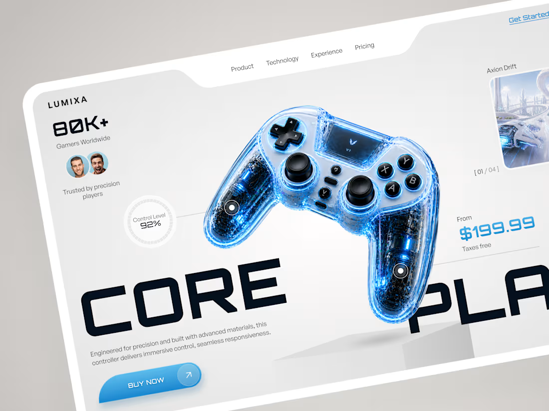
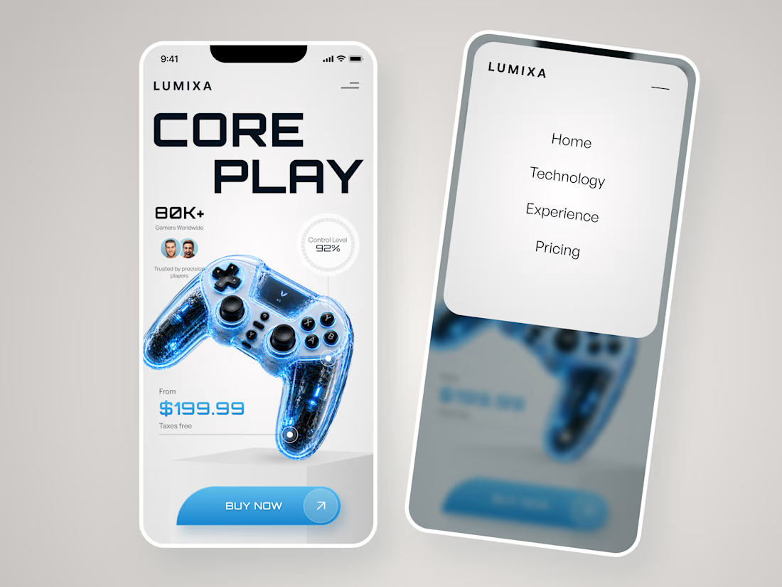
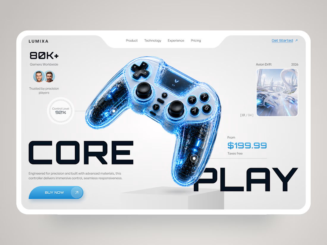

That LUMIXA landing page is stunning. The blue translucent controller against the minimal layout creates such a strong visual identity. Klym absolutely nailed this.

Looks Fantastic!

woohh very Attractive🔥

Just dash me this design cause its mouth watering

Cool!

beautiful
The network for creativity
Join 1.25M professional creatives like you
Connect with clients, get discovered, and run your business 100% commission-free
Creatives on Contra have earned over $150M and we are just getting started









Related posts

FOCUS — Creative Portfolio & Digital Art Website 🌸✨
A visually expressive website concept for a creative portfolio, built around digital art, bold imagery, and visual storytelling
The design combines vibrant pink tones, soft gradients, experimental typography, and immersive photography to create a distinctive editorial experience
Special attention was given to:
• Bold editorial hero composition
• Vibrant pink and dark color palette
• Experimental typography and visual details
• Immersive photography and digital artwork
• Creative project gallery and navigation
• Responsive mobile experience
• Clean layouts with a strong visual identity
The result is an expressive digital experience that puts creativity, emotion, and visual storytelling at the center of every screen 💗
Looking to create a standout portfolio or website for a creative brand? Let’s connect 🚀







Figma Football
An unofficial football concept inspired by Figma and its visual language.
The ball was created using a custom 3D generator I built in ChatGPT, with animated interface icons and graphics developed with Claude.
Part design experiment, part exploration of how custom AI-powered tools can become part of the creative process.


The interface icons translate surprisingly well into a football identity.

Ripple: book an Influencer the way you'd book a hotel 💧
Working with Influencer is still messy: DMs that go nowhere, rates you have to chase, contracts over email, and paying upfront with no guarantee.
Ripple puts the whole deal in one place:
• Discover Influencers matched to your Brand campaign, with real stats and a clear rate card
• Send a request and negotiate terms in chat
• Approve a proposal that both sides can see, line by line
• Sign once and it's binding for both sides
• Pay by phase, held in escrow until the work is approved
From "who should we work with?" to "booked" in minutes.
#ProductDesign #UIUX #CreatorEconomy #MobileApp #ConceptDesign

This is such a needed concept, Praveen! 👏 The influencer booking process is honestly a nightmare right now. Love how you simplified it like booking a hotel - super clear positioning. The design in the video looks clean too! 💧