The network for creativity
Join 1.25M professional creatives like you
Connect with clients, get discovered, and run your business 100% commission-free
Creatives on Contra have earned over $150M and we are just getting started
Back to feedPost

The Handoff Trap: Why accessibility fails on client projects.
As independent creators, we’ve all been there: you design or develop a beautiful digital product, hand it off to the client, and months later they come back with a 200-page accessibility audit asking for urgent refactoring.
It’s stressful, inefficient, and eats into your margins.
The issue isn’t a lack of care; it’s that accessibility is usually treated as a post-production chore rather than a core workflow.
In my latest article, I share a framework on how we can operationalize empathy to bridge the gap between marketing goals and engineering velocity:
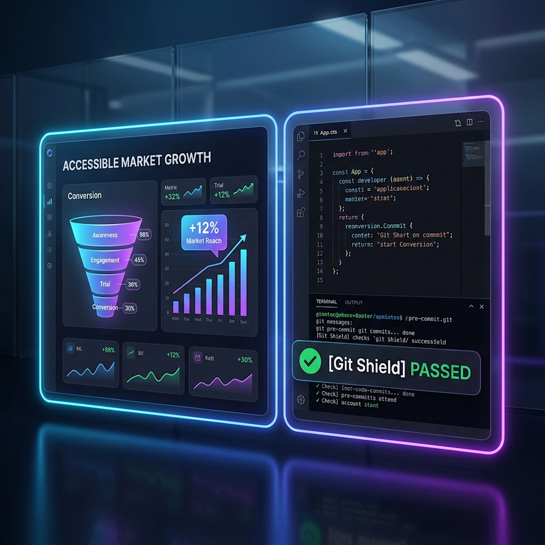
🛠️ Shift-Left Guardrails: Instead of checking for accessibility bugs at the end of a project, build automated pre-deployment shields (like Git Hooks) into your development flow to catch issues in real-time.
📊 Speak in ROI, Not Checklists: When presenting to clients, reframe accessibility from a compliance task to a growth metric. Use Accessible Market Growth (AMG) and Reach Recovery to show them exactly how many more users can navigate their checkout or sign-up funnels.
👁️ Visual Empathy: Equip your team or clients with simulation sandboxes to experience interactions through the eyes of users with cognitive, motor, or visual impairments.
By building accessibility directly into your release cycle, you protect your code quality, unblock enterprise sales for your clients, and deliver products built for everyone.
🔗 Read the full breakdown in the comments below
Are you currently using automated shields or manual simulators in your client workflows? Let's discuss in the comments!
accessibilitywebdevelopmentuxworkflowAI DevelopmentDigital Accessibility UX EngineeringFirebaseGoogle Antigravity


The network for creativity
Join 1.25M professional creatives like you
Connect with clients, get discovered, and run your business 100% commission-free
Creatives on Contra have earned over $150M and we are just getting started











Related posts


This is the kind of work I want to do more of.
A strong visual direction and plenty of room to get creative with the development. Built in Webflow, animated with GSAP.
Here’s a look around.


Outstanding Work❤️

Accidentally made app navigation look more satisfying than the actual music!😍
16 seconds of spatial audio, smooth transitions, and tactile UI motion. Testing how far you can stretch digital minimalism✨
Feedback and love from the design community are always appreciated🙌
UI DesignmotiongraphicsmobileappdesignuiuxdesignMotion DesignUX DesignAdobe After EffectsCinema 4DFigma


This is so satisfying Raheel! 🔥 You nailed that tactile UI motion - 16 seconds but it feels so premium! The spatial audio card with that depth + smooth transition from Home to Made for Spatial Audio is chef's kiss. Minimalism stretched perfectly without losing the Apple Music...

Working on a UX project to simplify an internal company app and make everyday tasks faster and easier.
I redesigned a 16-screen workflow into just 6 screens — a 62.5% reduction in screens — by removing unnecessary steps, simplifying the user flow, and making key actions easier to complete.
The goal is to reduce user friction, minimize cognitive load, and help employees complete tasks with fewer steps.
Hopefully, I can share the full case study soon! 🚀

Cutting 16 screens down to 6 is the kind of ruthless editing internal tools desperately need. Fewer steps and less cognitive load is a win every employee will feel, looking forward to the full case study.