The network for creativity
Join 1.25M professional creatives like you
Connect with clients, get discovered, and run your business 100% commission-free
Creatives on Contra have earned over $150M and we are just getting started
Back to feedPost
A hand-built studio site in a Swiss "lacquer & stone" style: warm stone paper, lacquer-red accents, thin uppercase type and fine film grain. Every section reacts as you scroll: Halftone portrait that reveals under your cursor
Signature that draws itself, and a manifesto that lights up word by word
The boutique: five project videos with a working till. Reach the end and the receipt prints PAID
3D paper crumple: the receipt folds into a real 3D ball and drops into the page with physics
"A Day in Code": an original stick-figure film drawn in code. The ball lands inside it and gets a bicycle kick
Generative synth music and cartoon sound effects, all made live in the browser
AI-style assistant in a glowing WebGL orb, available in six languages
Built with: Vanilla JavaScript · Vite · GSAP + ScrollTrigger · Lenis smooth scroll · Three.js (3D crumple and cart) · Matter.js (physics) · WebGL shaders · Web Audio API · Web Workers · Vercel
The 3D crumple runs in a Web Worker and only the video on screen plays, so it stays smooth at 60fps.


This is nice 👌

I appreciate man
The network for creativity
Join 1.25M professional creatives like you
Connect with clients, get discovered, and run your business 100% commission-free
Creatives on Contra have earned over $150M and we are just getting started









Related posts

A flower that inflates arrives in the mail.
Next month, a phone made of shell.
STILL LIFE SERVICE. Case study dropping soon.
Which object earns your shelf? Reply below.
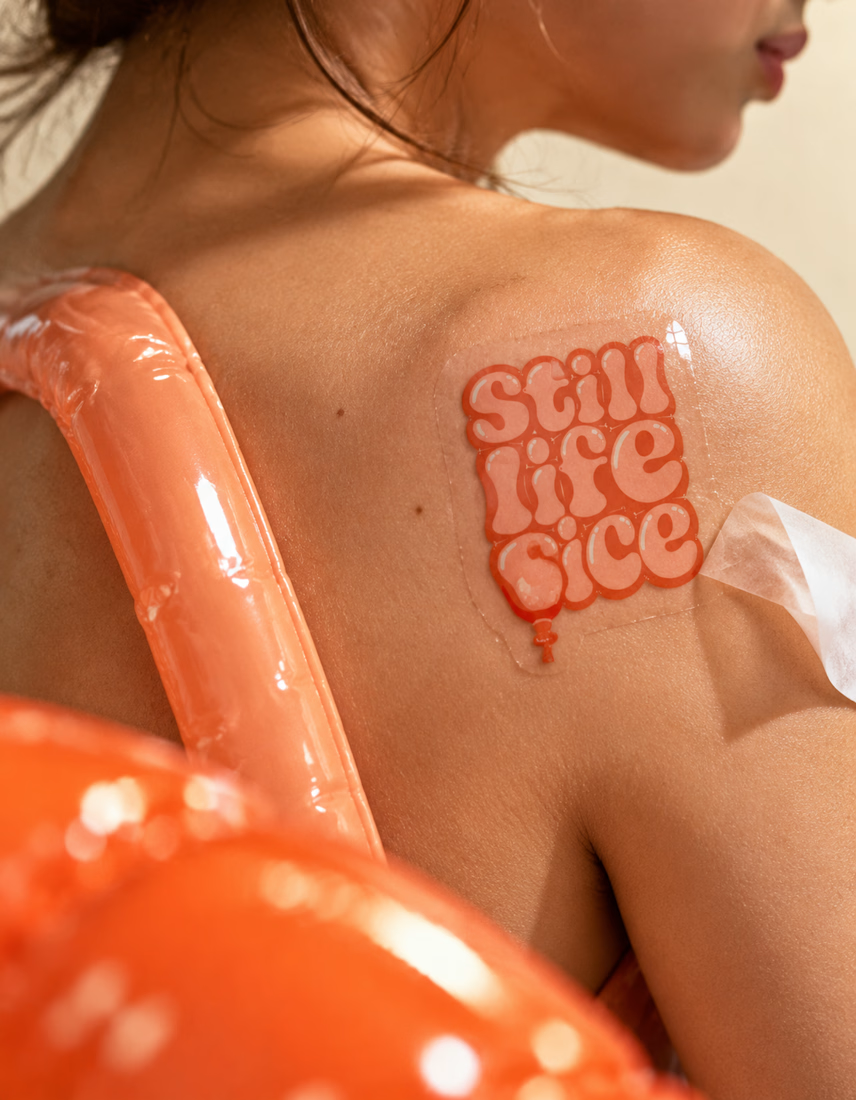
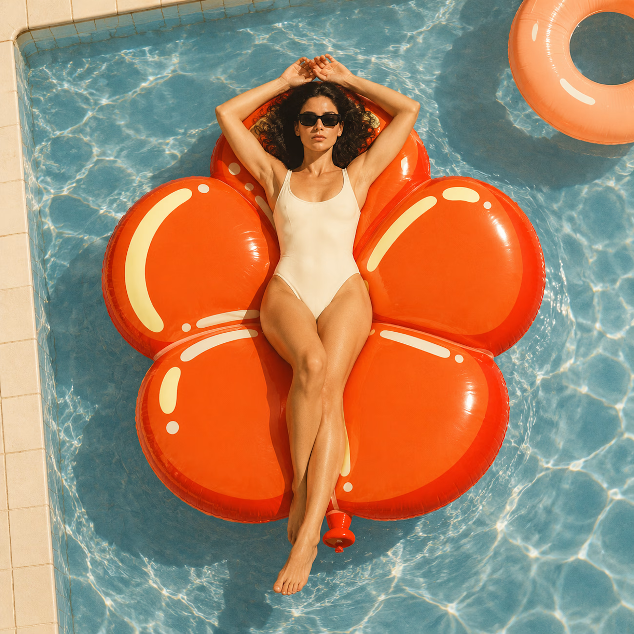
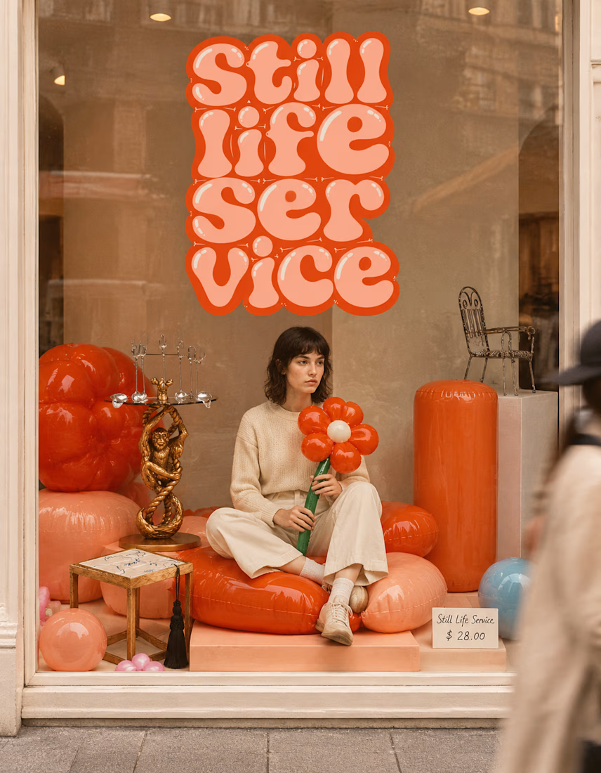

The inflatable flower. Only houseplant I'm guaranteed not to kill. Also, a new object every month is a sneaky good retention hook, people will stay subscribed just to see what's next.


I don’t avoid templates just to make things look different.
I avoid flattening a physical brand into a generic digital experience.
A restaurant, studio, fashion label or product can have incredible character in the real world, then lose all of it the moment it becomes a website.
That gap is what interests me.
The website should be able to carry the atmosphere through layout, typography, pacing, motion and interaction, and ideally attract people before they ever experience the physical space.
Not every project needs to be highly expressive.
Some websites should stay simple, direct and functional.
But even simplicity can carry identity.
Bolluni was built with that in mind: translating the character of the restaurant into a digital experience rather than simply presenting information.
Embrace the Creativity.

So well said. That's exactly the problem - a restaurant can have so much soul IRL then become another generic grid online. Love that you don't just avoid templates to be different, but to protect the brand's actual character. 100% agree.

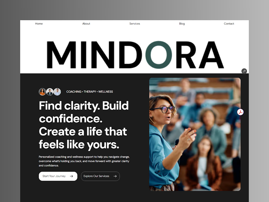
Introducing Mindora — a Life Coaching & Wellness Framer Template.
I designed Mindora for life coaches, wellness professionals, and personal growth brands looking for a calm, modern, and welcoming online presence.
Inspired by clarity, confidence, and meaningful growth, Mindora features a thoughtful layout, dedicated service sections, a blog for sharing valuable insights, and a clean visual style designed to help brands connect with their audience.
Built with Framer, it's a customizable starting point for creating a professional coaching or wellness website.
Explore Mindora and bring your next website idea to life.
Kindly check it out the template: https://www.framer.com/marketplace/templates/mindora-life-coach/



Great work