The network for creativity
Join 1.25M professional creatives like you
Connect with clients, get discovered, and run your business 100% commission-free
Creatives on Contra have earned over $150M and we are just getting started
Back to feedPost

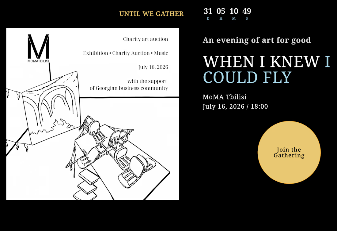
Event site for a charity art auction at MoMA Tbilisi, built in one week


The network for creativity
Join 1.25M professional creatives like you
Connect with clients, get discovered, and run your business 100% commission-free
Creatives on Contra have earned over $150M and we are just getting started





Related posts

Here's my submission for the Contra x Lovable challenge. It's more of a story than a design showcase.
I'd never used Lovable before this. I spent 3 days inside it, and it was an amazing first experience.
How I built it:
I planned everything with Claude, created the images with GPT, and then built and structured the whole app in Lovable.
The problem:
In Bangladesh, India, and across South Asia, brides book a mehedi artist to come home and apply henna before the wedding. I created an imaginary artist, Tisha. While she works, her hands are covered in mehedi for hours. She can't pick up a call or reply to a text, so she badly needs a booking system that works without her.
See it in action: https://mehedibytisha.lovable.app/
What it does:
Customers pick their service, number of guests, and design style from multiple options, then choose an open time.
Customers get a booking confirmation by email, and Tisha gets an email for every new booking.
A backend keeps every customer and every booking in one place.
Tisha sets her schedule once, and customers can book her any time based on it.
Thank you, Lovable and Contra, for organizing this.


Nice work


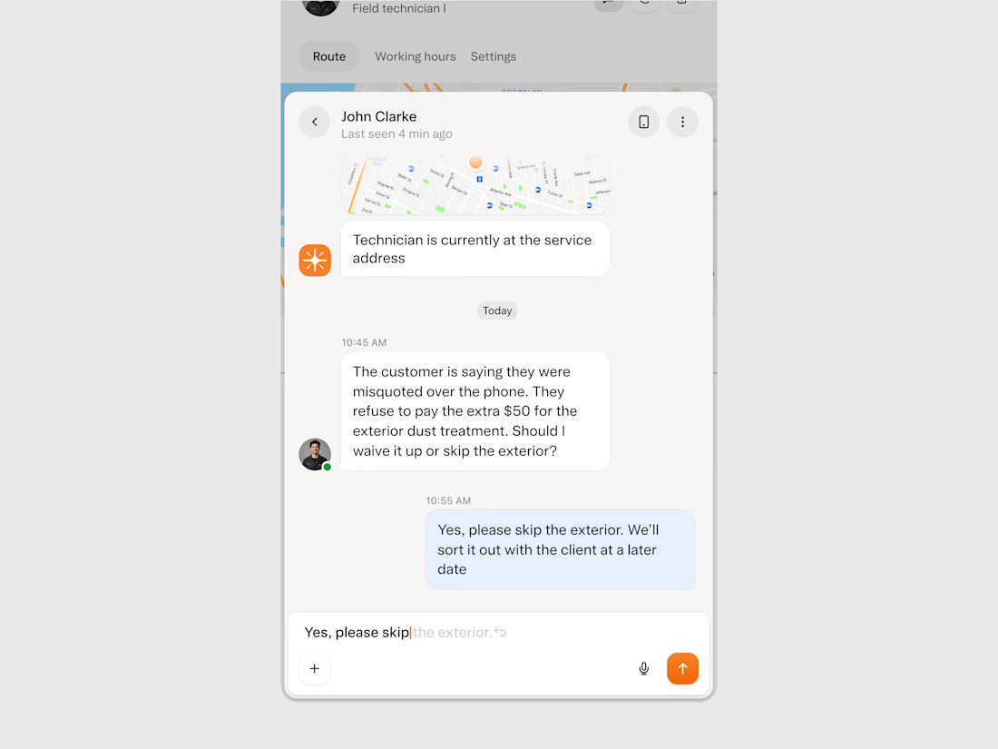
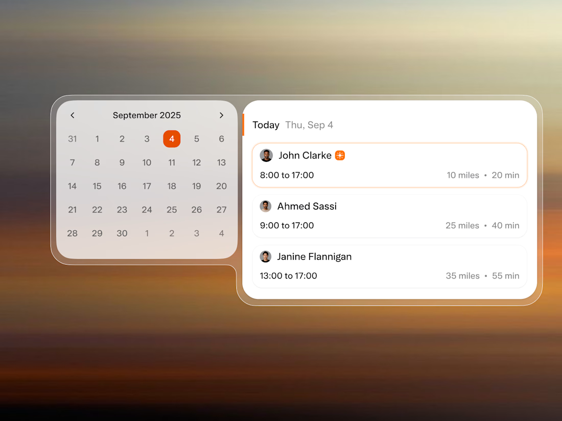
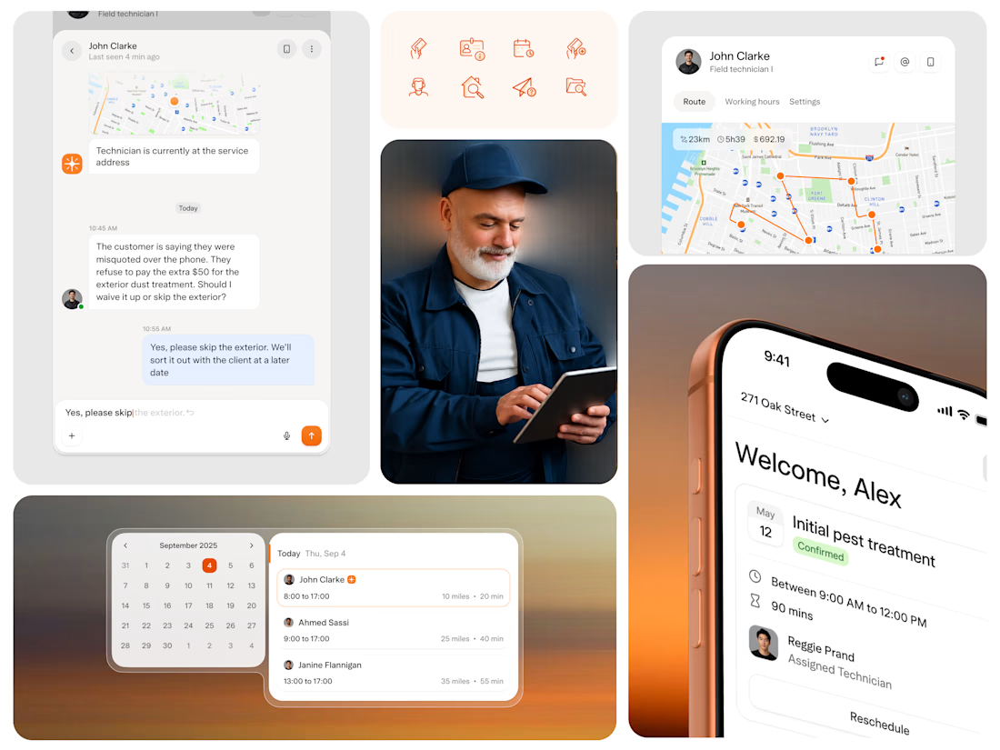
Solea came to us in September at seed stage with a clear idea: scheduling is the core business problem, and AI is the right tool to solve it. They needed a design partner and within 24 hours of our first call, we completed a design test to prove we could move at their pace.
After launch, pest control businesses using the platform started running more appointments per day with the same headcount and reported a 10x ROI on the switch.
Solea signed their first national customer within 6 months, raised a $10M Series A, and we are continuing with them into the next phase.


Top-notch design.