The network for creativity
Join 1.25M professional creatives like you
Connect with clients, get discovered, and run your business 100% commission-free
Creatives on Contra have earned over $150M and we are just getting started
Back to feedPost
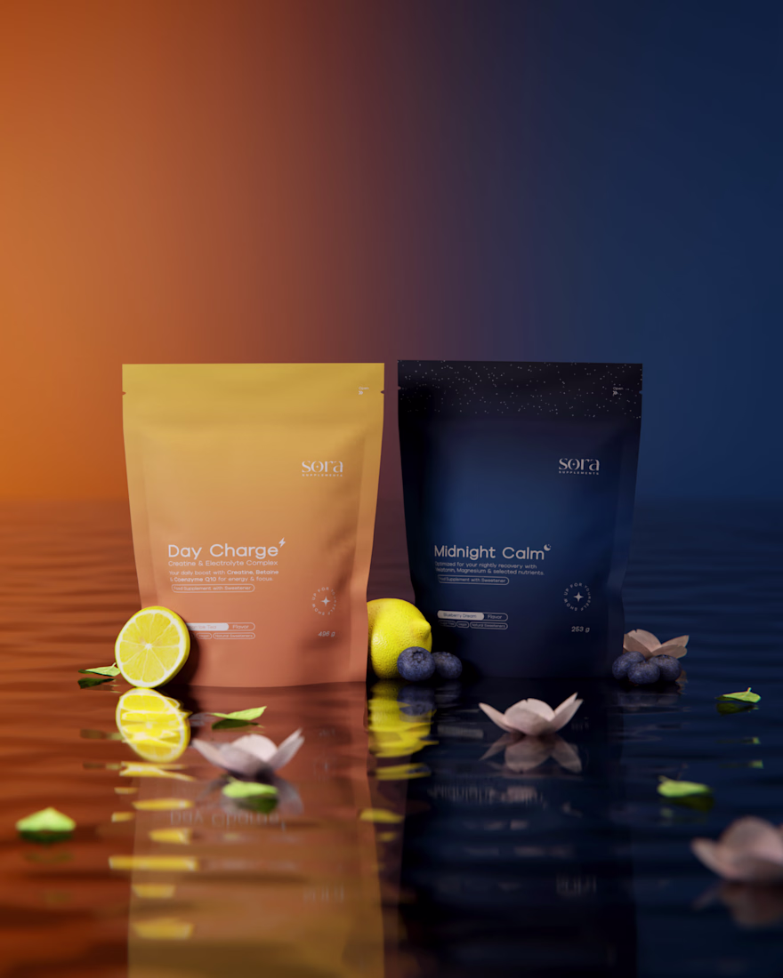
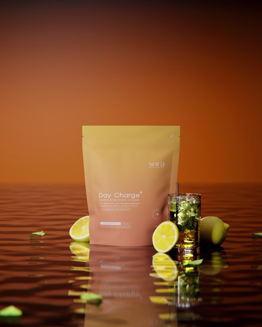
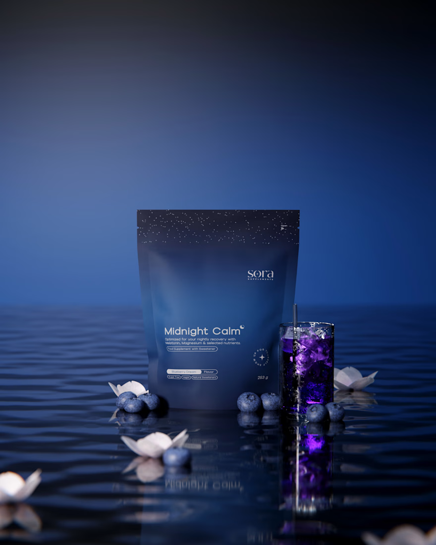
SORA Supplements
Designing for SORA, a premium supplement brand, was all about capturing balance — between energy and calm, day and night.
For the launch of their first two products, I was responsible for the logo design, packaging, and 3D visualization.
The vision was to create a minimal yet memorable identity — one that feels refined, modern, and rooted in simplicity.
Every detail, from the soft color palette to the matte finish of the packaging, was carefully crafted to reflect SORA’s calm and premium essence.
A huge thank you to Philipp, Alex, and Peter for the inspiring collaboration and trust throughout the process.
Client: www.sora-supplements.com
More about this project: www.ognjenbabic.com

really love the gradients used on the packaging!
thank you so much!!
Nice!
Thanks!!
Very sleek!! Wish I didn’t spend all my goats for today
Thank you so much!! 🙌
Haha! Same!
That's gotta be one of the most premium looking packages I've seen, really awesome work
Really happy to read that. Thank you!! 🙌 😊
Great work
Thank you!! 🙌
Love the packaging designs
Thank you!! 🙌
This design flows so well!
Thanks!!
Amazing
Thank you!
damn, very nice design
thank you 🙌
Ooo love the sun rising and setting for the day/night packaging!
Thank you! I’m glad the day/night concept in the packaging resonated with you.
That day/night duality in the color palette is genius 🌞🌙 The warm orange vs cool blue positioning makes the product benefits instantly visual. Those Blender renders look photorealistic - the matte finish especially. What was the biggest challenge balancing premium positioning with supplement market accessibility?
Thank you! The biggest challenge was keeping the packaging as simple as possible while still communicating all essential information. While many supplement brands are loud and cluttered, we wanted to make a different statement: a premium product without unnecessary noise. The...
The network for creativity
Join 1.25M professional creatives like you
Connect with clients, get discovered, and run your business 100% commission-free
Creatives on Contra have earned over $150M and we are just getting started
Trending
Claude
Claude has entered the design space. How are you using Claude Design?
Contra University
Learn from expert creatives how to earn more using next-gen AI tools.
creativeaiflow
Creative AI workflows are evolving. What tools do you use, and what are their strengths and weaknesses?
freelancerlife
Freelancer life is wins, pivots, and everything in between. What’s yours right now?