The network for creativity
Join 1.25M professional creatives like you
Connect with clients, get discovered, and run your business 100% commission-free
Creatives on Contra have earned over $150M and we are just getting started
Back to feedPost
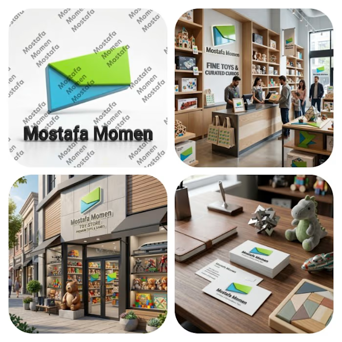
That's my Advanced minimalist 3D logo design I discover that I am so skilled in logo design but I use my skills in a wrong way but know I see potential and I start progressing in logo design and know I start building it as a full time carrier
If you have any advice to help me improving just tell me
Thanks for everyone who supporting me in my journey 😁


Great attention to detail!💯

Thank you Divya!
The network for creativity
Join 1.25M professional creatives like you
Connect with clients, get discovered, and run your business 100% commission-free
Creatives on Contra have earned over $150M and we are just getting started











Related posts

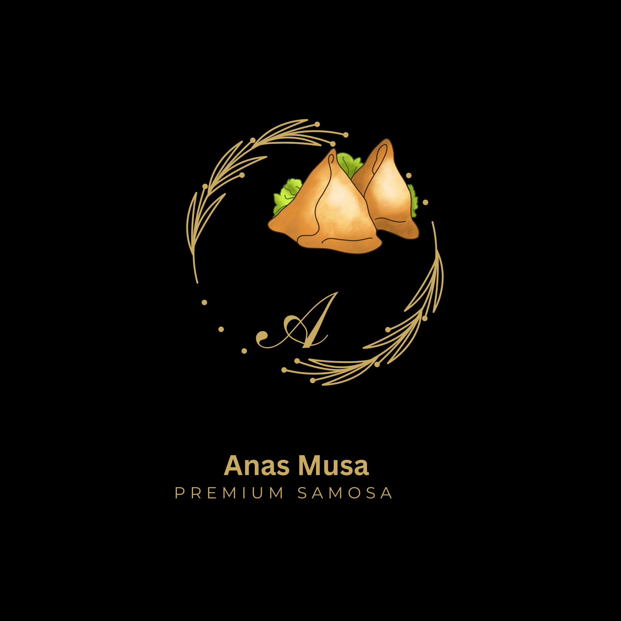
I premium and minimalist logo concept designed for a luxury food brand ,
Samosa logo, food logo brand logo, luxury logo, premium logo, restaurant logo, golden wreath logo, monogram logo,




Clean and confident work! The green gradient with the mark feels very modern for fintech - trustworthy but not boring. The app screens look really polished. Curious how you landed on this mark, does it represent growth / movement?

lune night balm — matte black jar w red lip texture. wanted messy luxury, not clean girl aesthetic #BrandDesigner

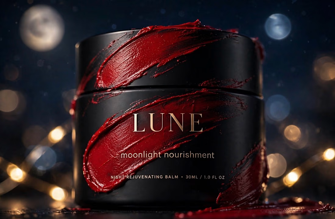
That's really great packaging design great black box design specially with red paste and premium golden font 🔥🔥🔥
great job Brenda🎉🎉🎉