The network for creativity
Join 1.25M professional creatives like you
Connect with clients, get discovered, and run your business 100% commission-free
Creatives on Contra have earned over $150M and we are just getting started
Back to feedPost

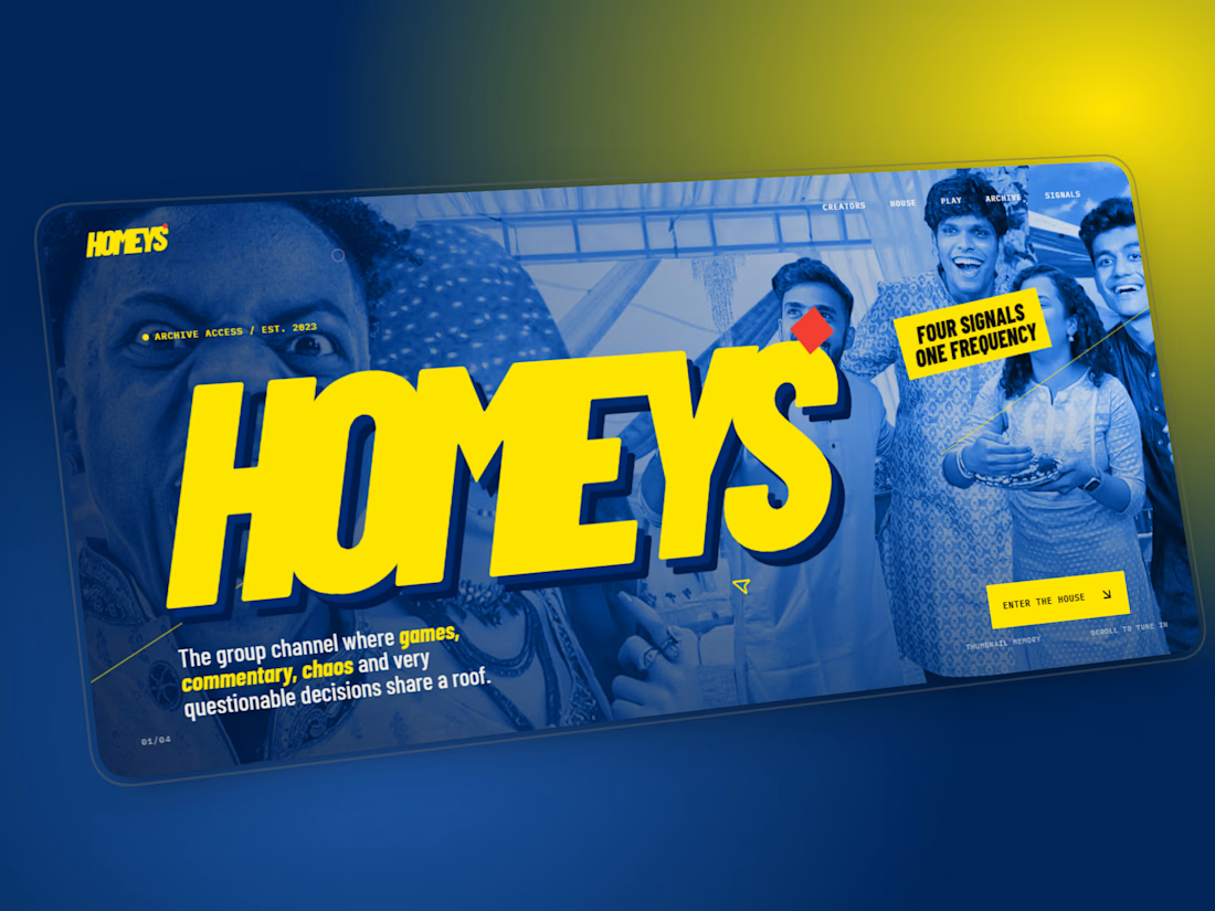
HOMEYS — A Digital Experience Built Around Creator Culture
HOMEYS is a self-initiated website concept created to explore how a creator collective could translate its personality, energy, and content ecosystem into a modern digital experience.
Instead of building a traditional creator website, I focused on creating something immersive, visual, and dynamic , combining bold typography, interactive motion, transitions, content-driven layouts, and a strong visual identity.
The goal
Create a digital home that feels as energetic as the creators themselves while still maintaining a polished, premium interface.
What I worked on
Creative Direction
Developed the overall visual language, composition, typography, color system, and interaction direction.
UI/UX Design
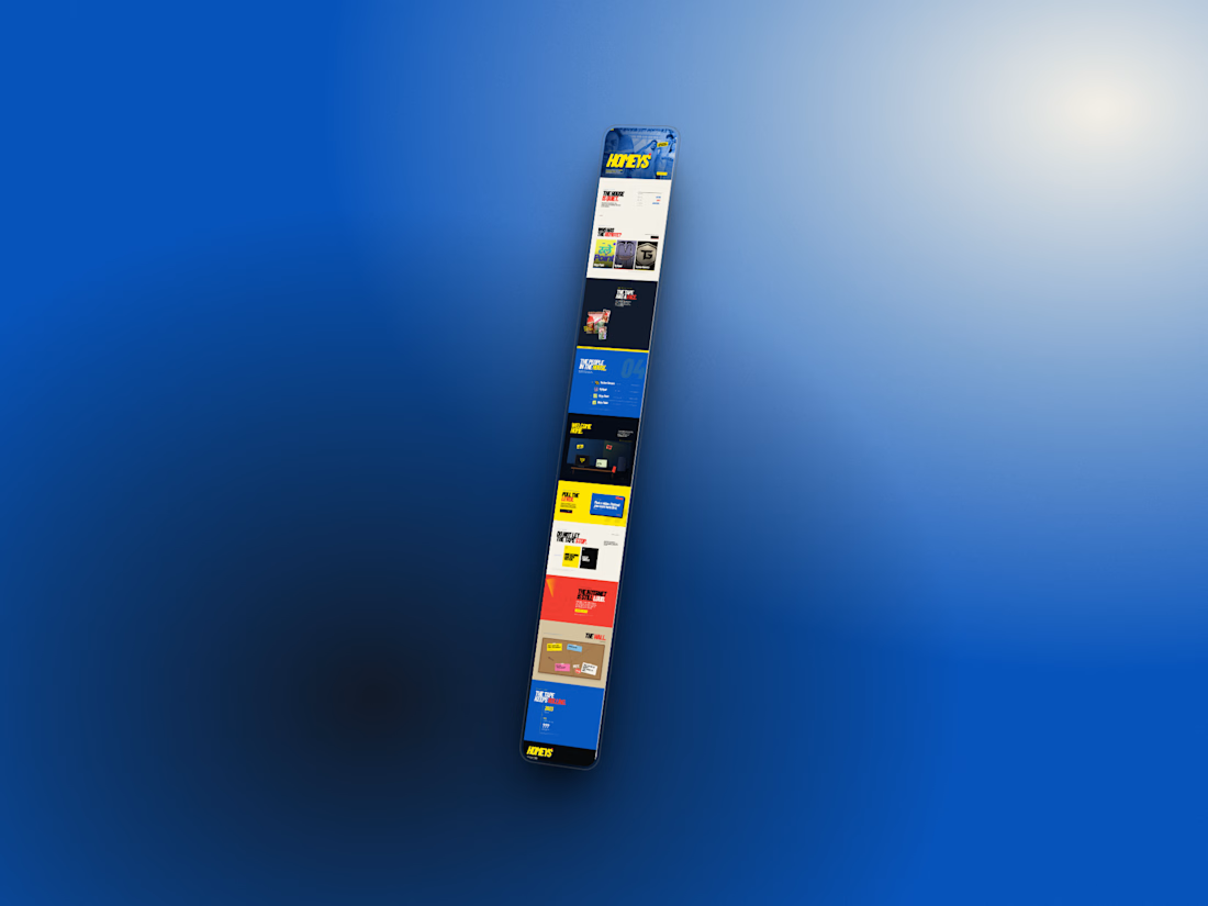
Designed the page structure, visual hierarchy, content sections, responsive layouts, and user flow.
Motion & Interaction
Added animated transitions, scroll interactions, hover states, movement, and other micro-interactions to make the experience feel alive.
Frontend Development
Translated the visual concept into a responsive, interactive website with a focus on performance and smooth interaction.
Design direction
The experience was intentionally built around:
• Bold typography
• High-impact creator visuals
• Dynamic transitions
• Interactive sections
• Strong visual hierarchy
• Responsive layouts
• A modern creator-first aesthetic
PREVIEW LINK: https://homey1.vercel.app/
This project was created as an exploration of how creator brands can move beyond social platforms and build a distinct digital identity of their own.dynamic,



The network for creativity
Join 1.25M professional creatives like you
Connect with clients, get discovered, and run your business 100% commission-free
Creatives on Contra have earned over $150M and we are just getting started







Related posts

Built the site for Linea — a boutique rail brand where the whole UI is made of the same rule as the print system.
Every route card's red line isn't decoration, it's that route's actual elevation profile. Fare tiers aren't styled, they're the same data at different density.
The logo's sparkle mark even resolves from the exact same contour-drawing logic, live on the page.
One idea, all the way down → Here
Every route has a shape. Most travel brands decorate over it.
For Linea, I built the whole system — ticket, app, uniform, packaging, site — around one rule: trace the actual terrain. Even the logo mark is generated by the same line that draws the mountains.
System, not just style.


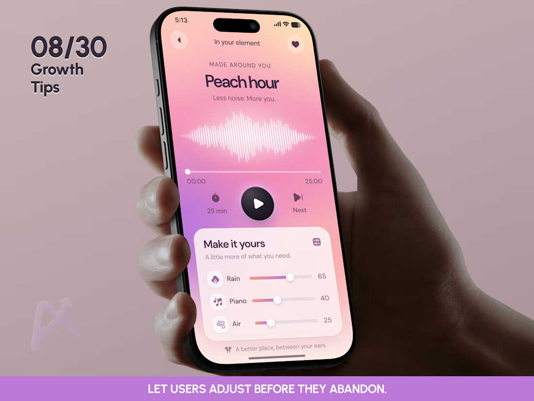
🎛️ GROWTH TIP 08/30: LET USERS ADJUST BEFORE THEY ABANDON.
Someone starts a relaxation session.
The piano feels too loud.
The rain is barely there.
The overall mix doesn’t fit their mood.
That small mismatch creates a product decision: keep listening, search for another session, or leave.
For In your element, we explored a simple way to give users another option: adjust what feels wrong while staying in the player.
🍑 MAKE IT YOURS
The Peach hour player puts 3 independent sound controls directly below playback:
🌧️ Rain
🎹 Piano
🌬️ Air
Users can see the current balance and change each layer without opening a separate settings screen.
The session is ready to start. Personalization is available when the listener has enough context to know what they want to change.
🧠 THE PRODUCT INSIGHT
Some preferences are easier to discover through experience.
Before pressing play, a user may not know how much piano they want. A few seconds into listening, they can make that decision.
That makes the timing of personalization a UX decision:
Start → Experience → Adjust → Continue.
Give users a useful starting point, then put relevant controls where the need appears.
📈 THE GROWTH OPPORTUNITY
An early exit can mean many things. Sometimes the content is wrong. Sometimes one adjustable detail is getting in the way.
This design gives us a specific hypothesis to test: can in-session sound controls help listeners resolve a mismatch and continue?
I’d track early exits, listening time after an adjustment, and session completion against a fixed-mix version.
Slider interactions alone wouldn’t prove success. What happens after the adjustment is what matters.
💡 A useful question for your next mobile app review:
When something feels slightly wrong, can the user fix it without starting over?
08/30 complete. 22 growth insights left.
Follow the series for practical mobile product lessons on activation, personalization, retention, and conversion.
👉 BOOK A MOBILE APP STRATEGY SESSION
https://calendly.com/asol_design/book-diagnostic-call-linkedin-clone
#MobileAppDesign #MobileAppDesigner #MobileAppRedesign #ProductDesign #GrowthDesign #GrowthUX #UXDesign #UIDesign #MobileUX #MobileApp #WellnessApp #MeditationApp #AudioApp #Personalization #Retention #Activation #ProductStrategy #InteractionDesign #AppDesign #AsolDesign