The network for creativity
Join 1.25M professional creatives like you
Connect with clients, get discovered, and run your business 100% commission-free
Creatives on Contra have earned over $150M and we are just getting started
Back to feedPost

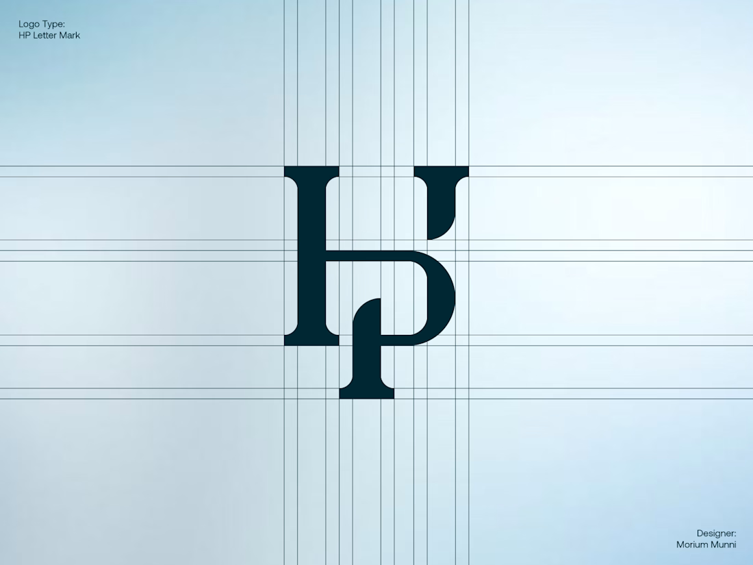
A modern and minimal HP lettermark built around a structured geometric grid.
The concept focuses on simplicity, balance, precision, and visual harmony, creating a distinctive monogram that can work across digital and brand applications.
Designed with a clean geometric construction to keep the mark memorable, scalable, and versatile.
#logodesign #logotype #lettermark #monogram #logomark #branding #HP #HPLogo

The network for creativity
Join 1.25M professional creatives like you
Connect with clients, get discovered, and run your business 100% commission-free
Creatives on Contra have earned over $150M and we are just getting started











Related posts

Brand Expressions -- Olivir



Thats so crazy!!!!!! Seeing this I feel we humans are still far better than AI

Logos from my archive.
A good logo doesn't really have to tell what you do; it's meant to tell a story. Here are some with their unique stories.
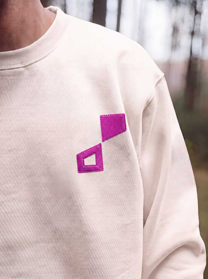
¹ Unik Mindz — inspired by Michelangelo’s 'Creation of Adam'; human creativity sparked by a higher source.
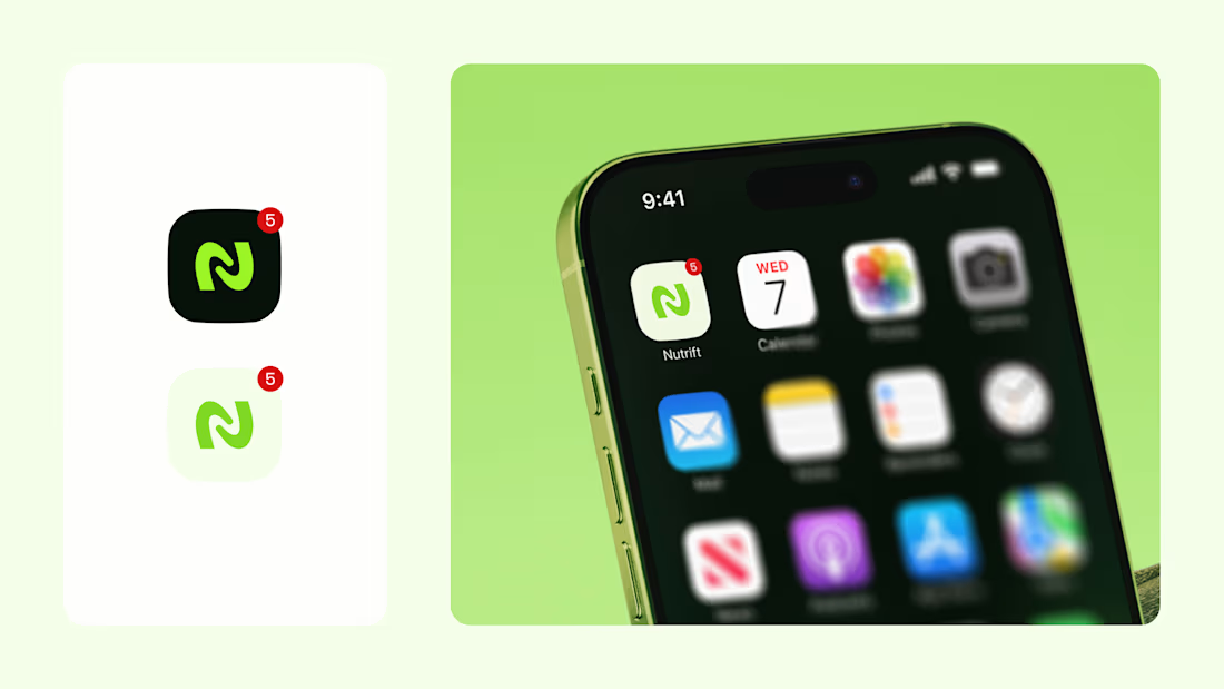
² Nutrift — reflecting the idea of weekly cycles and continuous meaningful progress.
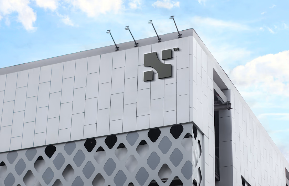
³ Nestform — built to reflect furniture that adapts and transforms to different living spaces.
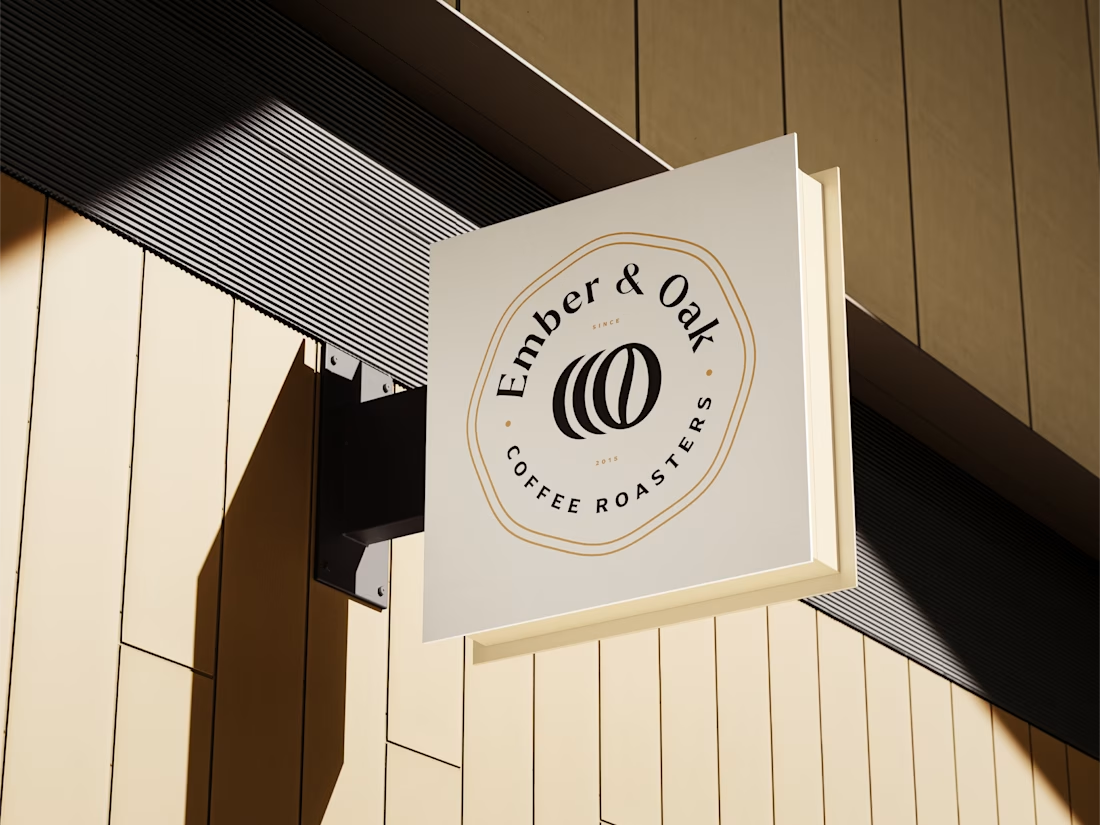
⁴ Ember & Oak — built around the truth that coffee is defined by its transformation, with the mark capturing the entire roasting journey.

Do you usually find the story first and draw toward it, or does the story get written once the mark takes shape? The weekly-cycle idea behind Nutrift reads like it could have gone either way.


Approved logo for a mental health and daily habit app built for seafarers and offshore workers.
Can't wait to share more.