The network for creativity
Join 1.25M professional creatives like you
Connect with clients, get discovered, and run your business 100% commission-free
Creatives on Contra have earned over $150M and we are just getting started
Back to feedPost
Chatpilot: a website template for AI chatbot startups
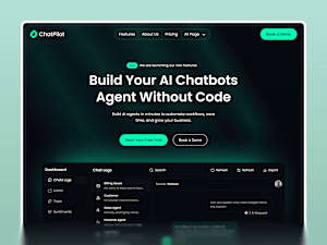
A green glow lights the dark hero, with a chat-log dashboard mockup right below it.


Chatpilot is built for AI chatbot and AI agent startups that want a premium, enterprise-feel homepage instead of a generic SaaS template.
Three design decisions.
1. A soft green gradient glow sits behind the hero headline, and a chat-log dashboard mockup drops in right underneath...
pentaclay.com
Chatpilot | High-Converting Framer AI Chatbot Template for SaaS
Launch your SaaS faster with Chatpilot, the ultimate Framer AI chatbot template. Featuring 11+ pages and a modern chatbot landing page Framer design.
The network for creativity
Join 1.25M professional creatives like you
Connect with clients, get discovered, and run your business 100% commission-free
Creatives on Contra have earned over $150M and we are just getting started







Related posts

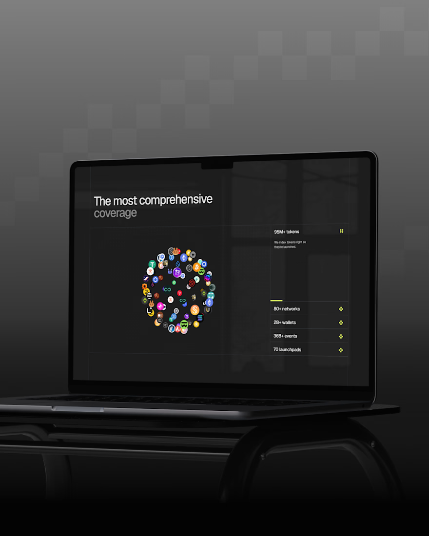
Just wrapped up a new redesign, and I’m really happy with how it turned out. 💻
Can’t wait to share more details and the live site soon...



Sitting on this before the reveal instead of rushing to post it says you're already happy with how it landed, so now I'm curious what part of the redesign you're most excited for people to see once the site goes live.

New tool Friday
A motion tool where every preset is a technique I'd normally charge for. (made by me)
Design taste isn't scarce because it has to be — it's scarce because most of us don't share the how.
Building > gatekeeping.

nice work

New case study: the landing page for REVAI, a concept AI sales platform.
The brief I gave myself was structural, not decorative: design a page where every section earns the next one. Hero makes one claim and gets out of the way. The value proposition comes before any feature gets named — because a feature nobody understands yet is just noise. Proof (testimonial, logos) sits right before the final ask, not scattered earlier where it does nothing.
Art direction followed the same logic — high contrast where the page needs to make a claim, quieter and more editorial where it needs to build trust. The layout isn't there to look good in isolation. It's there to move someone from "what is this" to "I trust this" in one scroll.

Love the colors dude! Hell of a work🔥