The network for creativity
Join 1.25M professional creatives like you
Connect with clients, get discovered, and run your business 100% commission-free
Creatives on Contra have earned over $150M and we are just getting started
Back to feedPost

A client wanted a simple way to capture subscribers on their website and send them directly to Mailchimp.
I built a Webflow subscription form and connected it to Mailchimp using just their API key and audience ID. Submissions flowed automatically into their list, giving the marketing team real-time access to new leads.
A few days later, spam submissions started coming in. To fix this without frustrating real users, I implemented Mailchimp’s double opt-in. Now, only verified subscribers are added, spam is blocked, and the process runs smoothly and automatically.
The takeaway: integrations aren’t just about connecting tools—they’re about protecting data quality while keeping the user experience seamless.


The network for creativity
Join 1.25M professional creatives like you
Connect with clients, get discovered, and run your business 100% commission-free
Creatives on Contra have earned over $150M and we are just getting started








Related posts


wowwwww😍

We designed and built a new website for Park Early Childhood Center in Lexington, KY. PECC has been caring for local families since 1979, and the new site lets parents feel that warmth before they ever walk in the door.
Real photos of real kids. Clear paths to enroll, join the waitlist, or schedule a tour. Smooth interactions that make it fun to explore, on desktop and mobile.
Live now at pecclex.org 🌱


Love the focus on real photography and clear enrollment paths. The site sounds warm, welcoming and parent friendly fr.


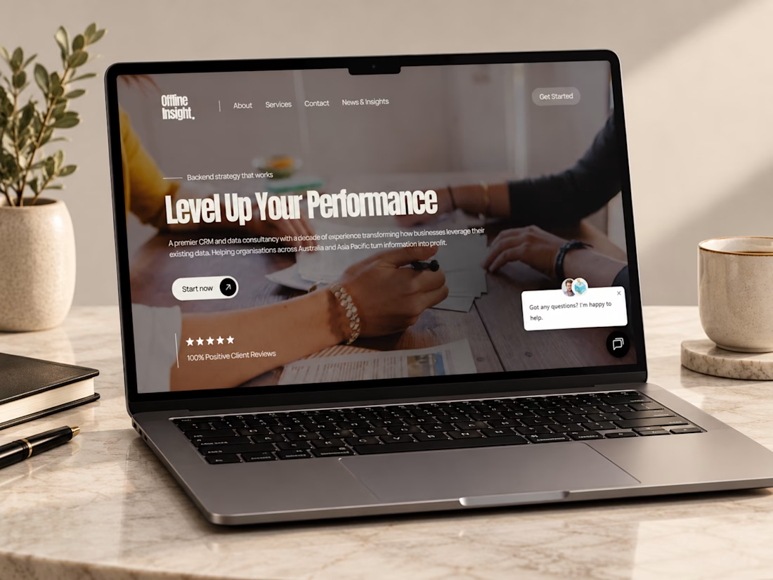
Just wrapped up this Webflow website project for Offline Insight, a CRM and data consultancy helping businesses simplify disconnected systems and make better use of their customer data.
For this one, I focused on making a technical service feel clear and approachable, cleaner messaging, stronger service structure, responsive layouts, and a smoother path from understanding the problem to booking a consultation.
I really like how the final experience balances technology, strategy, and simplicity.
Curious to hear your thoughts, does the website make a complex service feel easy to understand?
#Webflow #WebDesign #UIDesign #UXDesign #WebDevelopment #B2BWebsite #SaaSDesign #CRM #ResponsiveDesign #PortfolioProject #Contra

Ye le Jani Victor wali post ke liye copy-ready:
This looks genuinely polished, Victor! Making a CRM & data consultancy feel clear and approachable is not easy but you nailed it. Offline Insight website looks super clean and professional in Webflow + Figma. "Level Up Your Performance" hero is strong!