The network for creativity
Join 1.25M professional creatives like you
Connect with clients, get discovered, and run your business 100% commission-free
Creatives on Contra have earned over $150M and we are just getting started
Back to feedPost

Designers: 7 things I check in your Figma file before building it in Webflow
After 183 projects on Upwork, most of them Figma to Webflow, I see the same gaps in almost every file. They're not mistakes. They're just invisible in Figma and very visible in a browser.
Here's what I check before I touch Webflow:
→ Tablet and mobile frames. If only desktop exists, someone will guess the rest. Usually the developer.
→ Hover, focus and active states. Buttons, links, nav, form fields. A static frame doesn't show how a site feels.
→ Long and empty content. What happens when a blog title takes three lines? When a CMS list has 1 item instead of 6?
→ Text styles vs. one-off sizes. 14 slightly different font sizes means 14 classes nobody will maintain.
→ Consistent spacing. 32, 34 and 36px gaps on one page usually mean "32". I'll ask instead of guessing.
→ Image sizes. A 6 MB hero PNG looks great in Figma and kills page speed.
→ Forms, success messages and the 404 page. The screens nobody designs until launch day.
A file that covers these means fewer back-and-forth rounds and a live site that actually matches your design.
If you're a designer or an agency looking for a Webflow developer to build your designs pixel-accurate (white-label with NDA is fine too), here's my work and how I run projects: https://www.bohdan-tsiupka.com/
What would you add to this list? 👇


bohdan-tsiupka.com
Webflow Developer & Premium Partner | Bohdan Tsiupka
Certified Webflow Premium Partner. Figma to Webflow builds, template customization, migrations and ongoing support for teams in the US and Europe.

Spot on, Bohdan. So much of a smooth Webflow build depends on things that are invisible in Figma, like hover states, class naming and how sections should stack on tablet.
The network for creativity
Join 1.25M professional creatives like you
Connect with clients, get discovered, and run your business 100% commission-free
Creatives on Contra have earned over $150M and we are just getting started





Related posts
The painter’s house is always the last one on the street to get painted.
For 4 years, that was me.
80+ Webflow sites for clients. Zero for me.
In 2019 I was learning HTML and CSS with a plan: examples first, portfolio next, clients after. In 2022 I moved to Webflow and made the same plan.
The clients came first. And there was always one more project that needed the time more than my own site did.
Last month I finally shipped it.
It’s built the way I build for clients:
→ Your team clicks any text, changes it and hits Publish. No developer needed.
→ Prices are right on the page. Pick a service, drag the pages, see the number.
Both are in the video. Try them yourself, link in the comments 👇

This resonates. 80+ client sites and zero for yourself — that's not procrastination, that's a full calendar. The fact that your own site practices what you preach (edit any text without a developer, transparent pricing on the page) says more about how you work than any portfolio ever could. Congrats on the launch.

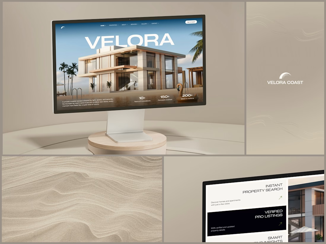
Real Estate Website
The villa stands in front of the name, on purpose.
The hero is one wide image of a modern villa under a blue sky, with palms at the sides and a pool in front. The name runs across the sky in wide white capitals, and the roof covers the bottom of the middle letters. It still reads at a glance, and the house keeps the foreground.
Lower on the page, the feature cards alternate cream and black, so it is clear where one card ends and the next begins. Each heading repeats the wide capitals of the name, aligned right, with a short line of copy and a small green arrow.
Designed by the Hue & Machine team.
#RealEstate #Architecture #RealEstateWebsite #WebDesign #LandingPage #HeroSection #Typography #UIDesign #DesktopDesign #FigmaDesign


This looks so premium! Love the concept of the villa standing in front of the name on purpose, it makes the hero feel so bold and confident. The wide image, the blue sky, palms and pool, everything feels luxurious but still clean. And the way VELORA runs across the sky in big...

Loved this project! Making a Canadian Soccer training brand look worldclass.