The network for creativity
Join 1.25M professional creatives like you
Connect with clients, get discovered, and run your business 100% commission-free
Creatives on Contra have earned over $150M and we are just getting started
Back to feedPost

What if your watch collection had a dashboard this luxurious?
Meet Chronova. Built for collectors who care about every detail.
Would you use this?


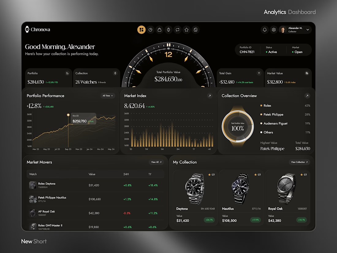
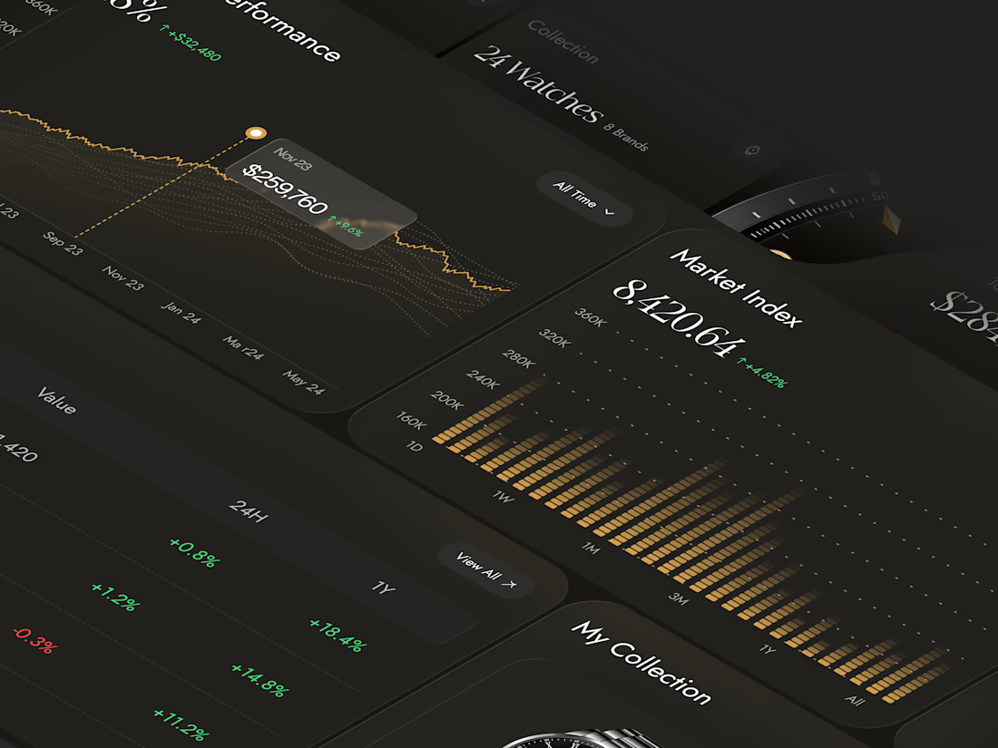
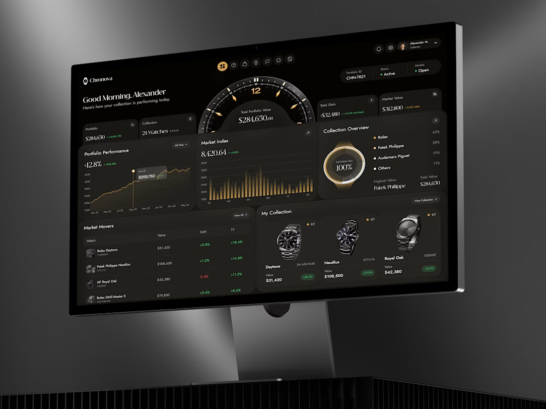

Luxury aesthetics with data that actually matters. This is clean!

The gold accents against the dark UI are such a premium touch.

A dedicated dashboard for watch collectors is a neat idea ⌚

a dark dashboard makes sense here, the watches get to be the brightest thing on screen. how do you show a collection's value changing without it feeling like a trading app?


Brilliant ✨

Premium dashboard😍


The centerpiece dial is a great design decision. It gives the dashboard a strong identity while keeping the financial insights accessible. 👏

Really neat and clean one
The network for creativity
Join 1.25M professional creatives like you
Connect with clients, get discovered, and run your business 100% commission-free
Creatives on Contra have earned over $150M and we are just getting started






Related posts


Very juicy. Didn't you feel like having some berries while working?


Love the attention to detail! The smooth scrolling, subtle animations, and interactive elements make the mobile experience feel clean, modern, and engaging. Great work! 👏


would you let people record a little voice intro before each track?