The network for creativity
Join 1.25M professional creatives like you
Connect with clients, get discovered, and run your business 100% commission-free
Creatives on Contra have earned over $150M and we are just getting started
Back to feedPost

A website template gives you a starting point. What you build around it makes it useful.
Before calling a website ready, we’d ask:
• Can visitors quickly understand the offer?
• Does the mobile layout prioritize what they need most?
• Can the owner update content without breaking the design?
• Is the next step clear—browse, book, buy or get in touch?
These questions matter whether you’re working with Wix Studio, WordPress or a custom build.
For us at AliThemes, a useful template should leave room for real content and real business needs—not just look good in a demo.
Designers: what’s the one thing you always check before handing a website over to a client?


so true. template is like 10% of work lol. i learned this hard way building product pages, if owner cant update without breaking everything then its not ready. mobile part is so real.
The network for creativity
Join 1.25M professional creatives like you
Connect with clients, get discovered, and run your business 100% commission-free
Creatives on Contra have earned over $150M and we are just getting started





Related posts

You leaned toward Atmospheric in my last taste test, so I took it beyond the hero.
Here’s the full homepage for the same fictional lighting studio, with two different scroll experiences: Fluid and Cinematic.
Which one makes you want to keep exploring?
Continuing from this post: https://contra.com/community/KacW2yxF-homepage-design-comparison-product-photography-vs
22 voted
46%
26 voted
54%
48 votes
Closed

I can't recognizable the difference but both of them are great 🎉🎉

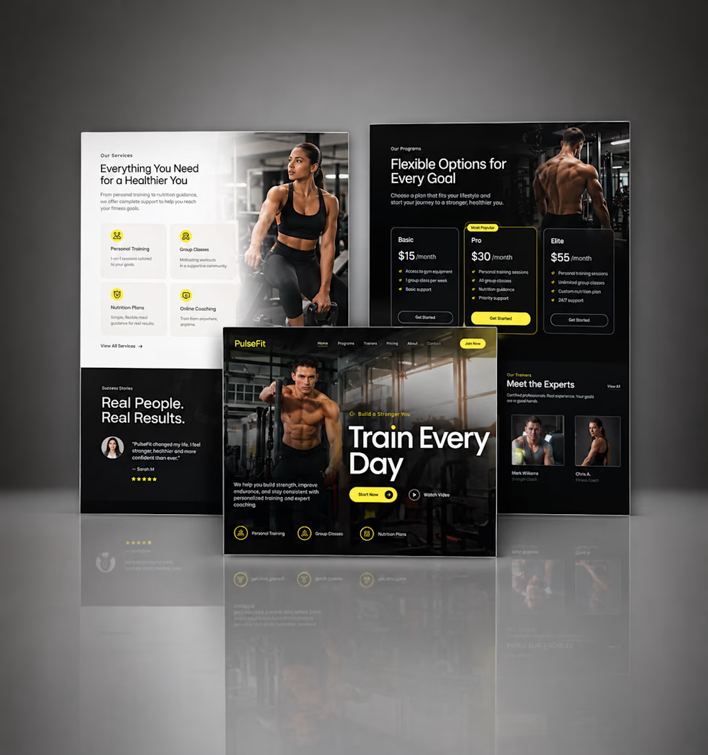
Kajabi Gym & Fitness Landing Page Design
The client needed a focused landing page for their gym and fitness offering that could present the program clearly and encourage visitors to take the next step.
I designed the landing page in Kajabi with a strong visual hierarchy, clear sections for the fitness program, benefits, social proof, and calls to action. The layout was also structured to work smoothly across desktop and mobile.
The result was a clean, focused fitness landing page that makes the offer easier to understand and gives visitors a clear path toward getting started.
#KajabiFitness #KajabiFitnessCoach #KajabiFitnessWebsite #KajabiFitnessLandingPage #FitnessCoachWebsite #FitnessCoachingWebsite #OnlineFitnessCoach #PersonalTrainerWebsite #FitnessLandingPage #GymLandingPage #FitnessProgram #OnlineFitnessProgram #PersonalTraining #WeightLossCoach #FitnessFunnel #FitnessSalesPage #GymWebsite #FitnessWebsiteDesign #FitnessWebDesign




Great work, Hesty. I like how you focused on clear hierarchy, social proof, and strong CTAs instead of just making the page look good. That combination of UX + conversion thinking is what makes a landing page effective.

Saas Management Landing Page Design


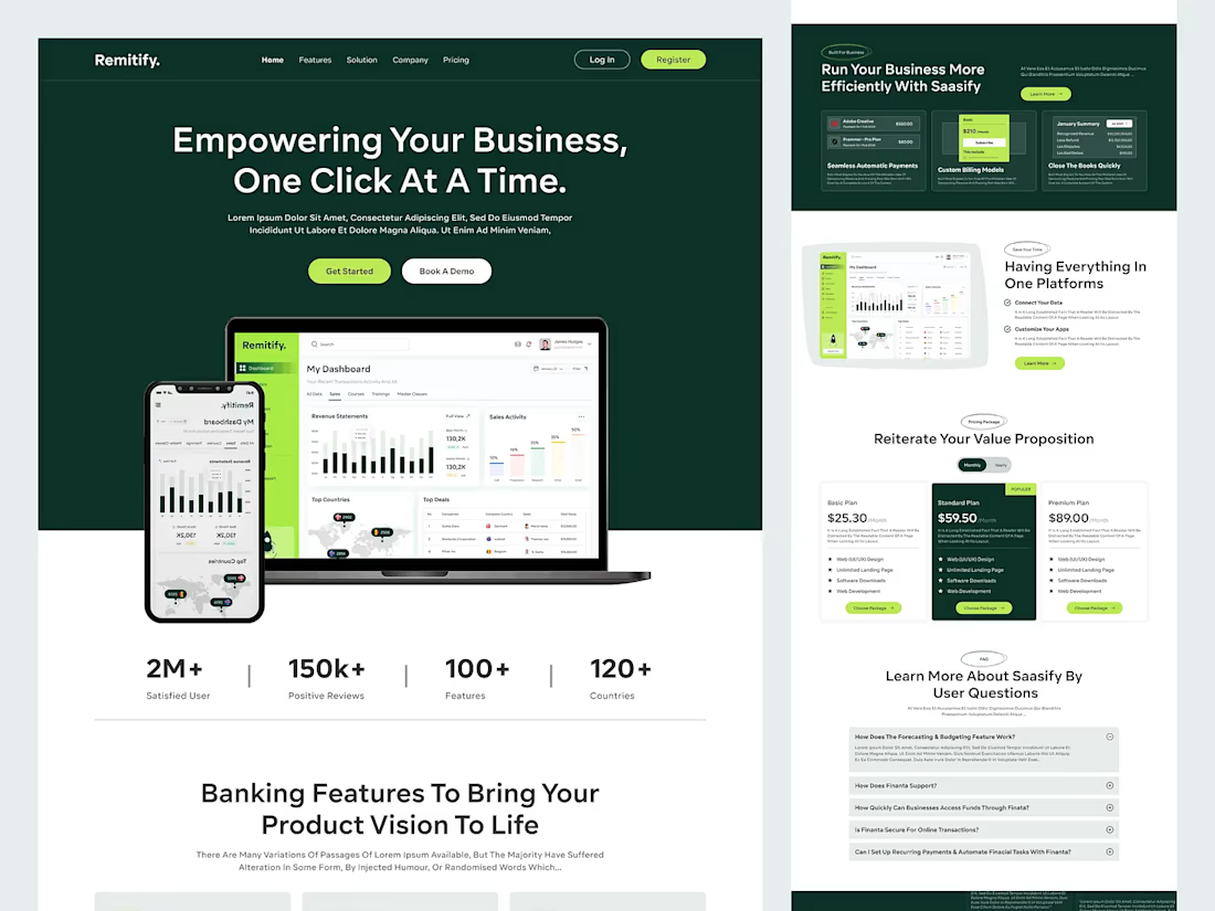
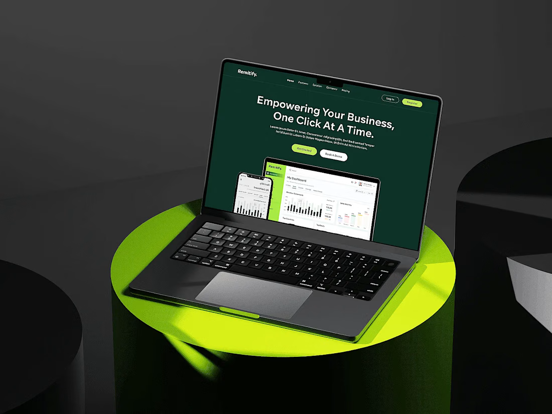

The deep green with lime accents reads "finance you can trust" without feeling like a bank, and the stats row right under the hero adds instant credibility. When pages like this get built, the dashboard in the hero is the part I'd make live: a lightweight animated version with...