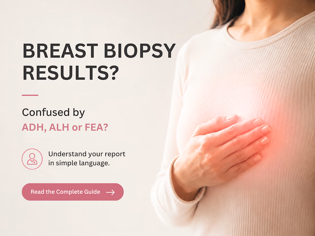
I designed this in Canva using a soft pink palette inspired by breast cancer awareness. My goal was to make complex medical information feel clear, approachable, and easy to understand.
Would this make you stop and read? I'd love your feedback. 💗
Hot take: aesthetics and clinical results should walk hand in hand.
Most brands in this space lean into cold, sterile whites or aggressive dark tones. It reads functional, but it also feels like something you'd hide in a medicine cabinet, not display on your vanity.
For this rebrand, we anchored the identity in classical beauty and organic sophistication. By combining warm earthy tones, botanical cues, and timeless iconography, we moved away from the "pharmacy product" feel into true high-end personal care.
It was a deliberate shift: positioning the brand not for someone who feels like they are treating a flaw, but for someone investing in a premium daily ritual.
Would a piece like this deserve a spot on your display shelf?
I wanted to tell a short story through animation, atmosphere and cinematic storytelling. The Last Light follows Kaito, a young swordsman returning to the ruins of his village, where a mysterious girl named Ayame reveals that his family’s past is far darker than he imagined.
The project moves through flashbacks, character interactions, supernatural battles and a final confrontation with Lord Akuma... building the story toward a cliffhanger rather than simply ending with the fight.
This was an exploration of 2D animation, character-driven storytelling, cinematic composition and anime-inspired visual direction.
I recently worked on the book design for Navigating the Waves: Embracing Homebirth With Confidence, creating a visual identity that reflects the book’s themes of birth, confidence, ancestral wisdom, and empowerment.
The design combines a soft, calming color palette with a pregnancy-inspired visual element to create a warm and welcoming feel while keeping the overall presentation professional and readable.
For the full cover, I focused on maintaining consistency across the front cover, spine, and back cover, while making sure the author information, book description, and biography were clearly structured.
What I focused on:
📖 Full-wrap book cover design
🎨 Cohesive color and typography selection
✍️ Professional text hierarchy and layout
📐 Print-ready KDP formatting
👩🏾🍼 Visual direction aligned with the book's subject
📚 Front cover, spine, and back cover consistency
The goal was to create a cover that feels personal, empowering, and connected to the subject matter, while still looking polished and professional for publication.
Have a manuscript that needs professional book design, formatting, or a publication-ready cover? I can help bring it together from manuscript to final KDP-ready files.