The network for creativity
Join 1.25M professional creatives like you
Connect with clients, get discovered, and run your business 100% commission-free
Creatives on Contra have earned over $150M and we are just getting started
Back to feedPost
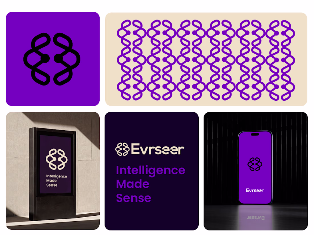
Visual Identity Breakdown
The Symbol: The logo mark is a stylized, symmetrical brain-like icon constructed from interlocking loops. It resembles neural pathways or a DNA double helix, cleverly blending the concepts of biological intelligence and algorithmic connectivity.
Typography: The wordmark "Evrseer" uses a clean, geometric sans-serif typeface. The lowercase "r" and "s" provide a friendly, accessible feel,
Color Palette: The primary color is a vibrant electric purple, which sits between the stability of blue and the energy of red. In the tech space, this color often symbolizes innovation, mystery, and premium quality. It is contrasted with deep obsidian and clean off-white for high visual impact.
#Branding #BrandIdentity #VisualIdentity #GraphicDesign #FreelanceDesigner #LogoDesign
The network for creativity
Join 1.25M professional creatives like you
Connect with clients, get discovered, and run your business 100% commission-free
Creatives on Contra have earned over $150M and we are just getting started
Related posts
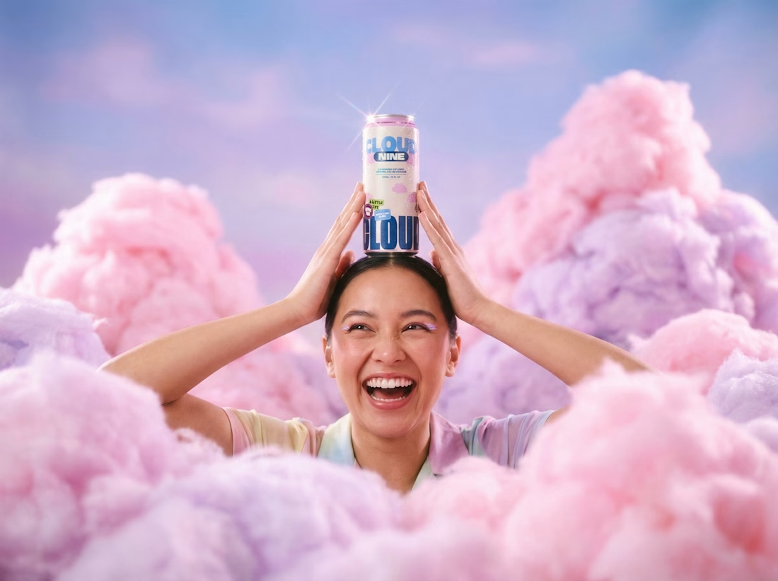
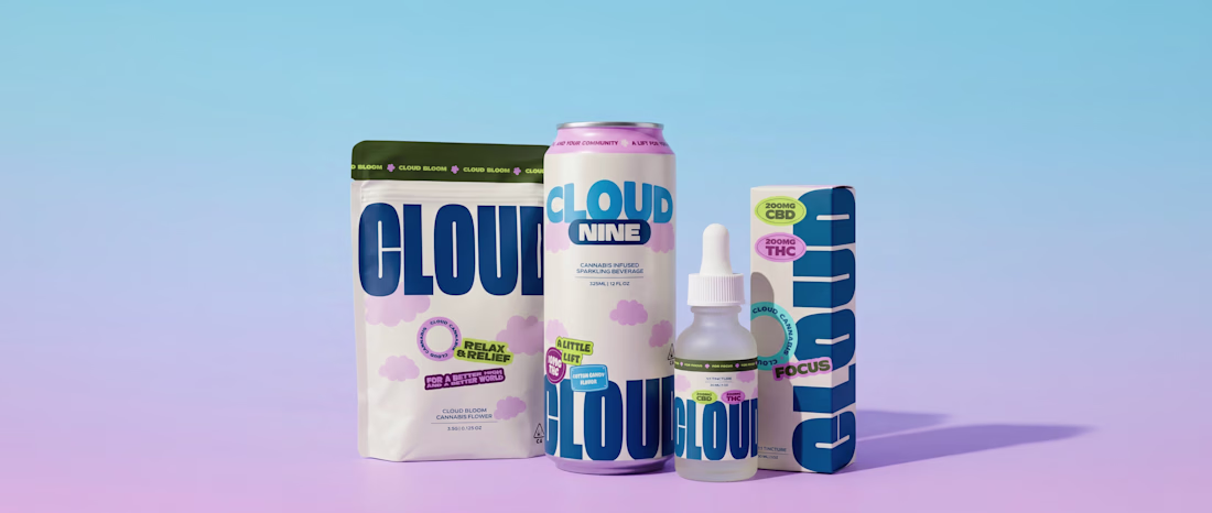
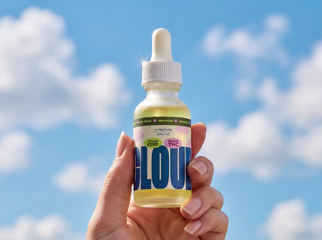
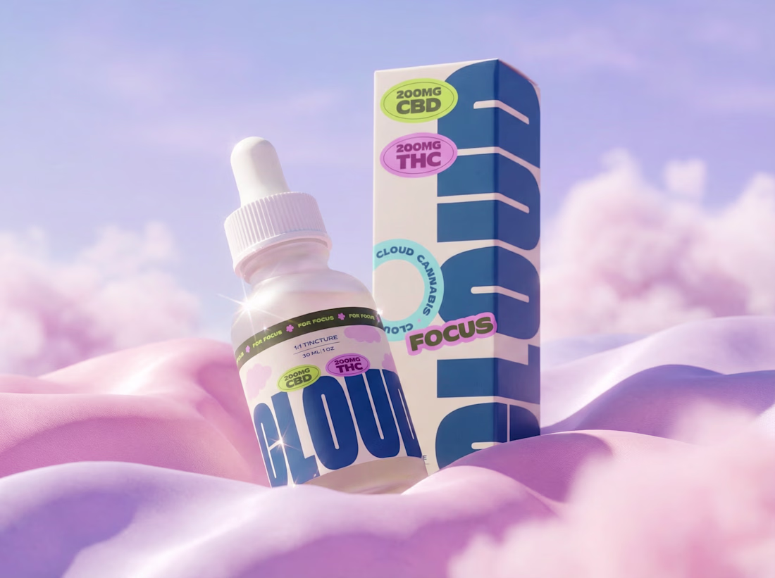
Cloud is a community-led cannabis brand built around inclusion, culture and education. They wanted an identity that felt bold and welcoming with loads of personality, but still trustworthy enough for something you're actually putting in your body.
That balance was the tricky bit. We didn't want it to feel too clinical, but it couldn't tip into novelty either.
So we leaned into big, confident type and a soft cloud world to give it warmth, then grounded everything with navy and clean layouts to keep it feeling grown up. The bright palette does the heavy lifting on the fun, community side.
It runs right across the range too, from tinctures to drinks to flower, so it always reads as Cloud no matter which product you pick up.
Brand identity, packaging and art direction.
nice work~
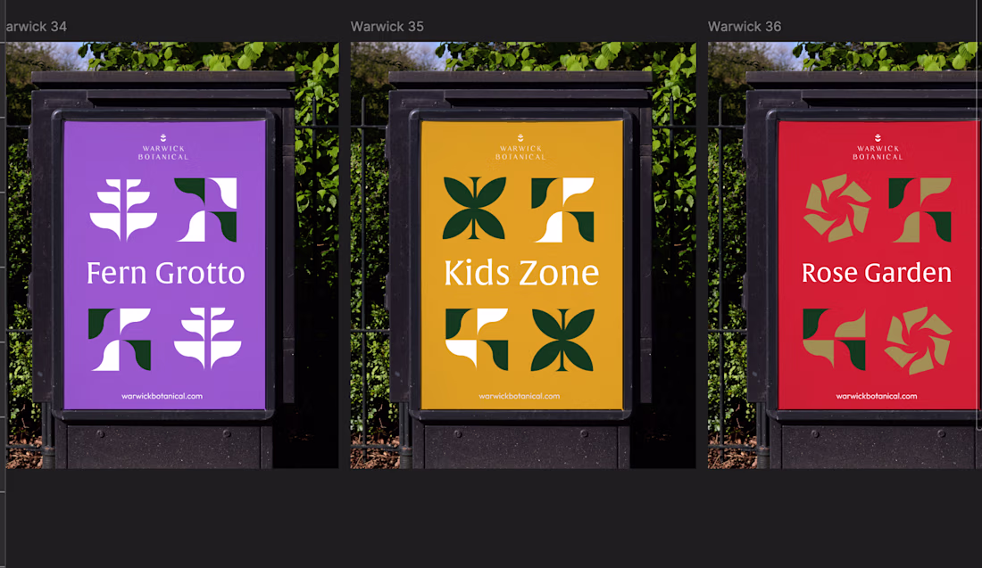
Working on a design system today, I thought maybe I'd do a series where I just share screenshots of things I'm working on / playing around with. This is for a botanical garden with many different areas, therefore they need subbrands for each one. Each subbrand utilizes the logo / colors of the main brand, that way they all work together cohesively.
Incredible!
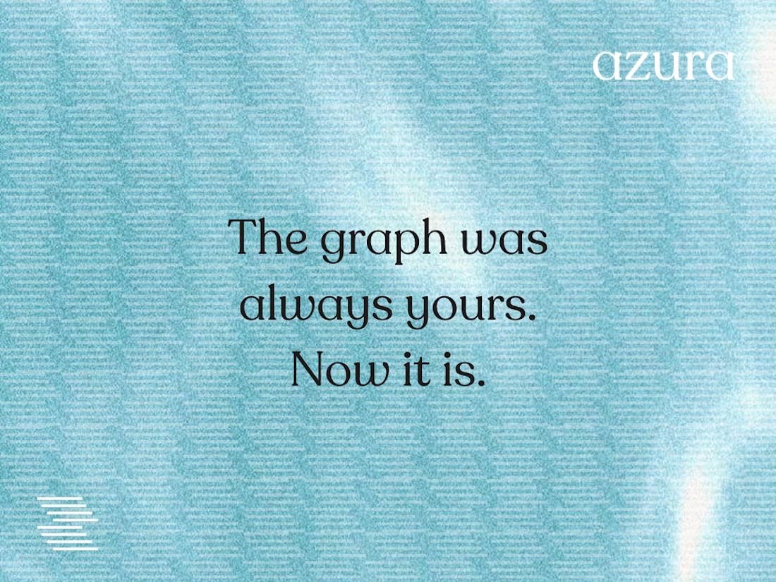
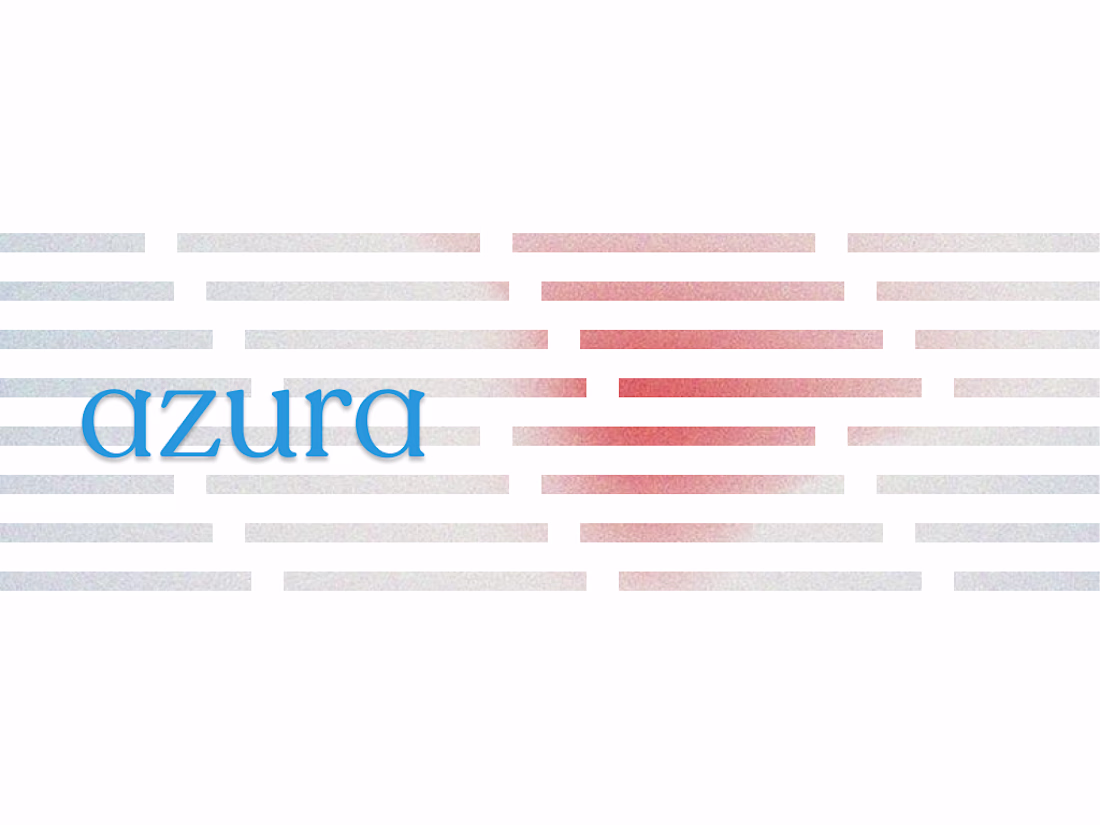
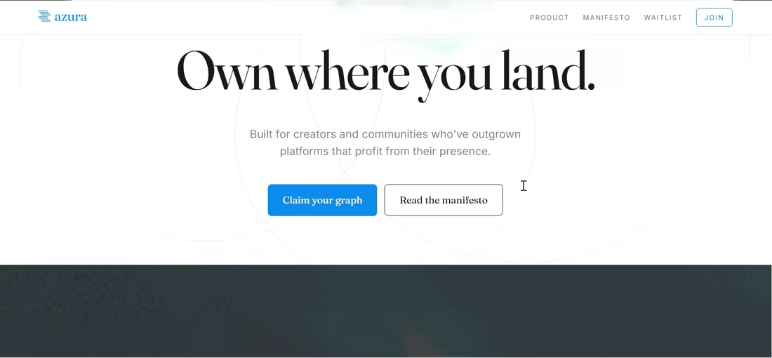
No gradients. No hype.
Just a signal mark, a serif, and one rule:
infrastructure deserves to be premium.
AZURA — SocialFi identity, pitch deck, OOH campaign, landing page system. Complete.
If you're building something that needs to feel inevitable before it's even launched —
Beautifully disciplined design.
Challenges
View allTrending
Claude
Claude has entered the design space. How are you using Claude Design?
Contra University
Learn from expert creatives how to earn more using next-gen AI tools.
creativeaiflow
Creative AI workflows are evolving. What tools do you use, and what are their strengths and weaknesses?
portfolioreview
The best portfolios tell a story, not just show a grid. Share yours for feedback.
freelancerlife
Freelancer life is wins, pivots, and everything in between. What’s yours right now?