The network for creativity
Join 1.25M professional creatives like you
Connect with clients, get discovered, and run your business 100% commission-free
Creatives on Contra have earned over $150M and we are just getting started
Back to feedPost
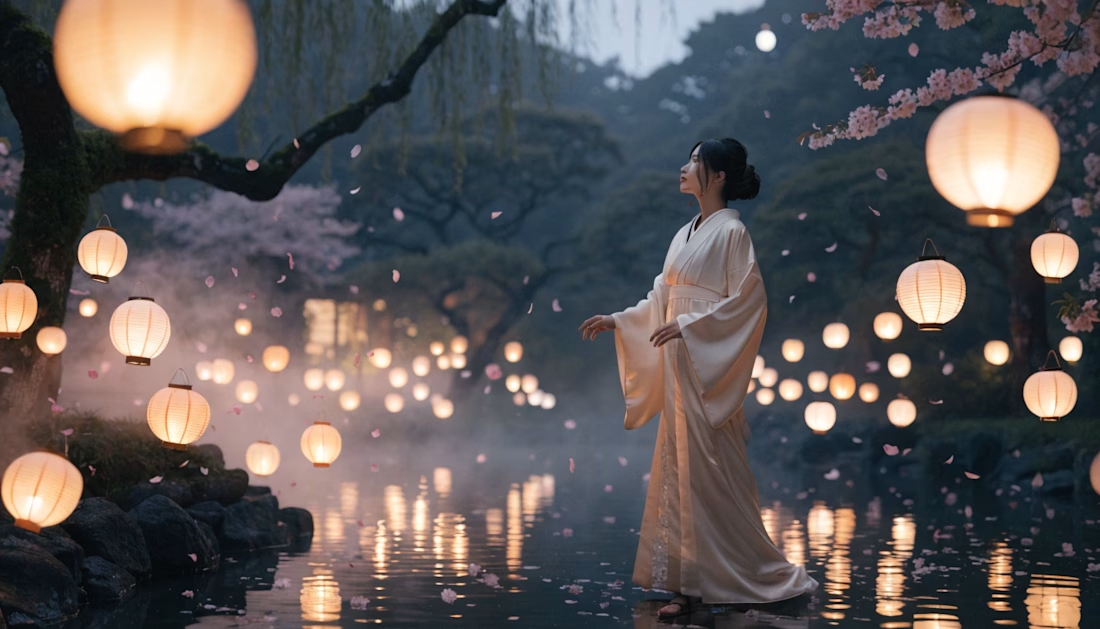
Color palette does way more than most people think.
It’s not just about making something look good or “designy”, it actually shapes how people perceive your product, your brand, and even you as a person!
Before someone reads a single line of text, they already feel something, and a big part of that comes from color. It sets the tone instantly and quietly defines what kind of experience they’re about to have, you know?
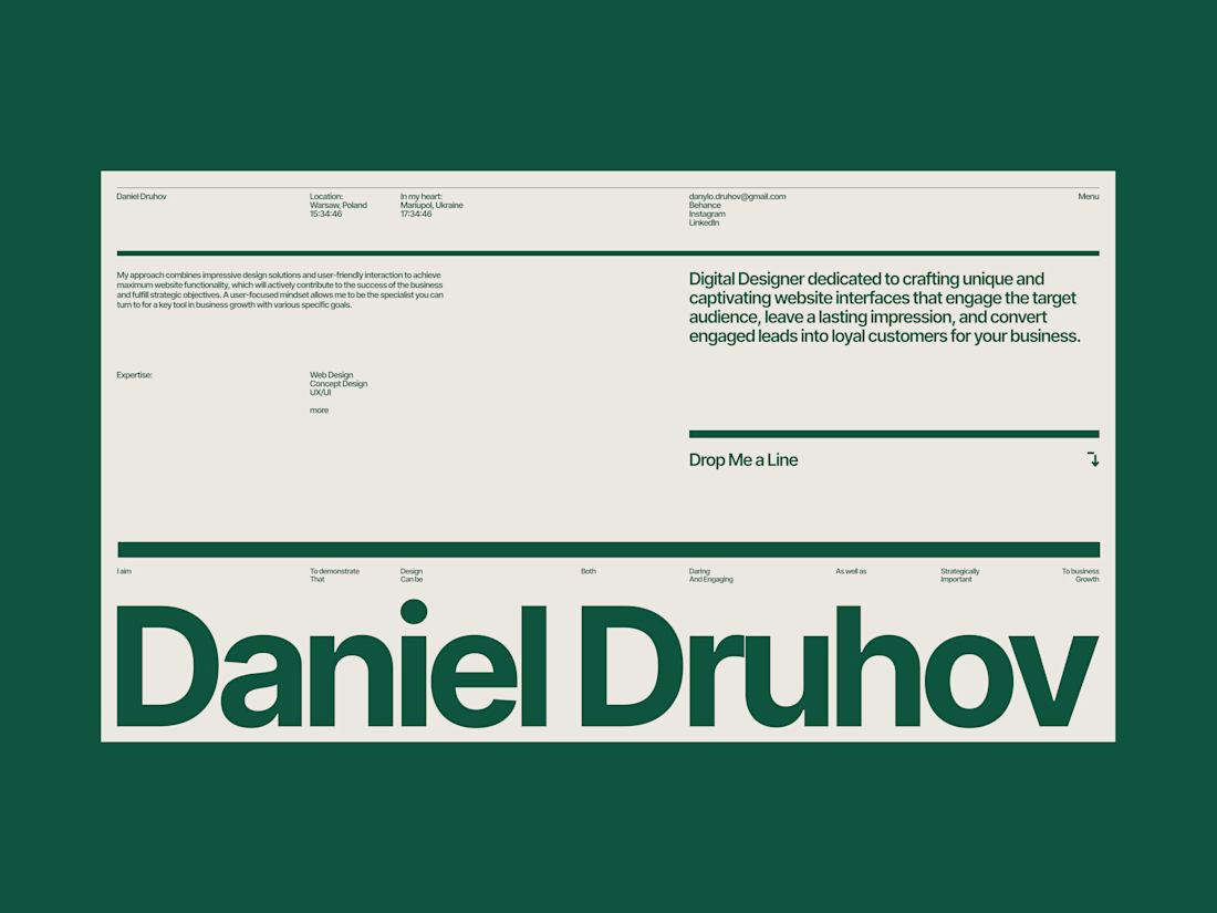
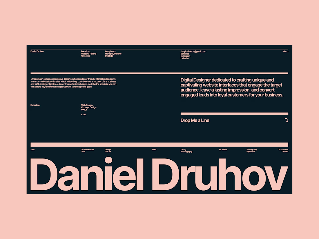
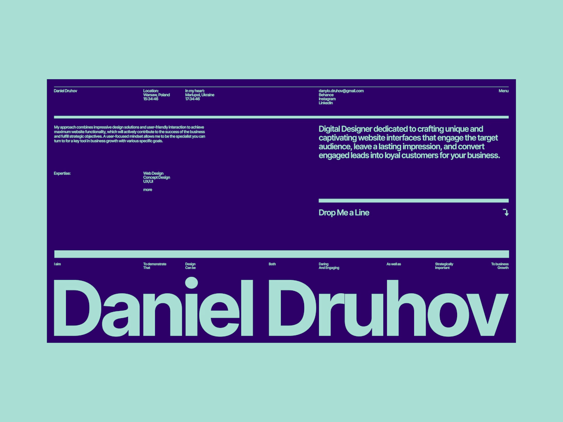
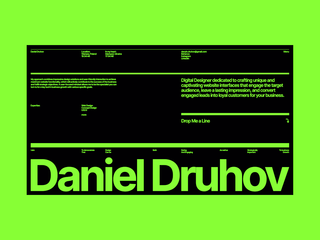
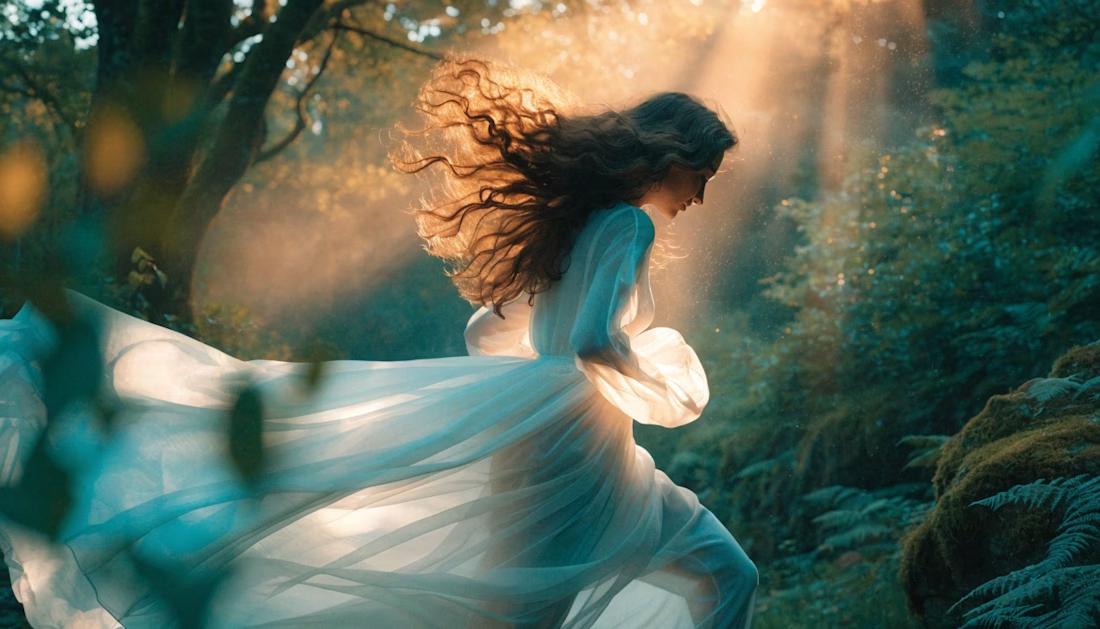
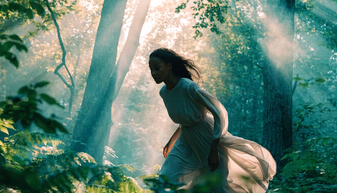
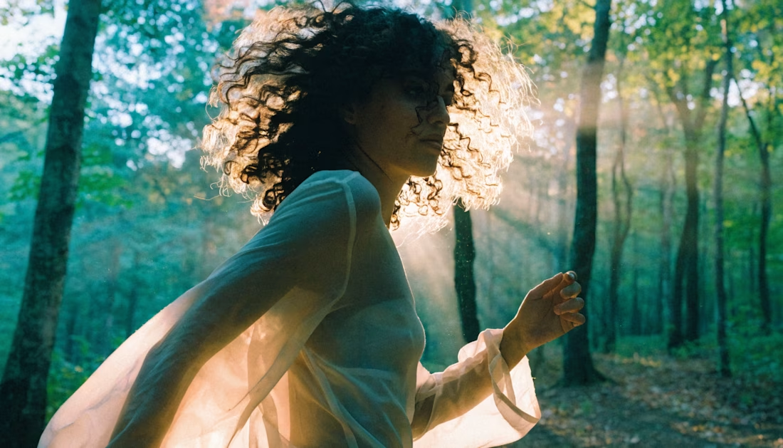
Some time ago I was exploring different concepts for my portfolio. Same layout, same typography — only the palette changes.
And it’s crazy how different it feels:
The 1st version feels more structured and calm, the 2nd and 3rd leans more into a creative direction, and the last one honestly feels like a Pentagon designer took over 😂
So yeah, color isn’t decoration. It’s one of the core tools that defines the mood and first impression of your work.
Worth keeping in mind when you design your next site 👀
Wow! The difference is insane for real🔥
thank you 🥰
The network for creativity
Join 1.25M professional creatives like you
Connect with clients, get discovered, and run your business 100% commission-free
Creatives on Contra have earned over $150M and we are just getting started
Related posts
Just completed another creative experiment with Recraft AI!
It's incredible how AI is transforming the creative process—from a simple idea to a cinematic visual experience in just minutes. This project challenged me to explore storytelling, composition, lighting, and prompt engineering to achieve a polished final result.
Every project is an opportunity to learn, refine, and push creative boundaries. Excited to keep experimenting with AI-powered design and video creation!
I'd love to hear your thoughts—what's your favorite part of this creation? 👇
#RecraftAI #GenerativeAI #AIVideo #AIArt #PromptEngineering #CreativeAI #ContentCreation #DigitalCreativity #Design #Innovation
Recraft AI is powerful, and you've showcased it really well.
3D Key animation exploration for Ayvapay
So clean. That key motion has real weight to it, reads premium without trying too hard. Killer exploration. 🔥
🎬Created this entirely with Recraft AI.
It's amazing how quickly an idea can turn into a cinematic visual with the right AI tools. I explored creative storytelling, dynamic visuals, and a polished aesthetic—all generated with AI.
Always experimenting, always learning, and always pushing creative boundaries.
What do you think? Feedback is welcome!
#RecraftAI #AIArt #AIVideo #GenerativeAI #CreativeAI #ContentCreation #DigitalArt #MotionDesign #AICreators #Innovation
The cinematic quality is impressive. Great job!
Trending
Claude
Claude has entered the design space. How are you using Claude Design?
Contra University
Learn from expert creatives how to earn more using next-gen AI tools.
MagicPath
The canvas is infinite, and exploration is becoming the workflow. How are you using MagicPath?
creativeaiflow
Creative AI workflows are evolving. What tools do you use, and what are their strengths and weaknesses?
freelancerlife
Freelancer life is wins, pivots, and everything in between. What’s yours right now?