The network for creativity
Join 1.25M professional creatives like you
Connect with clients, get discovered, and run your business 100% commission-free
Creatives on Contra have earned over $150M and we are just getting started
Back to feedPost

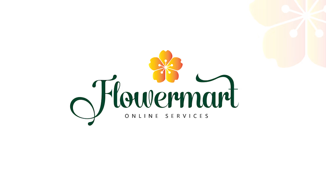
Flowermart — Online Services
A fresh identity designed to reflect simplicity, elegance, and a connection to nature.
The floral symbol represents growth and freshness, while the flowing typography adds a soft, approachable character to the brand.
A clean and memorable identity created for a modern online services brand.
Brand Identity • Logo Design • Visual Identity
#LogoDesign #BrandIdentity #GraphicDesign #LogoDesigner #VisualIdentity #Branding #CreativeDesign

The network for creativity
Join 1.25M professional creatives like you
Connect with clients, get discovered, and run your business 100% commission-free
Creatives on Contra have earned over $150M and we are just getting started





Related posts

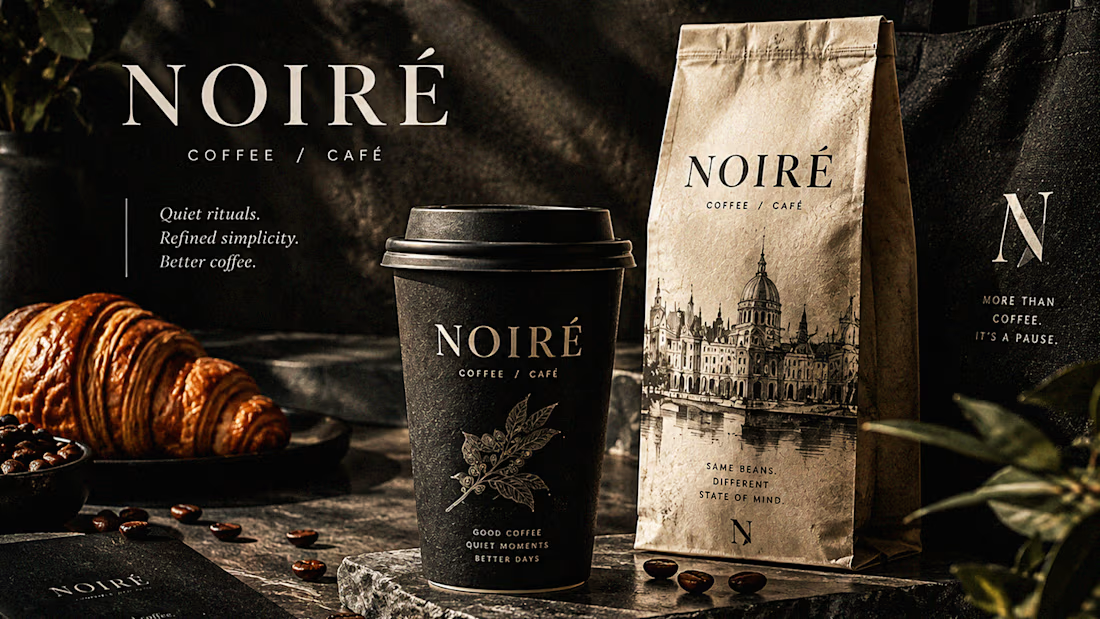
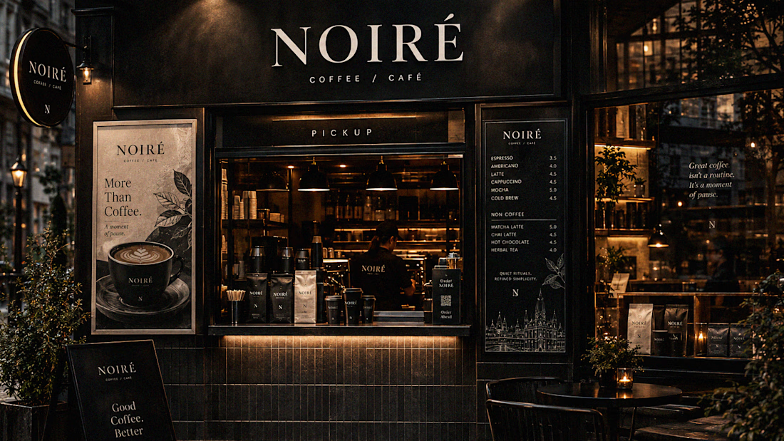
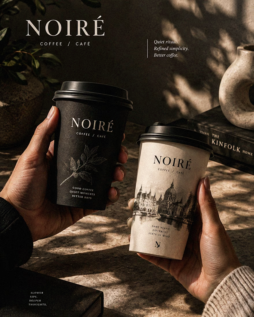
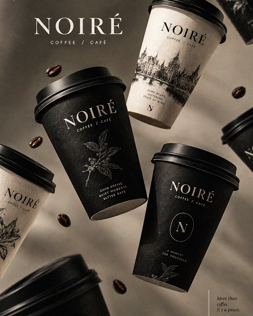
I Just Created NOIRÉ 🔥
A Coffee Brand Built Around the Pause.
NOIRÉ is a premium café brand built around a simple idea:
Great coffee should feel like a moment of pause, not another part of the
routine.
The project explores a complete visual identity, packaging
system, takeaway cups, coffee bags, tote bags, menu design, café applications and lifestyle campaign direction.
Instead of relying on the usual loud coffee aesthetics, I
built NOIRÉ around deep charcoal, warm ivory, soft graphite, refined
typography, subtle botanical illustrations and quiet editorial compositions.
The visual language is intentionally dark, tactile, and understated - giving every touchpoint the feeling of a slow morning, a quiet table, and coffee worth taking your time with.
From the cup in your hand to the café around you, every detail was designed to make the brand feel like a ritual.
Waiting for your thoughts in the comments 🙌🔥
branddesignertastetestBrand DesignGraphic DesignPackaging DesignAdobe IllustratorAdobe InDesignAdobe Photoshop




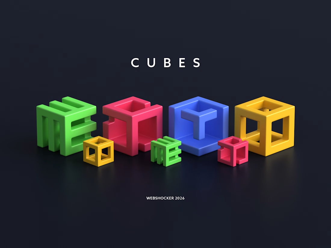
Created this custom 3D icon set for 3D Walkabout.
The icons are built around a cube-based system, with subtle variations to clearly represent different services while keeping a cohesive brand identity.


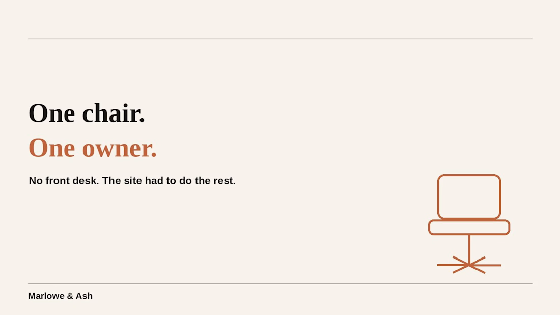
it's one chair. one owner. no front desk, no assistant, nobody picking up the phone.
that's exactly why the booking site had to do more work than most salons' ever will. built for #lovablechallenge, submitted via @contra — would appreciate a like:



Good luck Rahul 🙌