The network for creativity
Join 1.25M professional creatives like you
Connect with clients, get discovered, and run your business 100% commission-free
Creatives on Contra have earned over $150M and we are just getting started
Back to feedPost

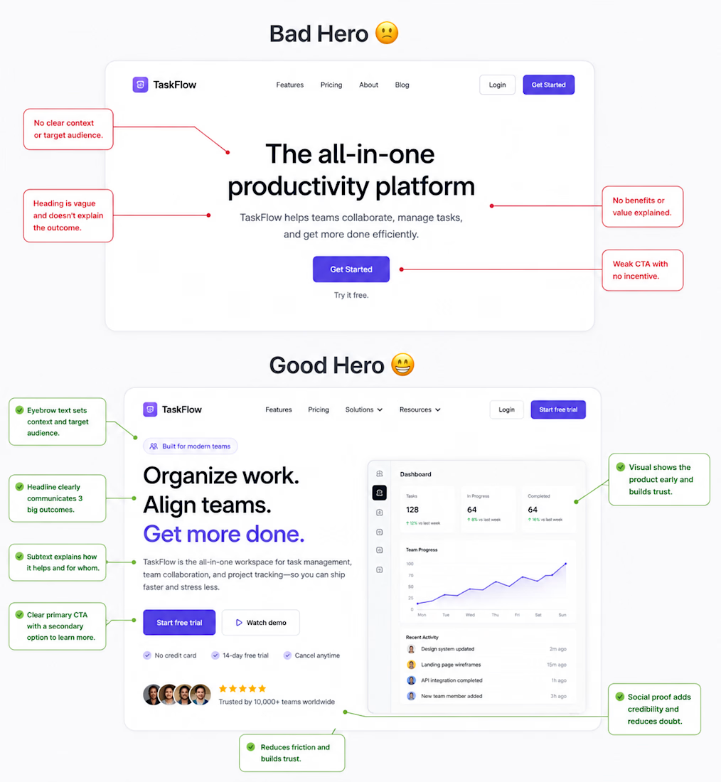
Your hero section has one job:
Make the visitor understand your value in a few seconds.
A strong hero section should include:
A clear headline that explains the main outcome
A short subheadline that adds context
One primary CTA
One supporting CTA if needed
A relevant visual, product screenshot, or demo
Social proof when it adds trust
A good structure is:
Headline
What do you help the user achieve?
Subheadline
How do you do it, and for whom?
CTA
What should the visitor do next?
Think about performance too.
A huge unoptimized hero image or video can hurt LCP and make your first impression slower.
A beautiful hero section is good.
A hero section that communicates value, builds trust, and drives action is much better.
What do you think matters most in a hero section: the headline, the visual, or the CTA?

The network for creativity
Join 1.25M professional creatives like you
Connect with clients, get discovered, and run your business 100% commission-free
Creatives on Contra have earned over $150M and we are just getting started



Related posts

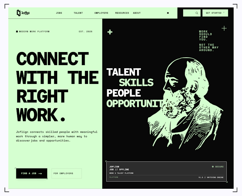
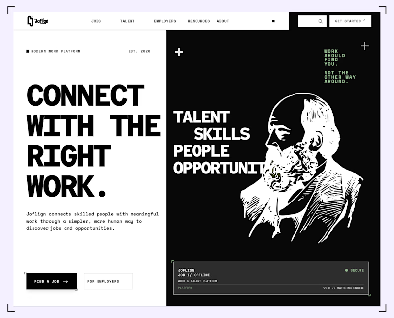
Which hero background works better?
9 voted
75%
3 voted
25%
12 votes
Closed

I lean light green because it carries through both the copy panel and the illustration, making the two halves feel connected. I’d keep “Find a job” clearly stronger than “For employers” if jobseekers are the main audience. That hierarchy matters more than the background preference alone.


cool

Question for designers & SaaS builders:
When landing pages mix dark-mode hero sections with light-mode content blocks:
1️⃣ Do you feel it creates a premium look?
2️⃣ Or do you prefer full dark / full light theme consistency throughout?
Drop your thoughts below! 👇
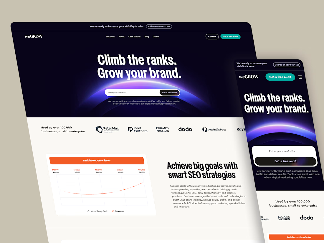
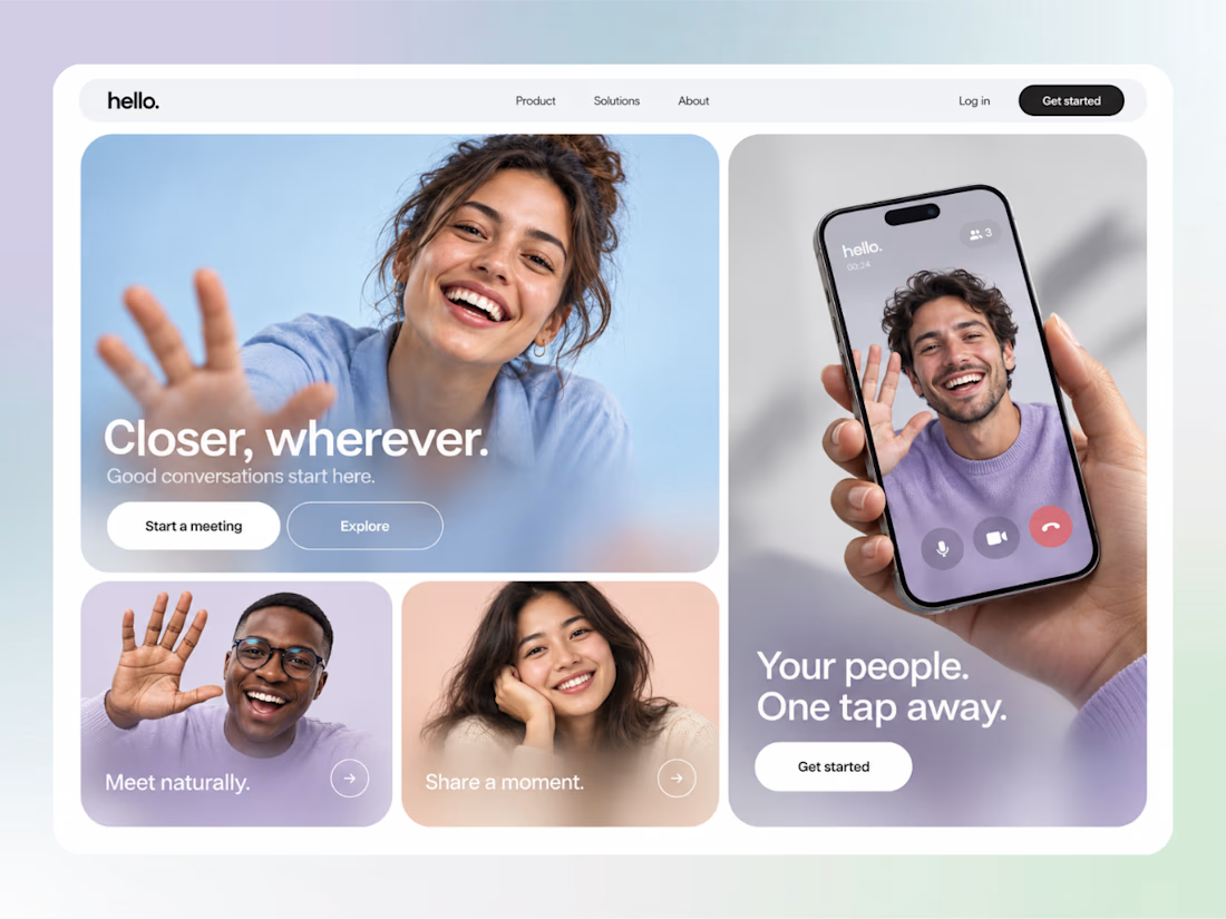
I’d tie the change to the content hierarchy. A dark hero moving into a lighter explanation can work well if the typography, spacing and button language stay consistent. The useful check is whether the transition helps someone follow the offer, rather than feeling like a new website halfway down.