The network for creativity
Join 1.25M professional creatives like you
Connect with clients, get discovered, and run your business 100% commission-free
Creatives on Contra have earned over $150M and we are just getting started
Back to feedPost

Oval emerald center with double diamond halo 💚
Grey/dark backgrounds make colored gemstones stand out way better than white ones. This setup really brings out the emerald's depth!


The network for creativity
Join 1.25M professional creatives like you
Connect with clients, get discovered, and run your business 100% commission-free
Creatives on Contra have earned over $150M and we are just getting started



Related posts

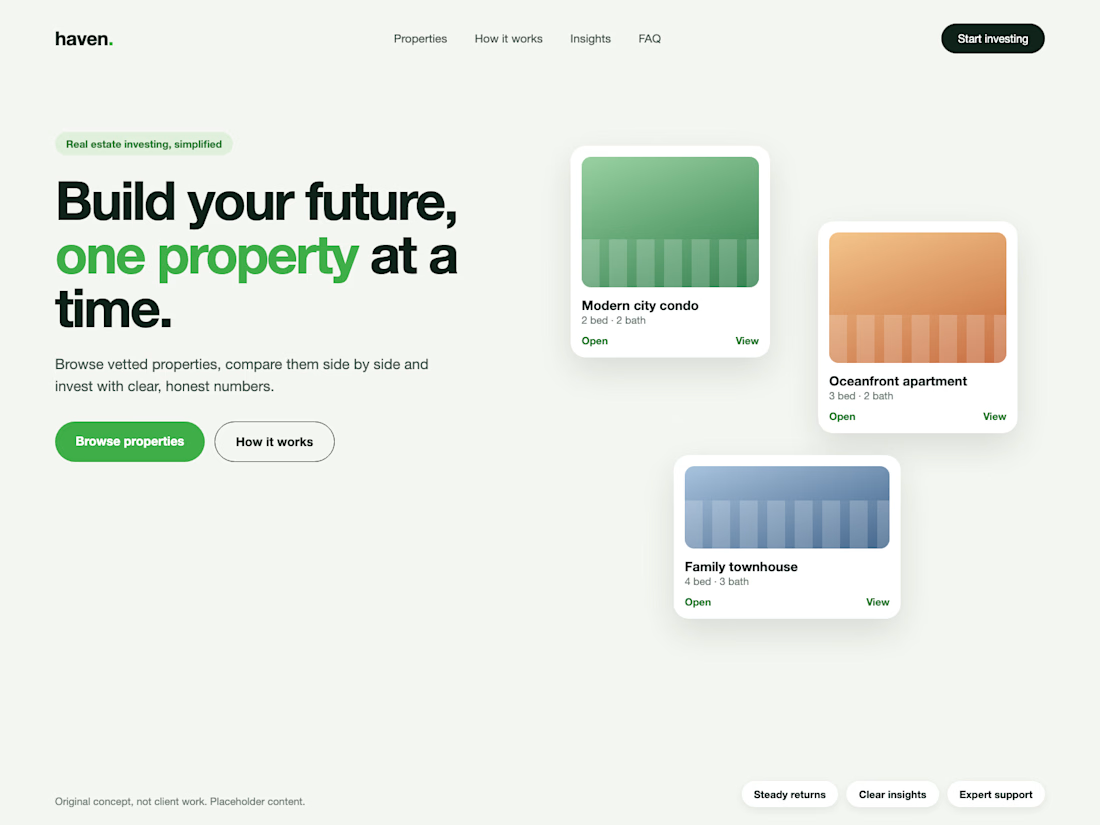
Real estate investing, simplified. Concept hero section.
I design professional hero sections: one clear message, one accent colour.



Architectural Visualization, Landscape Design,


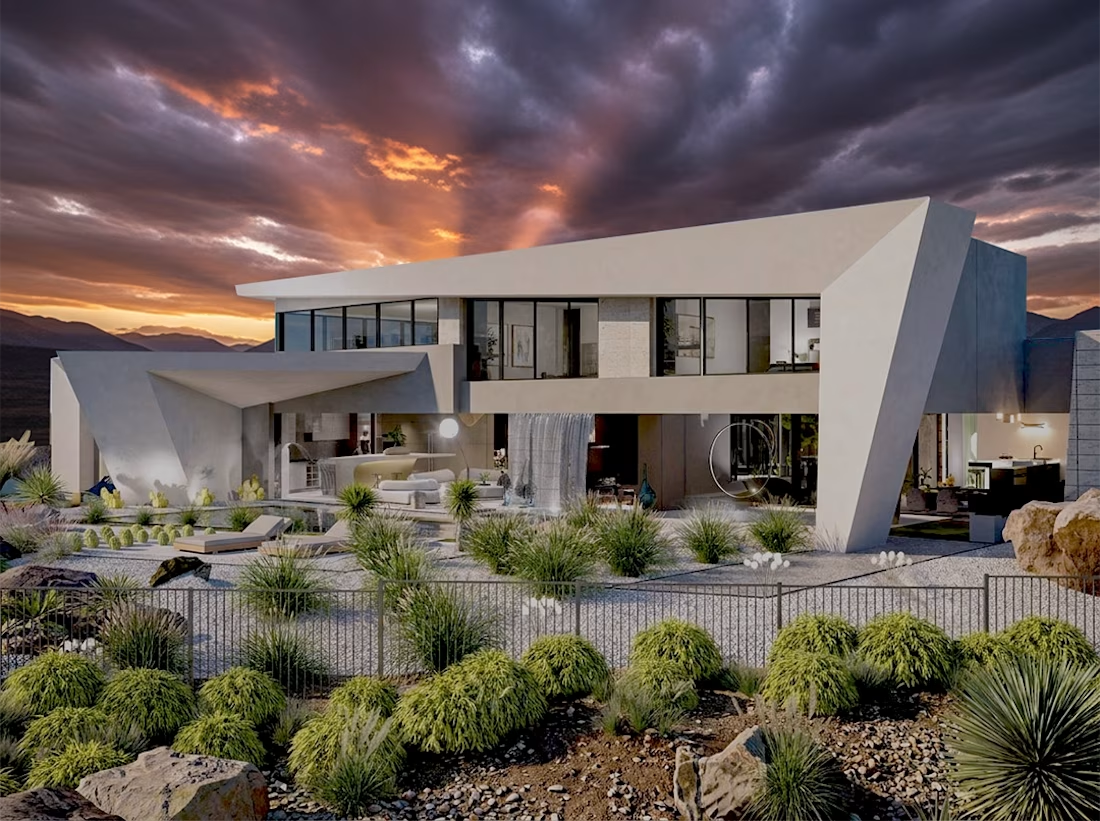

Really liked the edgy form with transparent architecture that feels unique and dynamic...nice visualization also.

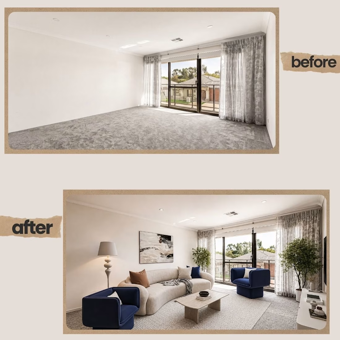
Virtual staging that helps your listing sell faster. Message me to get started! 📩
#VirtualStaging #HomeStaging #BeforeAndAfter #RealEstateMarketing