The network for creativity
Join 1.25M professional creatives like you
Connect with clients, get discovered, and run your business 100% commission-free
Creatives on Contra have earned over $150M and we are just getting started
Back to feedPost

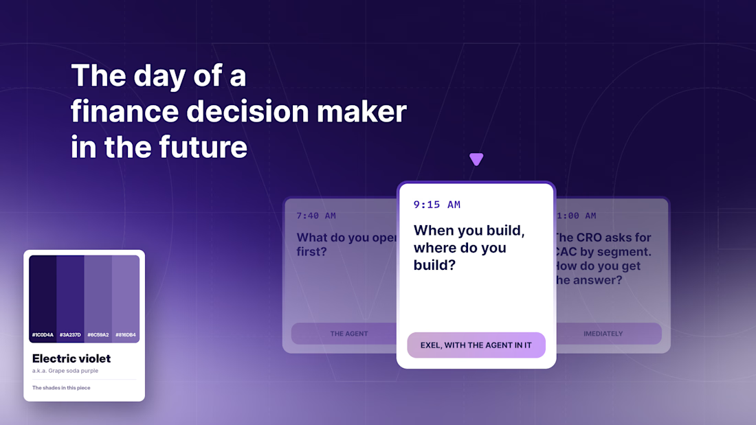
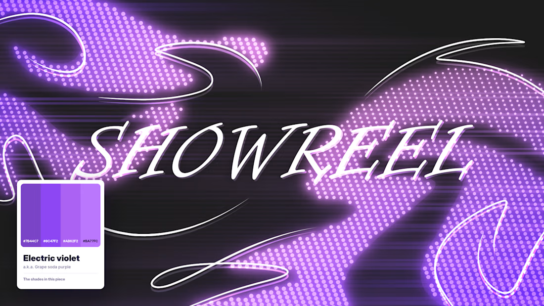
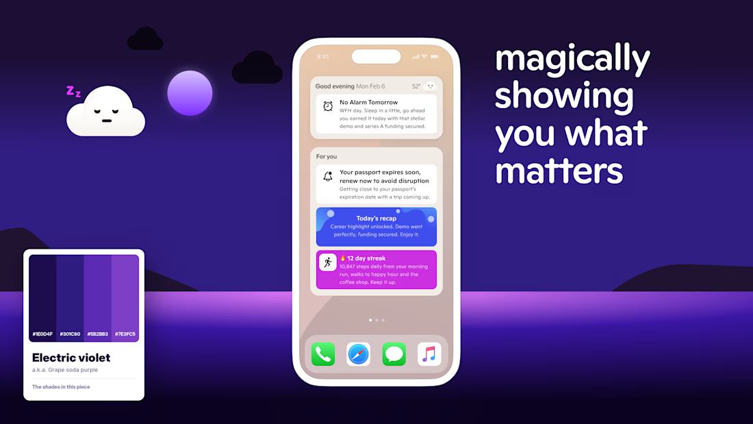
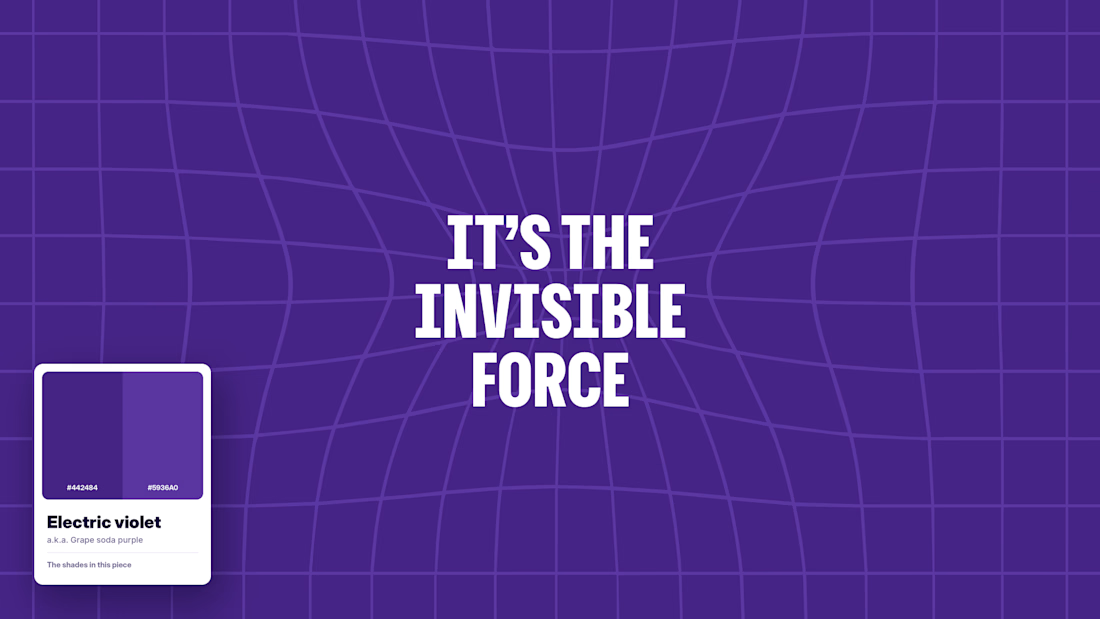
Every designer has a favorite color, and you can spot it in their portfolio in two seconds 💜
Mine is Electric violet. Not one exact code, more like a whole family of shades. It plays well with almost anything, and honestly, it just looks good. No matter the brief, it always finds its way in 😅 Here’s the proof.
Your turn, community: which color keeps sneaking into your work, even when nobody asked for it? 🎨

It must be mine, it's orange 🍊
Orange is such a bold choice! 🍊 It definitely knows how to make a design stand out! 😄
haha, thanks

Love it! Purple is my 2nd favourite
Glad purple makes the list! 💜

The palette swatch in each corner ties the four frames into one system, and "It's the invisible force" is a great line on that grid. Does Electric violet ever lose to a client's brand colors?
Thank you! And absolutely, the client's brand always comes first. I love finding ways to bring my favourite shades into a project, but the palette has to serve the brand and the brief. Sometimes that means letting violet take a back seat! 😄
The network for creativity
Join 1.25M professional creatives like you
Connect with clients, get discovered, and run your business 100% commission-free
Creatives on Contra have earned over $150M and we are just getting started



Related posts

Remotlin v1 design evolution.
Get verified. Get found. Get a remote job.
Join the waitlist here


The illustration style gives Remotlin a warmth most job platforms miss. Excited to see where v1 lands, Alex.

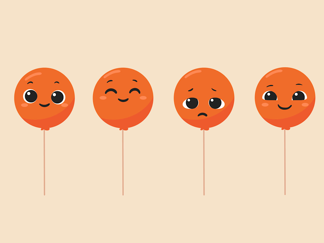
New project! Me and @Mary Delaney helped out the folks at Balloon with a rebranding a redesign of their mascot! Check out the new appstore listing and stay tuned for much more!

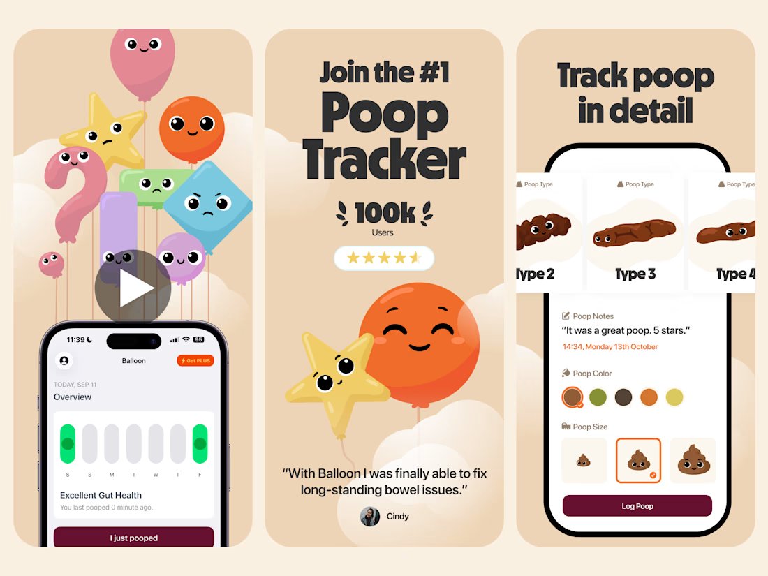


Everything has character! Good job. I like the little faces on the terds 🤣