The network for creativity
Join 1.25M professional creatives like you
Connect with clients, get discovered, and run your business 100% commission-free
Creatives on Contra have earned over $150M and we are just getting started
Back to feedPost
I’m working on a healthcare consultation platform and balancing two design approaches:
a minimal interface with fewer elements, versus a more informative layout that explains features upfront.
From a user perspective, which approach feels more reassuring in healthcare products?
and also, Beyond colors, what UI elements do you personally feel matter most in healthcare platforms - typography, spacing, illustrations, or something else?
AI Agent DevelopmentBackend DevelopmentFrontend DevelopmentAWSFirebaseTypeScripthealthcarelandingpagemedtechdigitalhealthcare
The network for creativity
Join 1.25M professional creatives like you
Connect with clients, get discovered, and run your business 100% commission-free
Creatives on Contra have earned over $150M and we are just getting started
Related posts
I prefer this option B because it makes the brand feel luxurious
How's Vibe Design going for you?
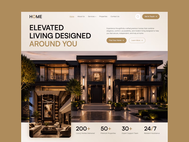
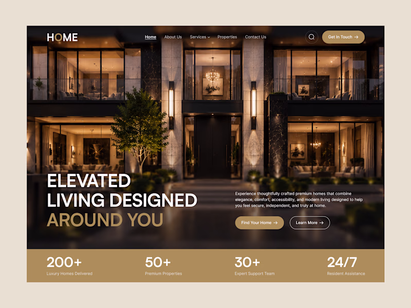
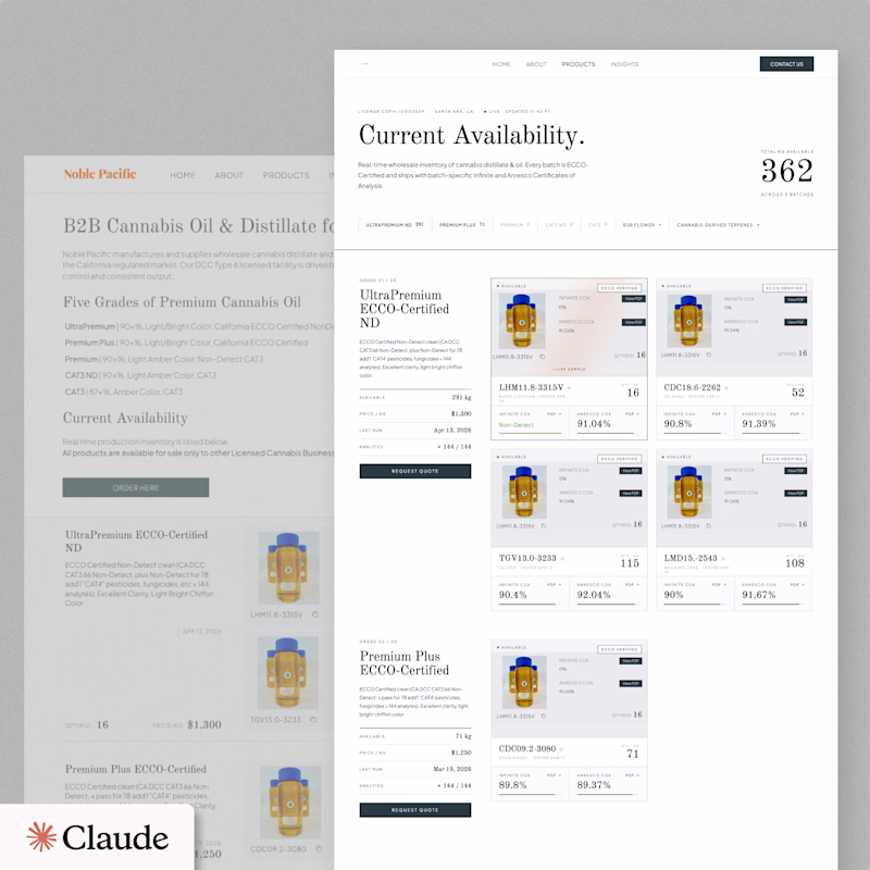
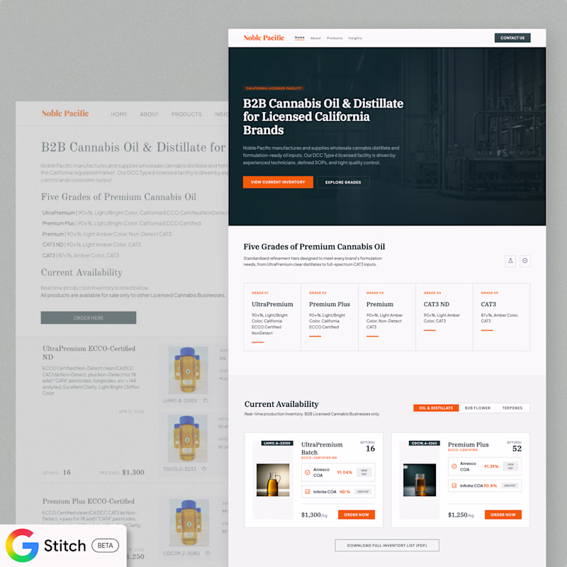
Bellow is a single prompt Product page redesign with Claude Design and Google Stitch. Which one you'd go with? Any thoughts / examples of results you're getting?
16 voted
42%
22 voted
58%
38 votes
Closed
Innovation in Action: A look at @OrbixStudio's 'Weekly Shots'
This week, we're proud to share a snapshot of our diverse capabilities, from strategy-led UI/UX for social platforms, healthcare, and real estate applications to impactful branding and captivating digital illustrations.
Our team is dedicated to crafting experiences that not only look exceptional but also deliver tangible results and user value.
Explore how our strategic design approach translates across various industries. We're always keen to discuss how thoughtful design can elevate your next project.
Your feature block layout on the left panel is handled beautifully.
Trending
Claude
Claude has entered the design space. How are you using Claude Design?
Contra University
Learn from expert creatives how to earn more using next-gen AI tools.
creativeaiflow
Creative AI workflows are evolving. What tools do you use, and what are their strengths and weaknesses?
portfolioreview
The best portfolios tell a story, not just show a grid. Share yours for feedback.
freelancerlife
Freelancer life is wins, pivots, and everything in between. What’s yours right now?