The network for creativity
Join 1.25M professional creatives like you
Connect with clients, get discovered, and run your business 100% commission-free
Creatives on Contra have earned over $150M and we are just getting started
Back to feedPost

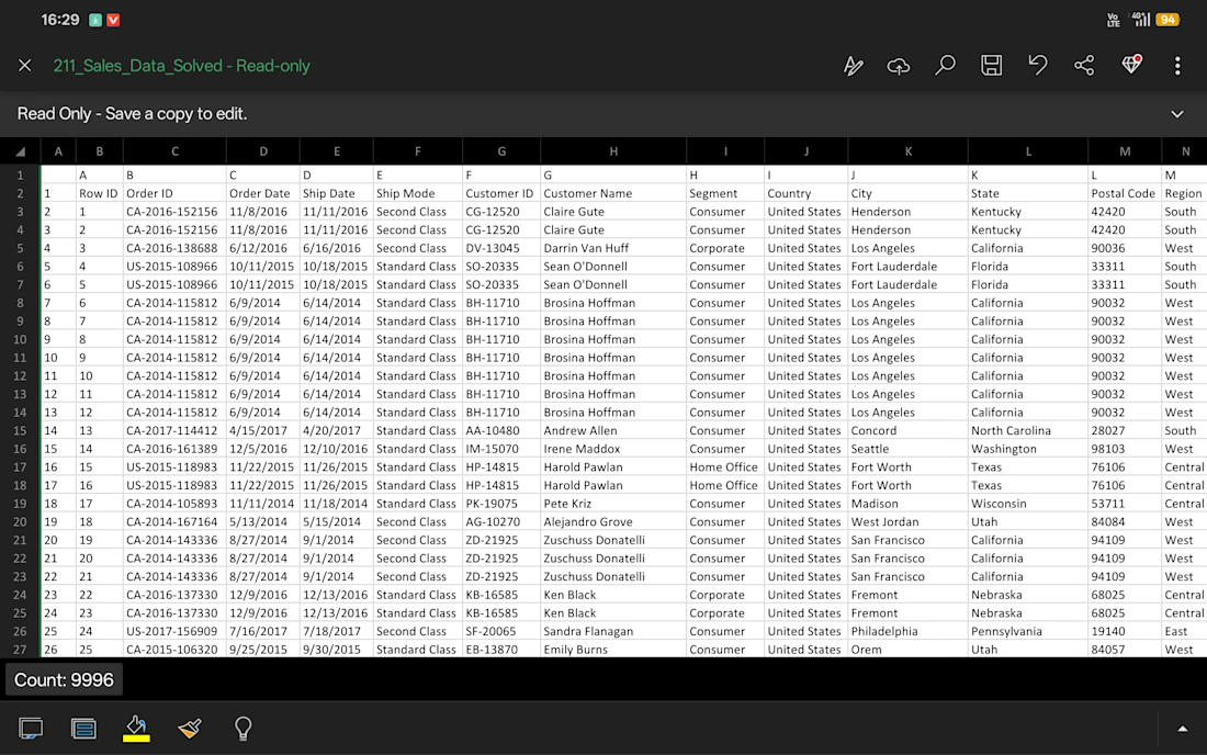
Interactive Sales Analytics Dashboard in Microsoft Excel | Pivot Tables, Charts & Business Insights

The network for creativity
Join 1.25M professional creatives like you
Connect with clients, get discovered, and run your business 100% commission-free
Creatives on Contra have earned over $150M and we are just getting started







Related posts

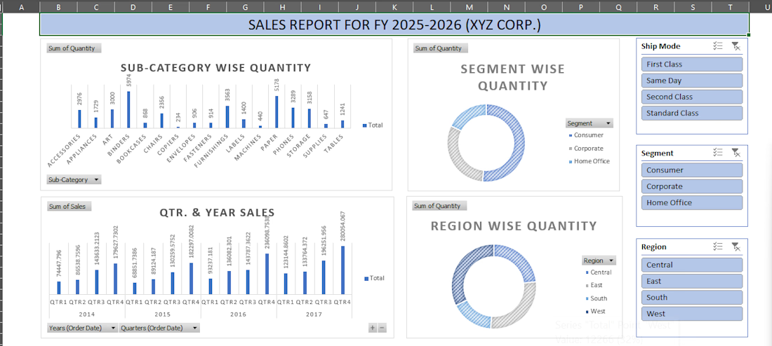
XYZ Corp. Sales Performance Dashboard
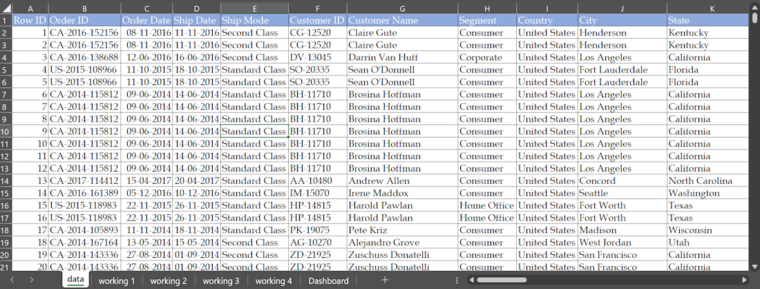
Created an interactive Excel dashboard to analyze FY 2025–2026 sales data and present key performance insights through KPIs and visual summaries.
Excel features used: Pivot Tables, Pivot Charts, Slicers, Formulas, Data Cleaning, and Dashboard Design.
The dashboard transforms raw sales data into a clear, interactive view, making it easier to track and understand overall sales performance.

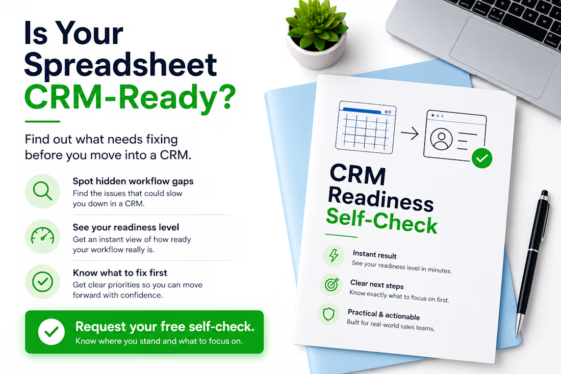
Thinking about moving from Excel or Google Sheets to a CRM? Don’t migrate the problems with the data.
Before choosing or configuring a CRM, I usually check five things:
• Does every active lead have a clear owner?
• Is there always a defined next action?
• Are follow-up dates consistently tracked?
• Are lead statuses clear and used consistently?
• Could another team member understand the spreadsheet without asking for help?
If several answers are “no”, the problem may not be the CRM yet — it may be the workflow behind it.
A CRM works much better when the sales process is clear before migration starts. I created a free CRM Readiness Self-Check for small teams that want to identify these gaps before investing more time or money in a CRM.
If you’re currently working from spreadsheets and considering a CRM, comment “CHECK” or send me a message and I’ll send it to you.
#CRM #CRMReadiness #SalesOperations #RevOps #WorkflowOptimization #GoogleSheets #Excel #BusinessProcess

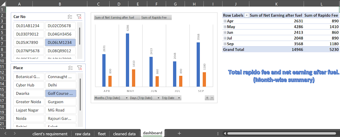
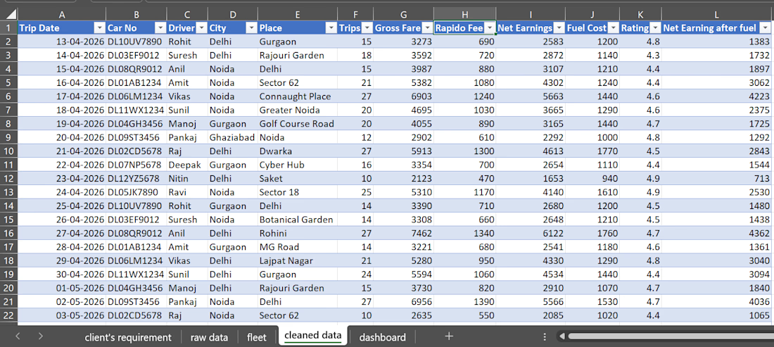
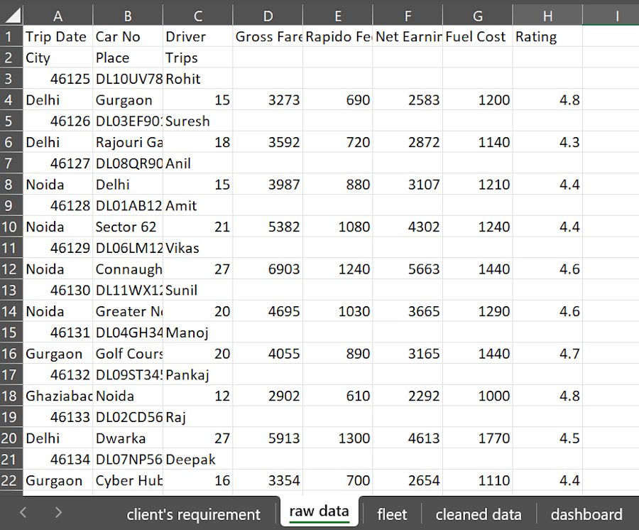
Rapido Cab Trip Data Analysis
Analyzed and transformed messy trip data from a 12-cab Rapido fleet into a clean, structured, and interactive Excel dashboard. The project involved cleaning and organizing raw data, identifying useful information, and creating summaries and visualizations to make the data easier to understand and analyze.
Excel features used: Fill Series, Sorting, Go To Special, Merge & Unmerge, Pivot Tables, Pivot Charts, and Slicers.
The final dashboard provides an easy-to-understand view of the cab trip data and helps turn raw, unorganized data into meaningful insights.