The network for creativity
Join 1.25M professional creatives like you
Connect with clients, get discovered, and run your business 100% commission-free
Creatives on Contra have earned over $150M and we are just getting started
Back to feedPost

Project Title: "Don’t Just Fetch Coffee" – Creative Recruitment Campaign
The Design Brief:
The goal of this project was to design a high-visibility internship recruitment poster for TechTide Co. The client wanted to move away from boring, corporate HR ads and instead create something that resonates with Gen-Z developers and UI/UX designers. The message was clear: this is a place for builders, not just observers.
My Creative Approach:
I used a "Scrapbook/Journal" Aesthetic to make the internship feel like an active, hands-on journey. Key design elements include:
Tactile Textures: I incorporated digital "duct tape" and polaroid-style frames to give the design a raw, creative, and "work-in-progress" energy.
Themed Copy Design: I used technical puns like "Speaks in tags" and "Dreams in Figma" to instantly filter and attract the right niche talent.
Typography & Hierarchy: The bold purple and blue palette provides a modern, tech-focused vibe. I used a mix of heavy sans-serif and handwritten-style fonts to balance professionalism with a youthful, approachable feel.
Engagement Loops: The stamp-style "Upgrade your portfolio from MEH to MODERN" acts as a strong value proposition, giving potential interns a clear reason to apply.
The Results:
The final asset is an "eye-catching" recruitment tool designed for social media and campus distribution. It successfully bridges the gap between a corporate professional environment and the creative hustle of a modern tech startup.


The network for creativity
Join 1.25M professional creatives like you
Connect with clients, get discovered, and run your business 100% commission-free
Creatives on Contra have earned over $150M and we are just getting started

Challenges
View all


Related posts


A look at the identity we designed for Vetti, a dog health monitoring brand.
There’s a lot of data behind a product like this but the person using it just wants to know their dog is okay.
That’s the balance in the design with a connected dot system that feels precise and warm colors and photography that keep it close to what people care about.
Also, an excellent excuse to spend far too long choosing dog photos.


Wonder -- Visual Expressions


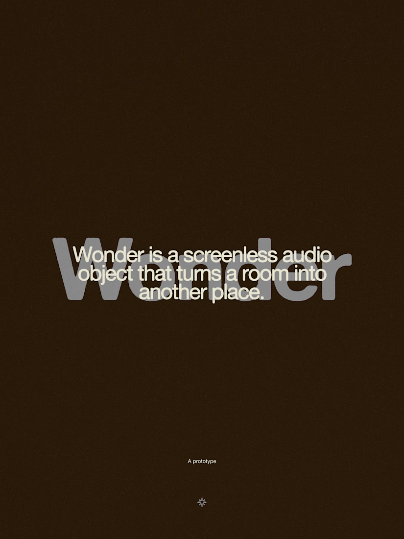
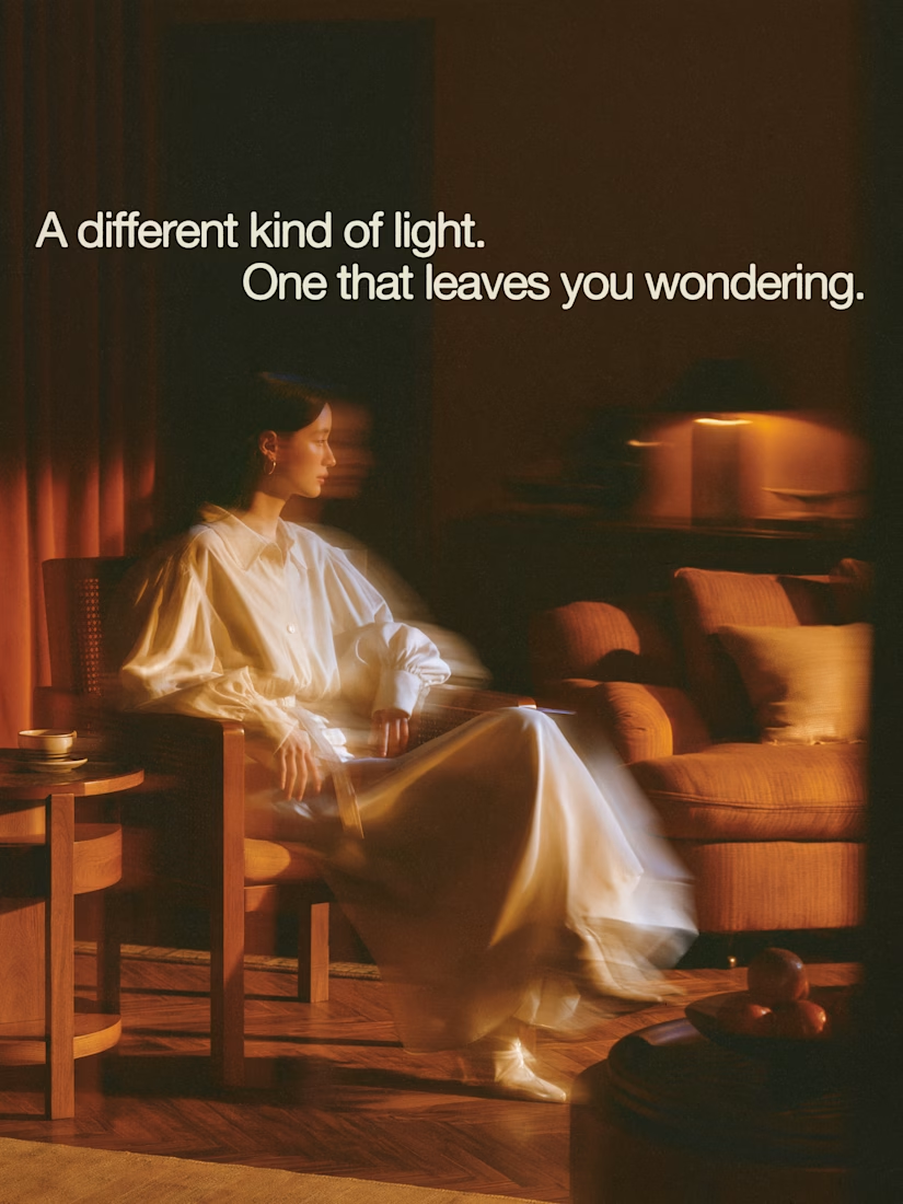


The restraint in the warm palette really lets the sound-object concept breathe—especially that shift from readable type to atmosphere.

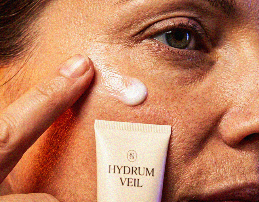
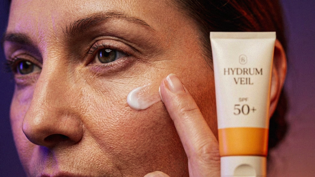
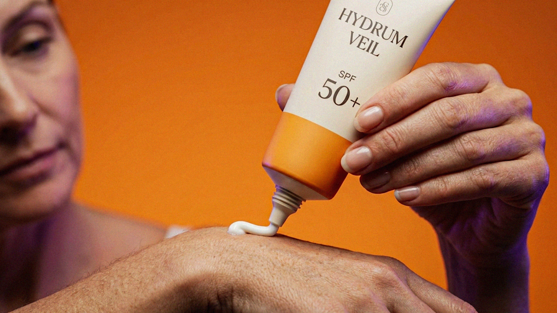
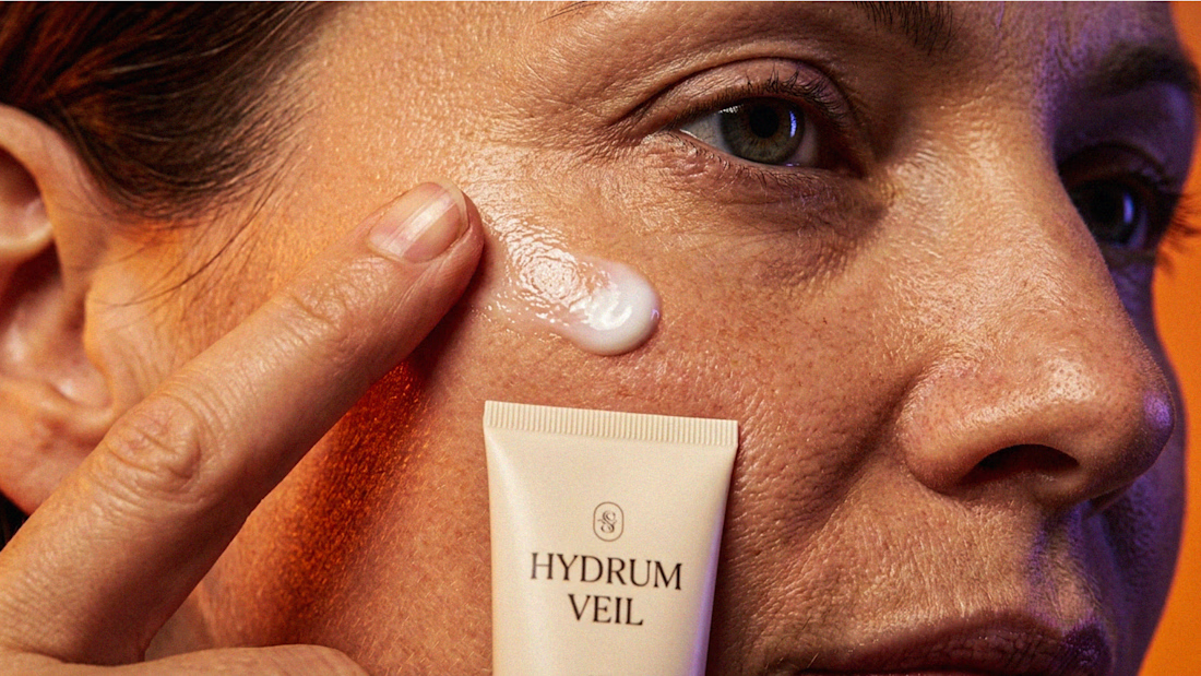
I Just Created HYDRUM VEIL 🔥
HYDRUM VEIL is a skincare brand built around a premium SPF 50+ sunscreen, developed as a complete brand identity, packaging design, and seasonal advertising campaign.
The project explores a question most seasonal beauty work gets wrong: how do you make a limited-edition campaign feel festive without making it feel cheap?
Instead of stacking decorative props, the campaign holds a strict visual system - vivid pumpkin orange, deep twilight violet, warm cream, and restrained black and lets a single product carry every frame.
Drop your replies in cmnts.....!!!!! 🙌
branddesignertastetestBrand DesignGraphic DesignPackaging DesignAdobe IllustratorAdobe PhotoshopClaude