The network for creativity
Join 1.25M professional creatives like you
Connect with clients, get discovered, and run your business 100% commission-free
Creatives on Contra have earned over $150M and we are just getting started
Back to feedPost

When a store owner comes to me with a sales problem, everyone else tells them the same things.
Run more ads. Post more content. Work on your SEO. Get more traffic.
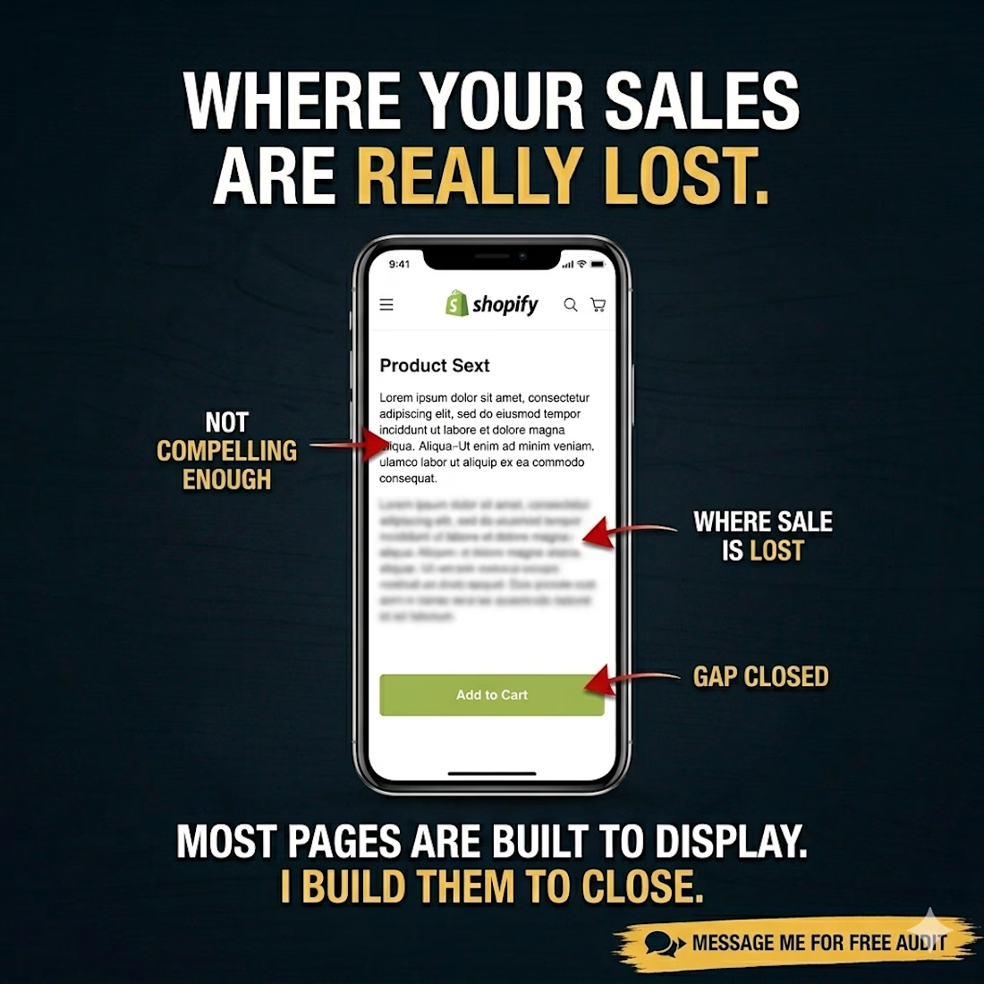
I go to the product page.
Because that is where the money is being lost. Not in the ad account. Not in the follower count. On the actual page where a real person landed, looked around for a reason to buy, found nothing compelling enough, and left.
A product page is the last point of contact between your store and your customer. It is the moment everything either comes together or falls apart.
Most Shopify product pages are not built to close. They are built to display. And there is a very big difference between those two things.
This is what I fix. The gap between the traffic store owners already have and the sales that traffic should be producing.
If your store is getting visitors but not converting them, send me the link. Free product page audit. I will tell you exactly where the sale is being lost.
The network for creativity
Join 1.25M professional creatives like you
Connect with clients, get discovered, and run your business 100% commission-free
Creatives on Contra have earned over $150M and we are just getting started








Related posts

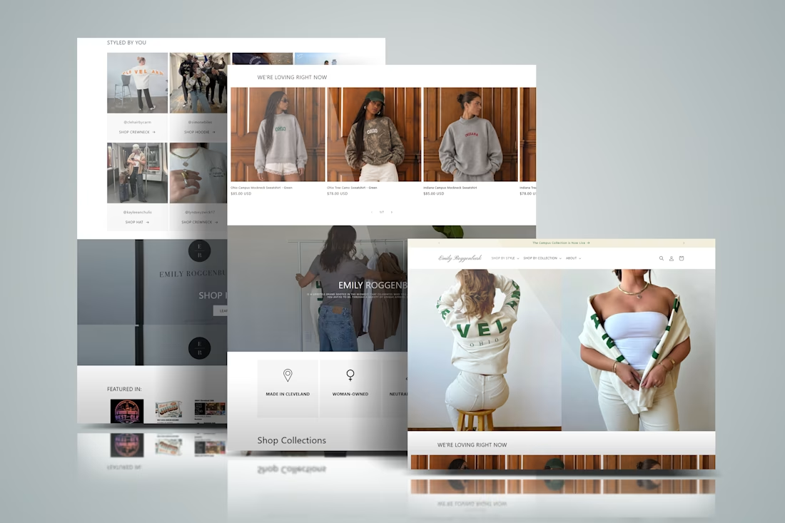
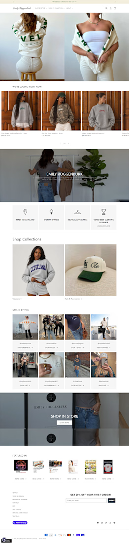
Designed a modern Shopify fashion ecommerce experience for Emily Roggenburk, combining a clean storefront layout with lifestyle-focused product presentation. The website features product collections, apparel and accessories showcases, a shoppable customer gallery, designer highlights, featured press coverage, and newsletter signup with a first-order discount.
The goal was to create a seamless shopping journey that reflects the brand’s identity, helps customers discover products easily, and guides them from browsing collections to making a purchase across desktop and mobile devices.

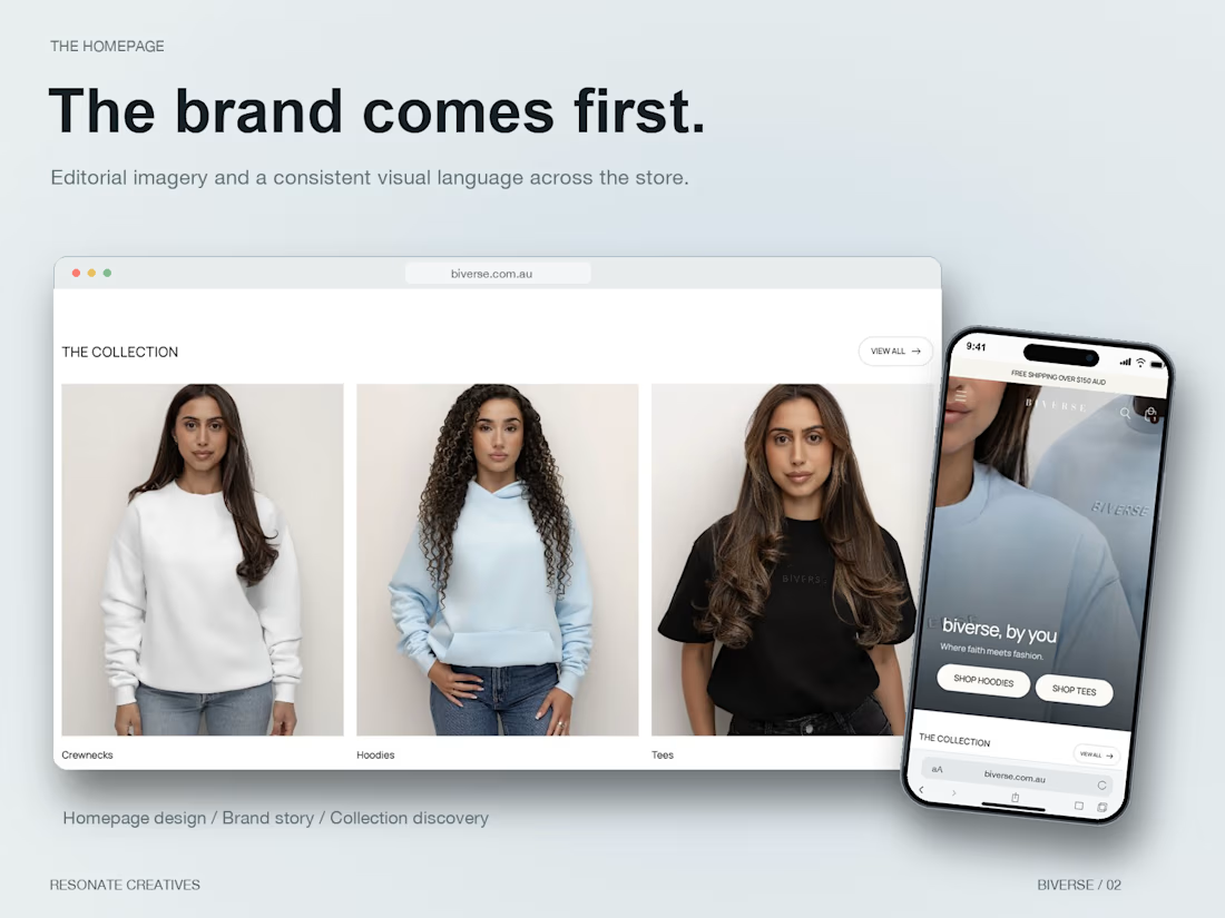
Finished the Shopify site for BIVERSE, an Australian faithwear brand.
We built the store around its personalised pieces, with a custom verse field on the product page and an editorial design that carries across desktop and mobile.
Resonate Creatives handled the website design and custom Shopify build. A few screens from the finished site below.
View the site: https://biverse.com.au/


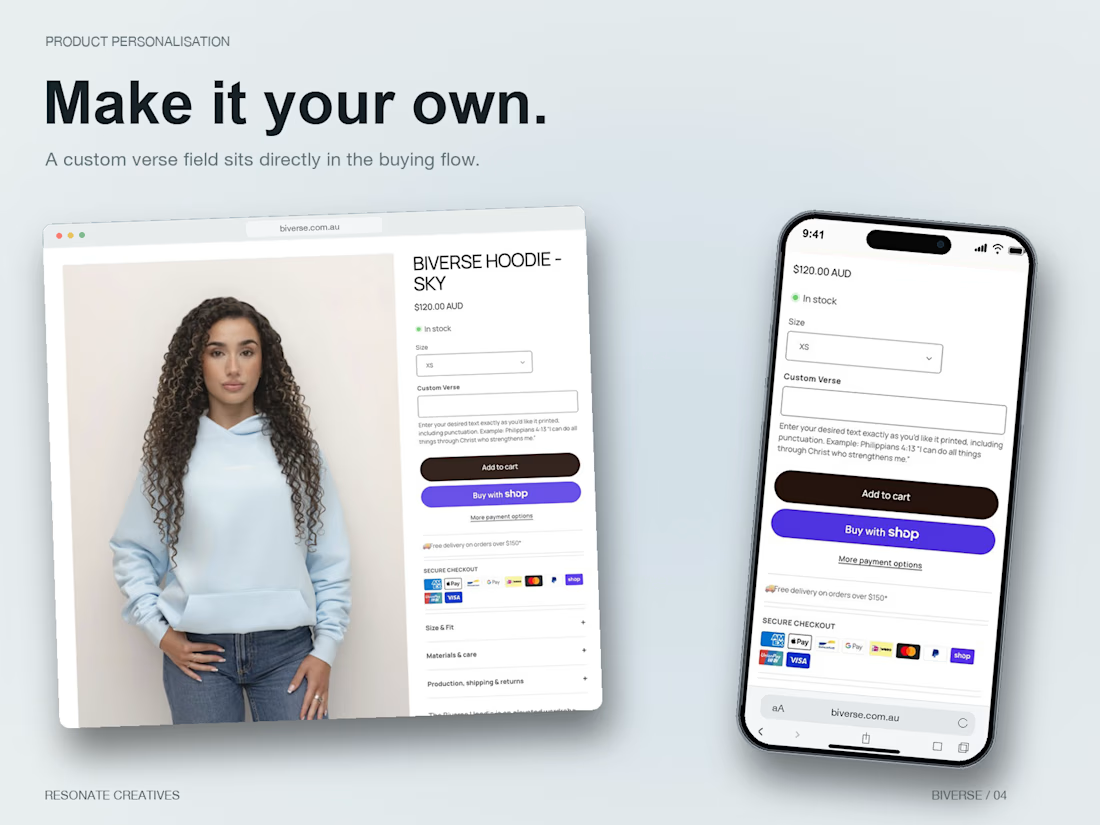
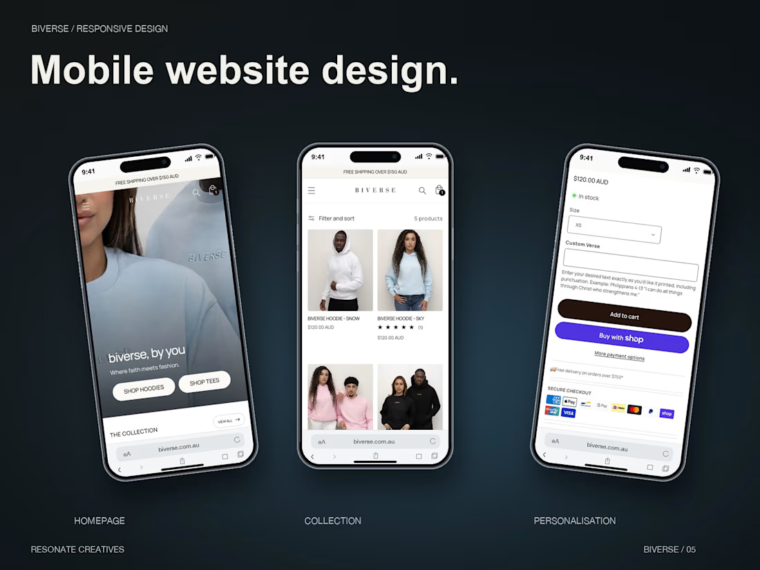

Nice one. A custom verse field is where personalised stores win or lose: the text has to make it into the cart and the order so fulfilment never has to chase the customer for it. Did you show a live preview of the verse on the product, or keep it as a text field only?

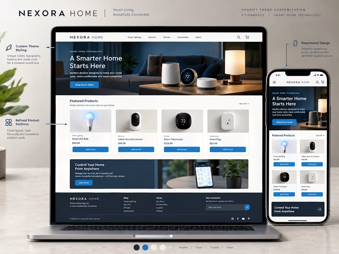
A Shopify theme gives a store its starting point, but customization helps make the experience fit the brand.
For this concept, I focused on how small design decisions can work together to create a more cohesive storefront.
→ Brand aligned colors and typography
→ A clear homepage structure
→ Consistent product cards
→ Refined buttons and section layouts
→ Better visual hierarchy
→ A responsive mobile experience
The goal isn't to change everything just for the sake of being different.
It's to make thoughtful adjustments that help the store feel consistent, professional, and easy to navigate.
Good theme customization brings the brand and the shopping experience together.
What would you customize first when adapting a Shopify theme for a new brand?


I'd start with the typography and colors. They set the tone for the entire storefront.