The network for creativity
Join 1.25M professional creatives like you
Connect with clients, get discovered, and run your business 100% commission-free
Creatives on Contra have earned over $150M and we are just getting started
Back to feedPost

What if a logo could show you how it was made?
SOVA started with one problem:
What should the “S” look like?
So I played with it.
Changed it. Scrapped it. Tried again.
Different strokes, different personalities, different directions.
Until one finally felt right.
This is a small branding experiment for SOVA — a handmade candle brand, exploring how a simple logo can feel crafted rather than just designed.
Would you have picked the final S? 👀


The network for creativity
Join 1.25M professional creatives like you
Connect with clients, get discovered, and run your business 100% commission-free
Creatives on Contra have earned over $150M and we are just getting started




Related posts

What should a creative agency website actually feel like?
For Orvika, we didn't want another agency site built around the same safe layouts and predictable sections.
We pushed the visual direction further with oversized typography, editorial layouts, bold imagery, and stronger contrast, while keeping the experience structured enough to communicate the agency's work and capabilities clearly.
The goal wasn't just to make it look different.
It was to make the agency feel different.
Designed in Figma and built in Framer.
We're sharing more of the websites and digital experiences we've been working on here over the next few weeks.



Very neat man

Some more Midjourney backgrounds.



Logo Suite designed for Annie Bakery — a local bread bakery.
©2026
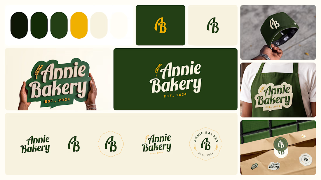

The suite holds together because the script wordmark, the AB monogram, and the round badge all carry the same wheat detail, so it reads as Annie Bakery whether on a storefront or shrunk onto a cap. The dark green with mustard is also a warm artisan pairing that dodges the usual beige bakery cliche.