The network for creativity
Join 1.25M professional creatives like you
Connect with clients, get discovered, and run your business 100% commission-free
Creatives on Contra have earned over $150M and we are just getting started


The network for creativity
Join 1.25M professional creatives like you
Connect with clients, get discovered, and run your business 100% commission-free
Creatives on Contra have earned over $150M and we are just getting started





Related posts

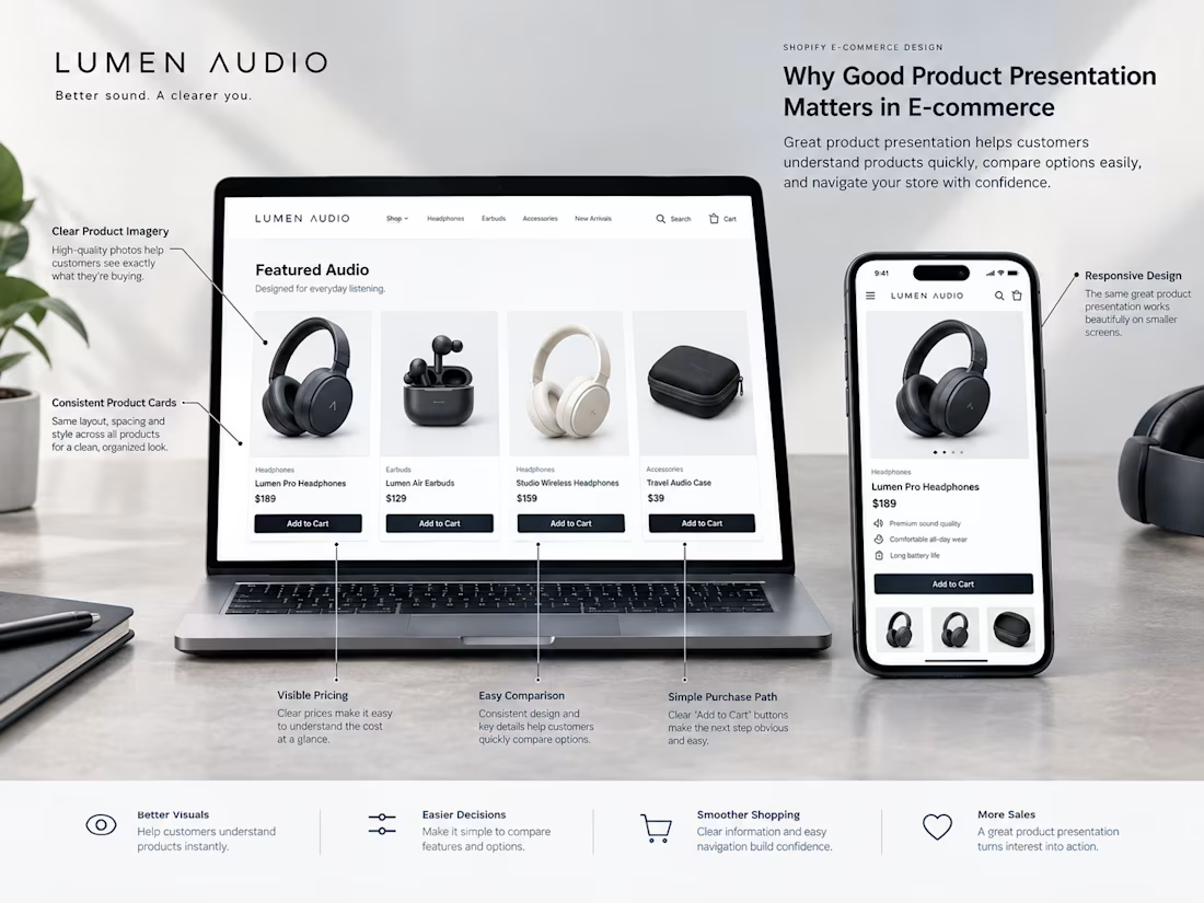
Good product presentation is more than making a Shopify store look attractive.
It helps customers understand what they're looking at and makes it easier for them to compare products.
A strong product presentation usually starts with:
→ Clear product photography
→ Consistent product images
→ Easy to read product names
→ Visible pricing
→ Useful product information
→ Clear product categories
→ Simple actions like Add to Cart
When these elements are organized properly, customers don't have to work as hard to understand the store.
The goal isn't to make every product section complicated.
It's to make the important information easy to see and easy to understand.
That's a big part of good e-commerce UX.

Agree, and the description text matters as much as the photos. A lot of stores have great images but a one line description, so the shopper still has to guess at material, sizing or care before they trust the add to cart button.

Hunker makes poop stools from 100% post-consumer waste, designed to be left out in plain sight. Their website was doing the opposite.
The old site had cream text on green at 1.8:1 contrast, one banner, one button, and nothing to tell people why they should buy.
So I rebuilt it:
• Added Brownie as a contrast colour, so every text pairing now passes WCAG AA
• Put press, reviews, and the founder story on the homepage
• Rebuilt the product pages around benefits, reviews, and cross-sells
• Added FAQs that answer the questions people type into Google
In just 10 days:
+41% conversion rate
+390% sales from Google search
+208% visitors
If your Shopify site is holding your product back, I can fix it.
Have a look 👉 https://hunker.shop/

Great work!!


Just wrapped up this high-converting Shopify product page for Haloven, designed and built in Replo. 🚀
The focus was simple: turn product interest into purchase confidence through strong offer presentation, social proof, customer testimonials, product education, comparison, trust signals, and CRO-focused UX.
The client loved the final result and said she’d happily recommend my work to others. 🙌
Built with Replo + Shopify + CRO thinking.


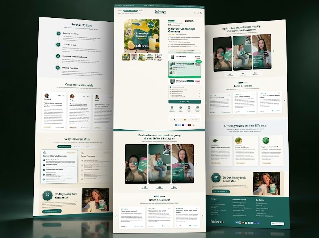
Nice work. Putting the guarantee badge next to the testimonials instead of on a separate policy page is the right call, that kind of trust signal only helps if it shows up right when someone is deciding.