The network for creativity
Join 1.25M professional creatives like you
Connect with clients, get discovered, and run your business 100% commission-free
Creatives on Contra have earned over $150M and we are just getting started
Back to feedPost

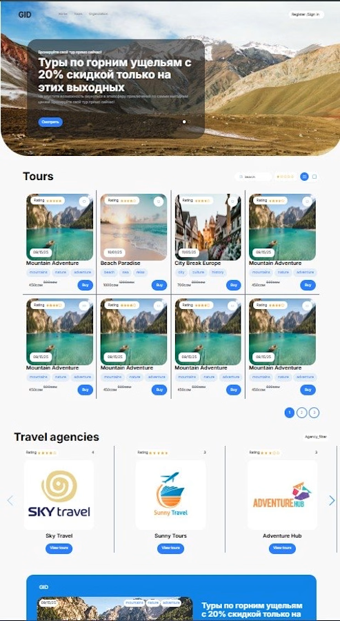
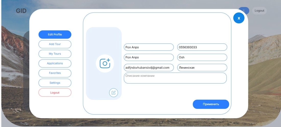
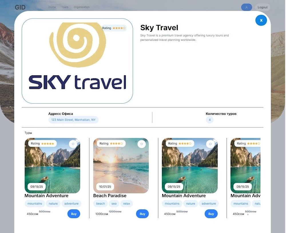
Web app for travelling, system for travellers and companies


The network for creativity
Join 1.25M professional creatives like you
Connect with clients, get discovered, and run your business 100% commission-free
Creatives on Contra have earned over $150M and we are just getting started





Related posts


Lidar Drone Scanning, 3D Scroll Website


Top-notch design.

A component for Sandbox Platform, showing the boot sequence


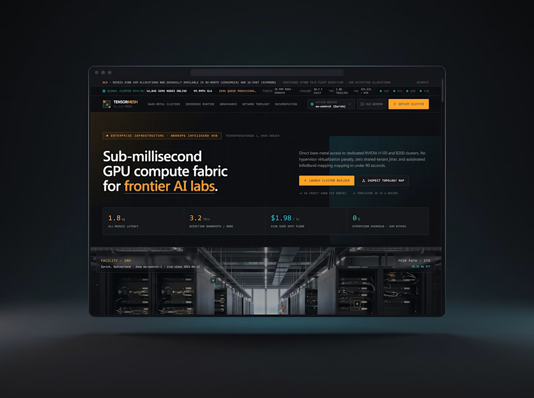
High-performance technical web application with interactive cost models, dark UI architecture, and modular React components.