The network for creativity
Join 1.25M professional creatives like you
Connect with clients, get discovered, and run your business 100% commission-free
Creatives on Contra have earned over $150M and we are just getting started
Back to feedPost
Sound On 🔊 — hike ticket UI Interaction
My flow: 😊
1. Final design in Figma.
2. Motion prompt and code from React Bits.
3. Building and polishing in Lovable.


The full screen design
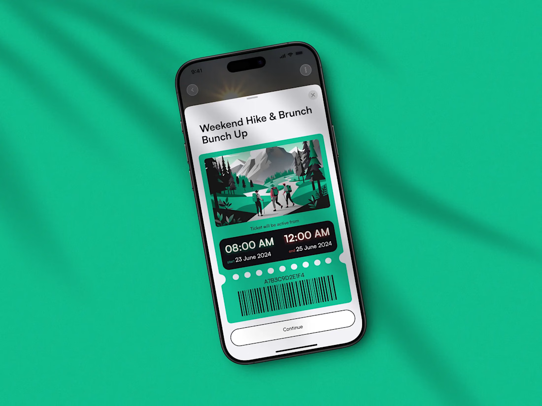

An animated ticket with the barcode, the validity window and a green illustration of hikers on a trail is a fun way to make a boring object feel alive, and sharing the three tool flow from Figma to React Bits to Lovable is generous. Contrarian question: the motion is the star,...
Good point! This is one of a few concept options. In the app, the ticket tears at the moment it’s scanned at the entrance, then shows a “Used” state. This screen is only the preview before payment.😊


figma to react bits to lovable, how much did you end up fixing by hand at the end?
In Lovable in one prompt — I gave it the design (PNG) + the Figma design code link, and + the React Bits animation preset — https://reactbits.dev/micro/tear-ticket (prompt + code). The first result was close, then it took 3-5 iterations through prompts only: adding the...
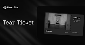
reactbits.dev
Tear Ticket — React Micro Interaction | React Bits
Ticket whose perforated stub tears off by hand, fibre by fibre, and drops away. Explore the Tear Ticket React demo and source code.

Sound on was the right call, it makes a ticket feel physical. The tear when it gets scanned that you mentioned in the replies is the moment I'd want to see next, that's the bit people will remember. Is the sound wired into the component itself or triggered from the app?
Thanks! It’s a concept, so the sound is inside the component in my prototype. In a real app, I would trigger it from the app when the ticket is scanned.
The network for creativity
Join 1.25M professional creatives like you
Connect with clients, get discovered, and run your business 100% commission-free
Creatives on Contra have earned over $150M and we are just getting started



Related posts

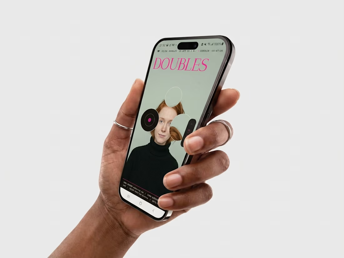
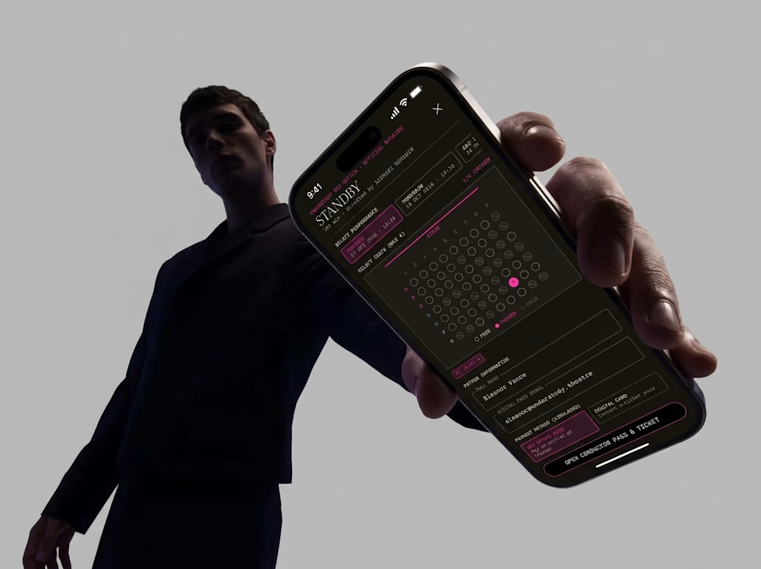
Friday app: Understudy
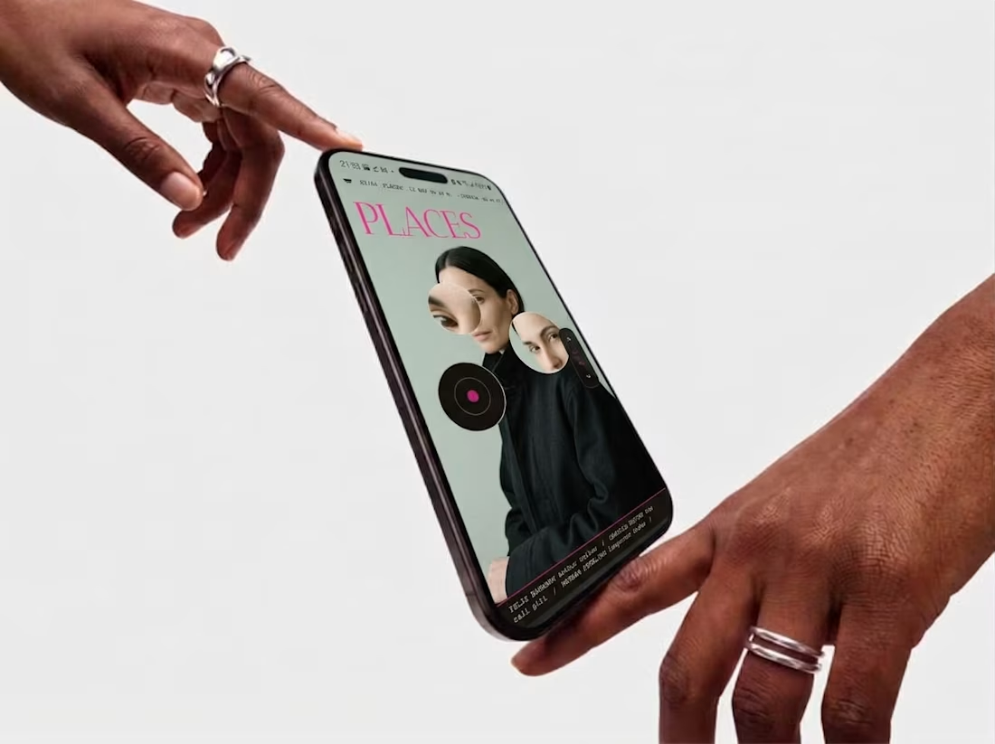
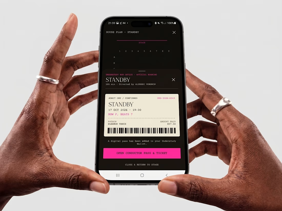
What if an app’s menu was a hole in a face?
UNDERSTUDY turns one circle into the interface: eyes open shows, voids open seat plans, and a typewriter clock counts down to curtain.


Check it out
New case study: Industrial IoT platform redesign with AI integration ⚡
Spent 5 weeks redesigning Lumicent’s industrial IoT platform. The headline change: cut alarm resolution from 4 taps to 1.
Started with a design audit that uncovered three UX failures burying the information operators actually needed to act. Mapped 3 personas (Technician, Risk Manager, Site Executive) and rebuilt the alarm, investigation, and home flows around how they actually make decisions under pressure.
AI assistant woven in at the right moments: contextual chat during investigation, daily brief on the home page, remedy suggestions at the point of alarm.

Putting the AI assistant at specific decision points, like remedy suggestions right at the alarm and a daily brief on the home page, feels much more useful than a generic chat box. Cutting alarm resolution from 4 taps to 1 is a strong result for operators working under pressure.

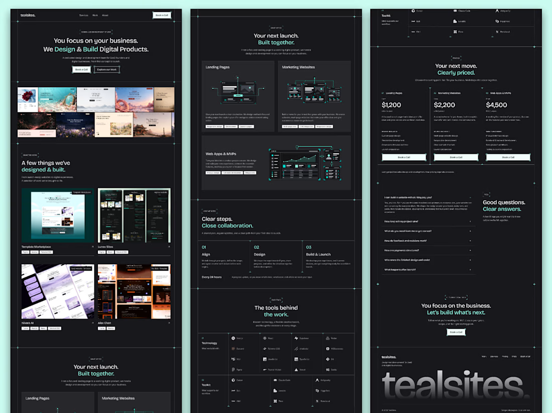
The full landing page design is complete.
I designed this website for a web design and development agency, with founders and growing businesses in mind.
Clear services, selected work, straightforward pricing and answers to common questions. Each section helps visitors understand the offer and take the next step.
Visually, I kept it consistent with teal accents, structured grids and corner details throughout.
Good to see all the sections come together.

Love how you’ve focused on clarity and consistency! The clear services and pricing make it easier for visitors to understand the offer and take the next step. 👏✨


