The network for creativity
Join 1.25M professional creatives like you
Connect with clients, get discovered, and run your business 100% commission-free
Creatives on Contra have earned over $150M and we are just getting started
Back to feedPost


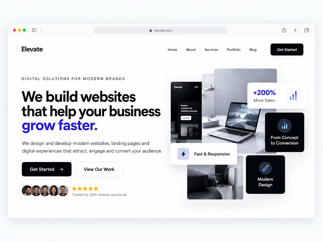
One of the easiest ways to make a website feel more professional:
Give your content more room to breathe.
Not every empty space needs another button, graphic, animation or paragraph.
Good spacing helps create:
• Better visual hierarchy
• Easier readability
• Clearer CTAs
• A more premium feel
Sometimes improving a website isn't about adding more.
It's about knowing what to remove.
Designers: do you prefer spacious layouts or more content-heavy websites?
#WebDesign #Webflow #UIDesign #Figma #WebsiteDesign





Well structured
The network for creativity
Join 1.25M professional creatives like you
Connect with clients, get discovered, and run your business 100% commission-free
Creatives on Contra have earned over $150M and we are just getting started





Related posts


too excited about this scroll animation, feels magical

It does feel magical! Super smooth scroll.


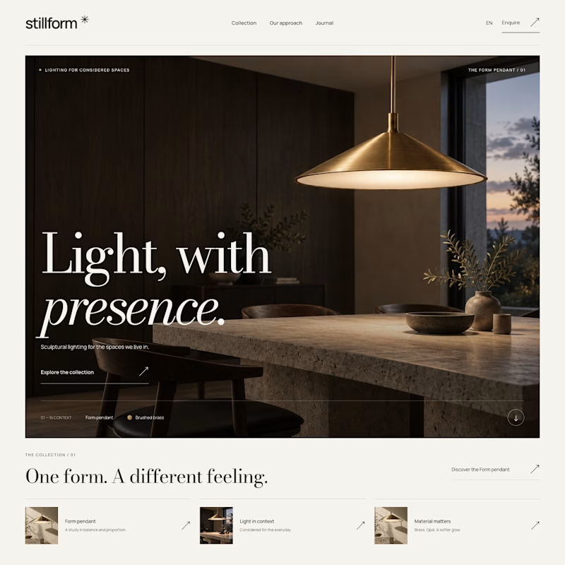
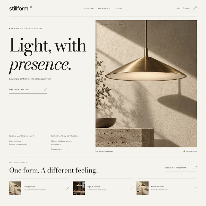

Atmospheric, and it was the photography that decided it. A lamp is a product you buy for what it does to a room, so seeing the warm glow pooling across a dark surface sells the feeling before the layout even registers. Sculptural is gorgeous but shows the object, Atmospheric shows the outcome.
I made a free agent skill for Framer template creators. It QAs a template before it goes on the Marketplace: checks the editor project, the live site on every breakpoint, and SEO and AEO, fixes clear issues, and adds a getting-started guide for buyers.
Install: npx skills add agnilem/framer-template-qa
skills.startfrom.co

skills.startfrom.co
framer-template-qa, an agent skill by Alex Prokhorov
An agent skill that QAs a Framer template before it goes on the Framer Marketplace.

this helps a lot! thank you for sharing 🔥