The network for creativity
Join 1.25M professional creatives like you
Connect with clients, get discovered, and run your business 100% commission-free
Creatives on Contra have earned over $150M and we are just getting started
Back to feedPost

Everyone's building AI tools with the same hero.
Clean. Minimal. Forgettable.
This one hits different.
ASCII video background for an AI song generator concept.
Old-school aesthetic. Cutting-edge product. The contrast is the point.
Built in @framer

The network for creativity
Join 1.25M professional creatives like you
Connect with clients, get discovered, and run your business 100% commission-free
Creatives on Contra have earned over $150M and we are just getting started





Related posts


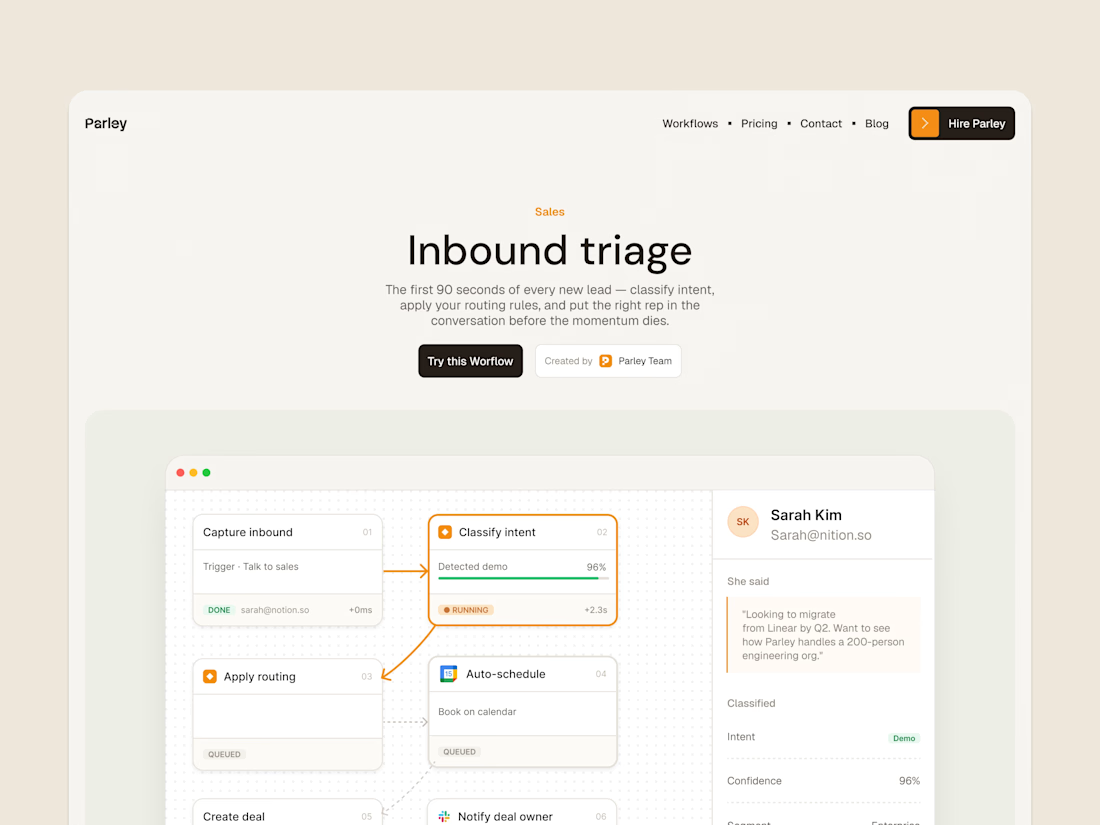
parley’s inbound triage page, with the workflow laid out below the introduction.
get it free now → https://framer.link/s1Llkdh

Nice work!


Building a pet SaaS hero
Soft visuals, bold typography, and a clear conversion path, designed to make the product feel as friendly as the pets it helps
Built in Framer
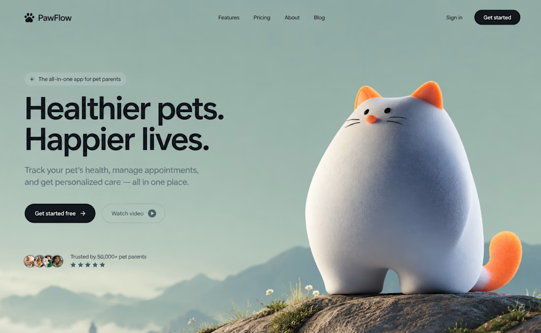

The dark CTA stands out against the soft sage background, even with the cat taking center stage. How are you handling the cat and headline on mobile: stacked or a tighter crop?

The best part of this website might be the page nobody is supposed to see.
About 4 months ago, we launched the new website for STORY Design Amsterdam.
STORY is all about giving homes personality, so we wanted the website to have some too.
Including their 404 page.
Naturally, I put the owner's dog on it.
If you end up on the wrong page, you might as well enjoy it.
But the fun details only work if the website itself does too.
Before the launch, most of their website traffic came through Instagram.
Today, around 60% comes from Google.
And now we've taken the next step by adding a little shop, so people can buy their kitchen handles directly from the site.
Next up: a great about us page; photoshoots are already planned.
I don't design websites that often.
But when I do, I don't want to create something that could belong to any business.
It should feel like their business. Do you think I achieved that?

Great work, Bram