The network for creativity
Join 1.25M professional creatives like you
Connect with clients, get discovered, and run your business 100% commission-free
Creatives on Contra have earned over $150M and we are just getting started
Back to feedPost

Fiddle Digital – Creative Agency & Interactive Portfolio Website


The network for creativity
Join 1.25M professional creatives like you
Connect with clients, get discovered, and run your business 100% commission-free
Creatives on Contra have earned over $150M and we are just getting started








Related posts

Recovery Brand Identity / Logo & Visual Direction
A new identity project for a recovery-focused brand that wanted to move away from the conventional clinical look of its category.
The direction combines clinical credibility with a more modern, movement- and performance-driven visual language.
First look at the logo. Full identity coming next.
Logo design and creative direction by Lepisov Branding
Social media Branding: collab with Mike Creative Mints


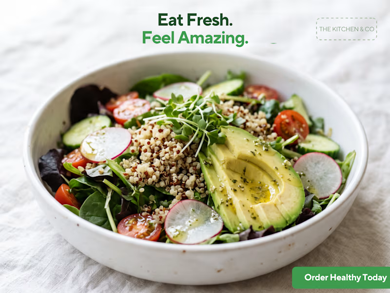
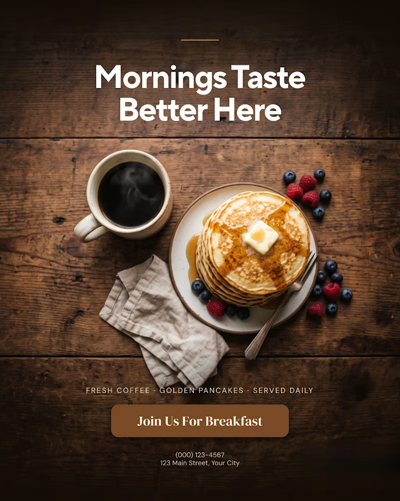
A creative food advertising design series focused on bold typography, visual hierarchy, and appetizing food photography.
The first design uses warm, rustic tones and expressive typography to create a cozy breakfast feel, while the second combines fresh green typography with a clean, modern layout for a healthy food concept.
Both designs explore how typography, color, and composition can communicate different food brand identities.
Which design do you prefer, the warm breakfast aesthetic or the fresh, minimal look?

1 voted
11%
8 voted
89%
9 votes
Closed

That is more attractive to me great job Malaika🎉🎉🎉

Selected Digital Experiences — FusionAura Studio
Six websites, six distinct identities. A look at ARVÉ, CAVENRA, LUMA, NOMERA, EREN LOGIX and Dua Nadeem — designed and developed by our studio.
Websites. Products. Experiences.
Explore our work: https://fusionaurastudio.com

This is nice