The network for creativity
Join 1.25M professional creatives like you
Connect with clients, get discovered, and run your business 100% commission-free
Creatives on Contra have earned over $150M and we are just getting started
Back to feedPost

Title:
Book Promotion Reel — Creative Short-Form Edit
Description:
A self-initiated promotional Reel created for a fictional/storytelling concept.
I combined typography, character visuals, transitions, background imagery, and music to create a visually engaging book promotion


The network for creativity
Join 1.25M professional creatives like you
Connect with clients, get discovered, and run your business 100% commission-free
Creatives on Contra have earned over $150M and we are just getting started







Related posts

: One of my favorite recent builds ✦
Theory was designed for a creative studio that needed something bold and editorial without losing clarity or usability.
The part I loved most was figuring out how to make the site feel visually expressive while still giving the portfolio work room to breathe. Lots of strong type, intentional movement, and little custom details throughout.
Designed + developed in Squarespace 7.1 with custom CSS and JavaScript.


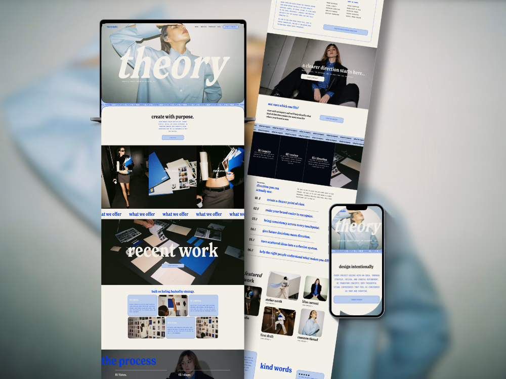
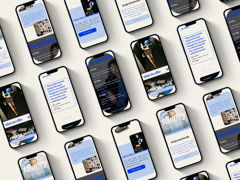

The oversized “recent work” type over the project imagery is a lovely touch. Gives the portfolio a real editorial feel.

Sharing this amazing project I had the pleasure to work on ⚡️
LUMA is a matcha brand built around the ritual of taking a moment for yourself.
The identity combines a fresh, playful color palette with a clean and contemporary visual language, creating a brand that feels vibrant without losing its sense of calm.
The result is a modern matcha identity that brings together natural qualities with a bright, lifestyle-driven aesthetic.
Check the full project on https://www.behance.net/gallery/255763939/LUMA-Matcha-Branding
Tell me your thoughts! 🔥🍵



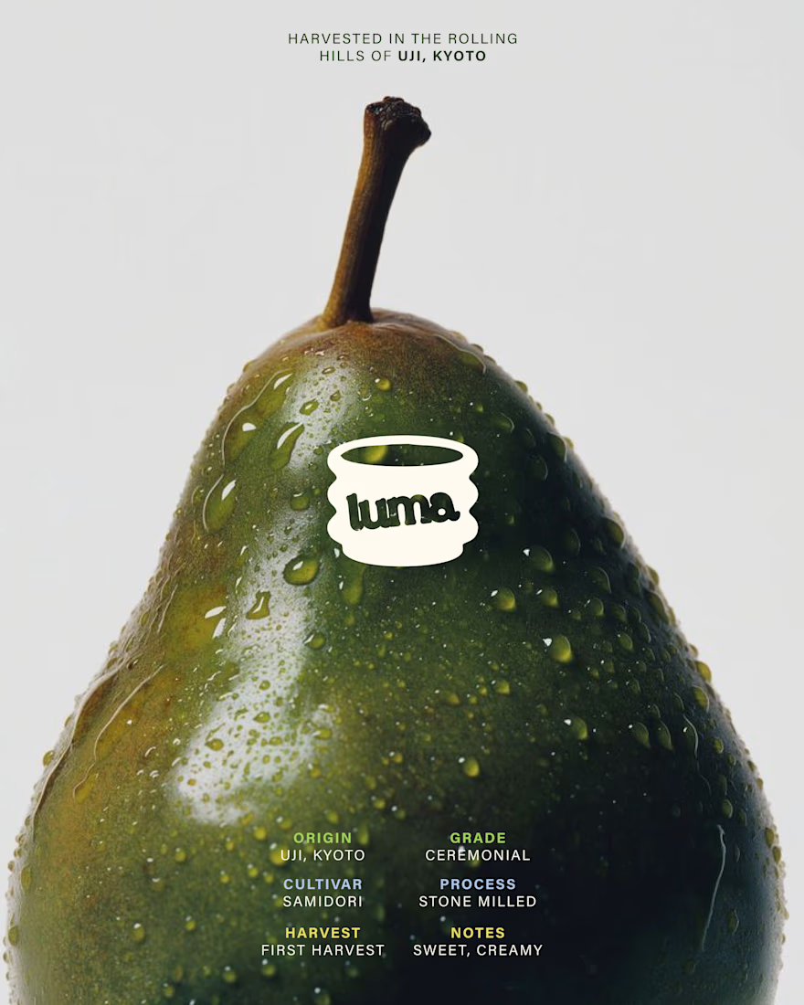
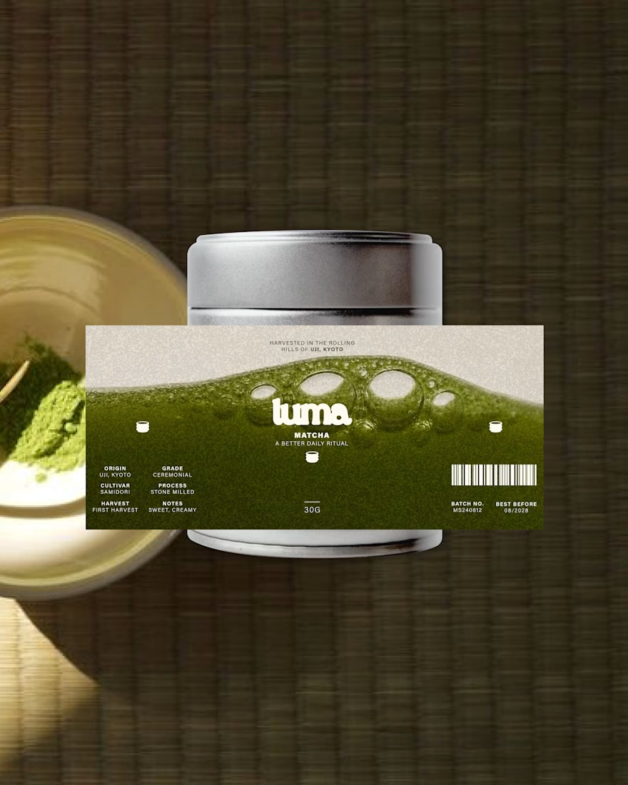
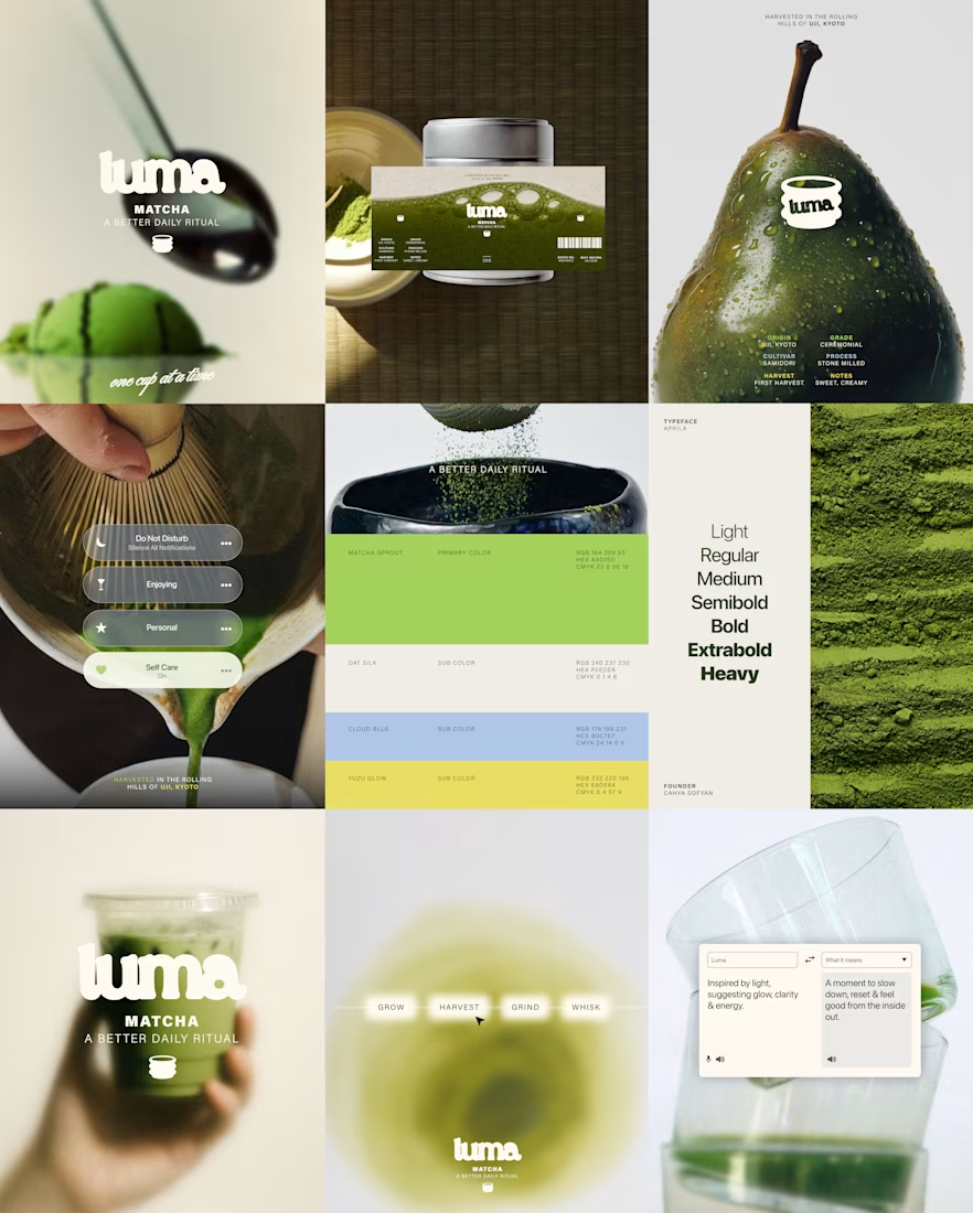

Most of the matcha shelf is muted and ceremonial-looking, so a bright palette is exactly what makes this findable. The trade is that brightness tends to read as everyday latte rather than premium grade, and that shows up in what people expect to pay - was the daily-ritual end the deliberate target rather than the ceremonial one?

A re-imagined version of ermia ramez's youtube short film paired with cinematic subtitles and premium animations to drive the viewers attention throughout the story


Using subtitles as part of the visual storytelling is an interesting direction. How do you decide when they should animate and when they should stay still for readability?