The network for creativity
Join 1.25M professional creatives like you
Connect with clients, get discovered, and run your business 100% commission-free
Creatives on Contra have earned over $150M and we are just getting started
Back to feedPost


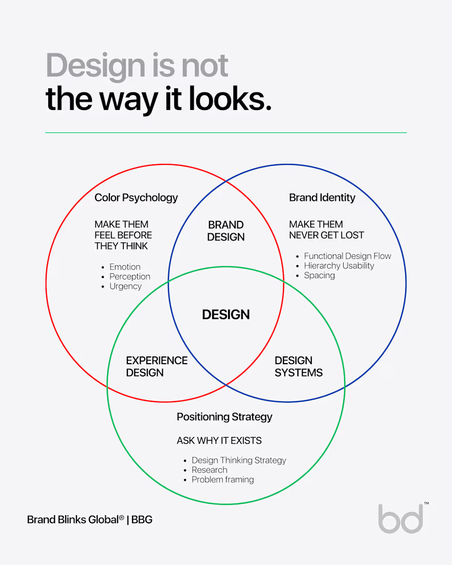
Design is not "THE WAY IT LOOKS."
After spending more than a decade with global executives, founders, and design teams across industries, I see most of them have no idea what design actually is.
I still see most designers spend 4 hours picking the perfect shade of blue. Redoing a layout because something "just felt off."
Design actually has 3 completely different functions. And most people, even experienced designers, are only doing ONE of them.
And every time someone asks them why a design works, they say something like, "It just looks good." But is that design thinking? That's just a vibe with a Figma, Photoshop, or Canva subscription.
The first job is MAKING PEOPLE FEEL SOMETHING BEFORE THEY THINK.
That's color psychology. Red doesn't just look urgent, but it raises your heart rate. Next, Blue doesn't just look trustworthy, but it literally lowers your cortisol.
These aren't opinions. They're physiological responses. Every time you "just pick a color you like," you're leaving emotion on the table.
The second job is MAKING SURE PEOPLE NEVER GET LOST.
That's functional design. Hierarchy, spacing, flow, affordance. The invisible hand that guides your eye from headline to subhead to CTA without you noticing.
When does it work perfectly? Nobody claps. Nobody even notices. That's the whole point.
The third job is ASKING WHY ANY OF THIS EXISTS IN THE FIRST PLACE.
That's design thinking. What problem are we solving? For whom? What does success look like?
This layer has nothing to do with how things look. And yet, it determines whether all that beautiful, functional work actually matters.
A red button doesn't convert because it's red. It converts because red, in that exact moment, in that exact flow, built on a strategy that understood the user was hesitating. It creates URGENCY at precisely the right emotional beat.
→ Remove the STRATEGY: you have a pretty red button that solves the wrong problem.
→ Remove the FUNCTION: you have a pretty red button nobody can find.
→ Remove the COLOR PSYCHOLOGY: you have a correct, well-placed button that nobody feels compelled to click.
Three layers. One outcome. All or nothing. Next time someone sends you a Canva file and says, "Can you make this look better?" ask them, "Better for whom? And better at doing what?"
Don't forget design isn't the way it looks. It's WHY IT WORKS.


The network for creativity
Join 1.25M professional creatives like you
Connect with clients, get discovered, and run your business 100% commission-free
Creatives on Contra have earned over $150M and we are just getting started
Challenges
View all


Related posts


Should a flower shop ever go black and white?
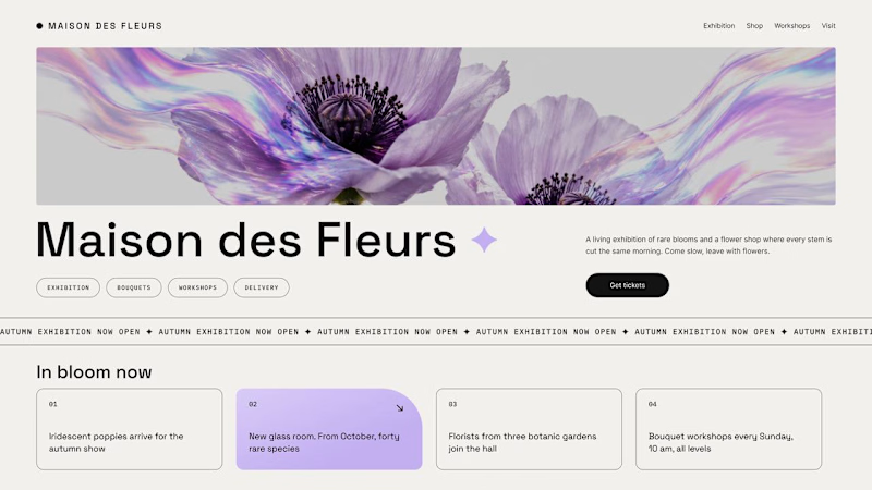
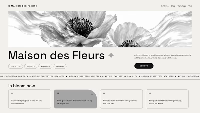
Same flower house, same layout. We only took the color out.
1. Full color. The iridescent petals do the selling: lilac, pink, a little shimmer. The photo is the brand, and every accent on the page borrows from it.
2. Monochrome. No color at all. Shape, texture and typography have to carry everything, and the page suddenly reads like a gallery catalogue.
Color sells the flower. Monochrome sells the exhibition.
Which one would get you through the door?
67 voted
91%
7 voted
9%
74 votes
Closed

The problem with monochrome is that, throughout computer history, it has conditioned users to associate gray and monochrome with being disabled, dysfunctional, or something to ignore and avoid.

Luxury Lighting E-commerce Website Design for Modern Home Decor
A modern luxury lighting e-commerce website concept crafted to showcase premium statement pieces through a refined, immersive, and editorial-inspired digital experience. The design combines warm ambient lighting, bold typography, cinematic imagery, and clean minimalist layouts to create a sophisticated online presence for a high-end home decor brand. Every element is thoughtfully designed to enhance product storytelling, improve user engagement, and deliver a seamless shopping experience across all devices.


really nice design

Hover animation made with Rive. Smooth, playful, and interactive.

