The network for creativity
Join 1.25M professional creatives like you
Connect with clients, get discovered, and run your business 100% commission-free
Creatives on Contra have earned over $150M and we are just getting started
Back to feedPost

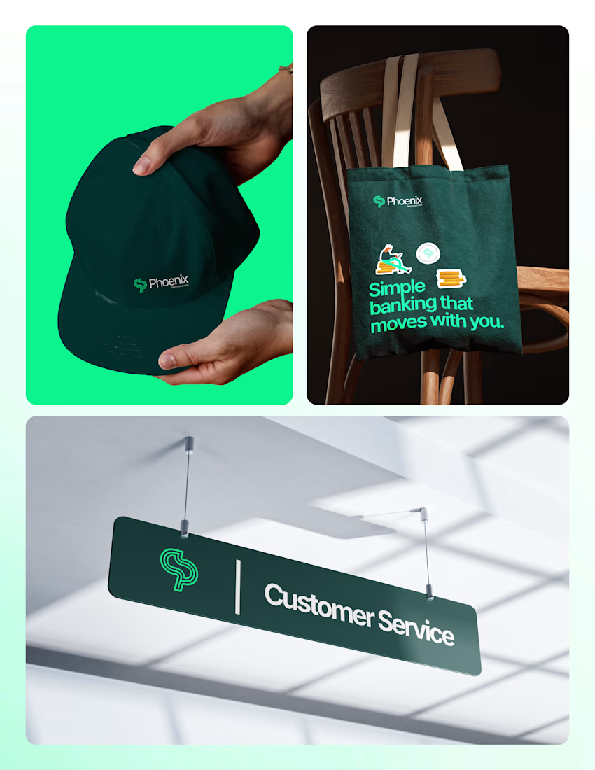
A good identity has to work everywhere, not just on a logo sheet.
Phoenix Microfinance Bank on a debit card, a cap, a tote, a Customer Service sign, a billboard and the social feed.
Same deep green, same mint, same line that keeps moving.
Simple banking that moves with you.
Open for gigs and collaborations.
Email: conceptdave01@gmail.com

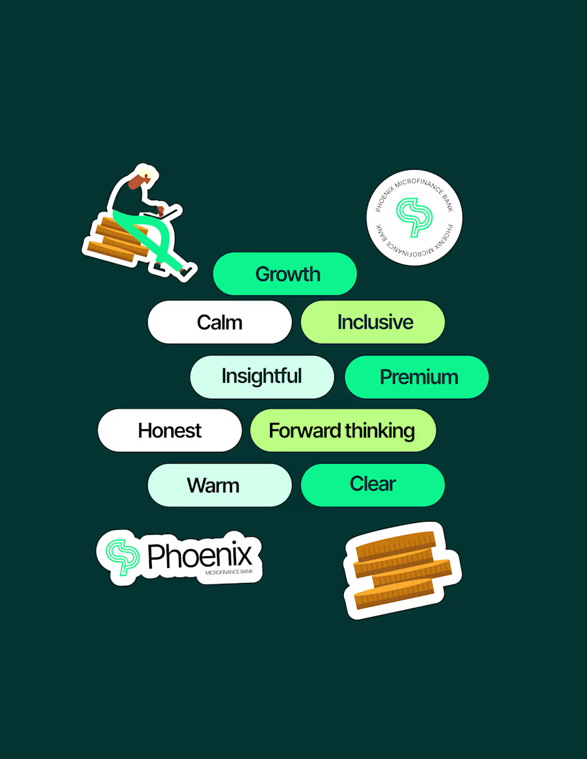
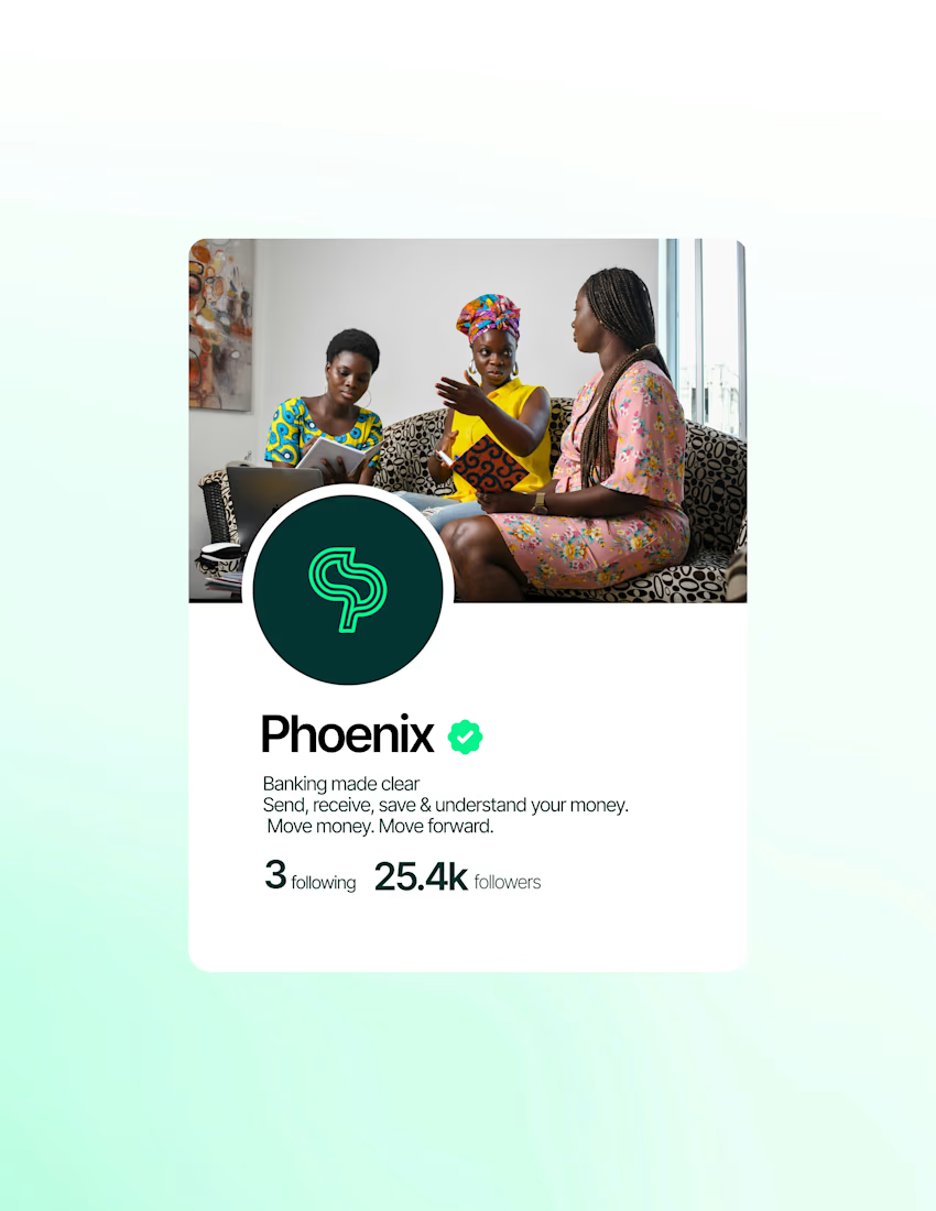

The brief: a bank that feels calm, premium and clear.
The mark: one continuous line forming a P, showing money sent, money received, and growth upward....
The network for creativity
Join 1.25M professional creatives like you
Connect with clients, get discovered, and run your business 100% commission-free
Creatives on Contra have earned over $150M and we are just getting started



Related posts


DockTail approached me with a fun idea: make us look nothing like what we do.
As strange as it sounds, I think this is one of the most exciting creative challenges. When branding a business, the primary objective is usually to communicate what it does. But what happens when you deliberately take that away?
After a few days of brainstorming, experimentation, and using Curative Intelligence, I arrived at these two concepts.
One is ALL CAPS, the other is all lowercase. Both carry the same personality, but express it through two entirely different approaches.
Now I'm curious: Which one do you like more?
22 voted
65%

12 voted
35%

34 votes
Closed

Website & Branding for Blockchain Payments Consortium (Mysten Labs)


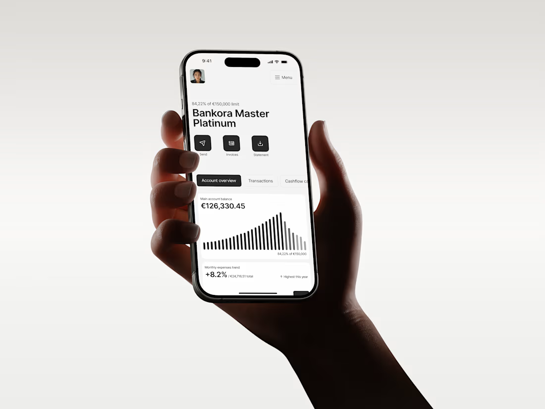
Business banking is already complex. The product shouldn’t make it feel even harder.
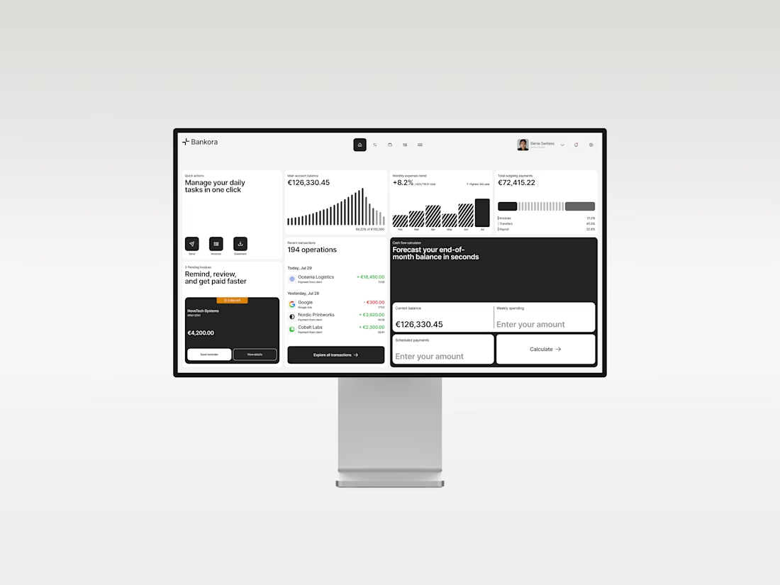
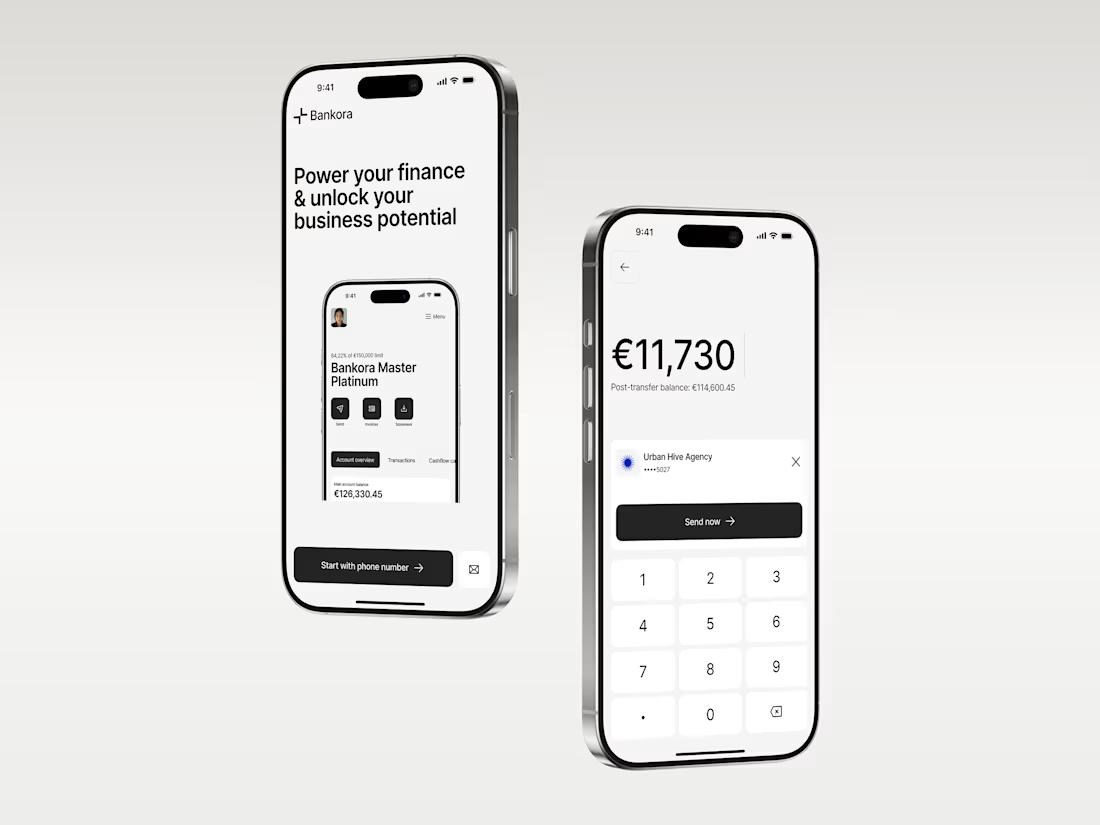
That was the thinking behind Bankora.
Payments, invoices, cash flow, financial overview. These are things business teams deal with constantly, yet many banking products still bury simple actions under dense data, long paths, and complicated navigation.
So I started with the workflows, not the screens.
I looked at the tasks people need to complete most often, where unnecessary steps appear, and what information actually needs attention first.
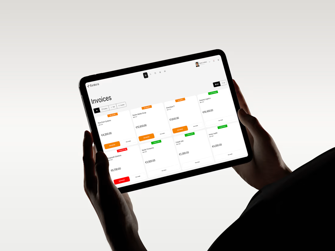
From there, I built the experience around clearer priorities: key actions available quickly, predictable navigation, structured financial data, and modular UI that makes things like pending and overdue invoices easier to understand at a glance.
I also designed an interactive cash flow calculator to help users see where the business may be heading, not just what has already happened.
The goal wasn’t to make financial operations simpler than they really are.
It was to make interacting with them feel simpler.
Less searching. Less cognitive load. More confidence in what to do next.
And it was especially nice to see Bankora later featured by Contra.


Lovely!