The network for creativity
Join 1.25M professional creatives like you
Connect with clients, get discovered, and run your business 100% commission-free
Creatives on Contra have earned over $150M and we are just getting started
Back to feedPost


I created this project as a personal portfolio experience that feels sharp, technical and credible without relying on generic futuristic visuals.
The main goal was to communicate what I do within a few seconds. Instead of vague agency language, I positioned myself clearly as an AI Developer, Automation Engineer and SaaS builder. The headline, “I build AI systems that remove manual work,” makes the value of my work immediately understandable.
I kept the design dark and premium, using charcoal, off-white and a small emerald accent to create a focused technical feel. The grid is intentionally subtle and only appears around the project area, adding structure without making the page feel like a system dashboard.
The layout uses an asymmetric composition. Rather than using fake analytics or decorative 3D objects, I included a believable product view with the actual product name, purpose and technology stack.
Every element guides attention in a natural order: my name, what I do, the problem I solve, the project proof, and finally the services I offer. The buttons are simple and direct so the visitor can either view my work or start a conversation without distractions.


The network for creativity
Join 1.25M professional creatives like you
Connect with clients, get discovered, and run your business 100% commission-free
Creatives on Contra have earned over $150M and we are just getting started











Related posts

FOCUS — Creative Portfolio & Digital Art Website 🌸✨
A visually expressive website concept for a creative portfolio, built around digital art, bold imagery, and visual storytelling
The design combines vibrant pink tones, soft gradients, experimental typography, and immersive photography to create a distinctive editorial experience
Special attention was given to:
• Bold editorial hero composition
• Vibrant pink and dark color palette
• Experimental typography and visual details
• Immersive photography and digital artwork
• Creative project gallery and navigation
• Responsive mobile experience
• Clean layouts with a strong visual identity
The result is an expressive digital experience that puts creativity, emotion, and visual storytelling at the center of every screen 💗
Looking to create a standout portfolio or website for a creative brand? Let’s connect 🚀






The vibrant pink against the dark palette gives this such a bold editorial feel. The experimental typography is the star here.

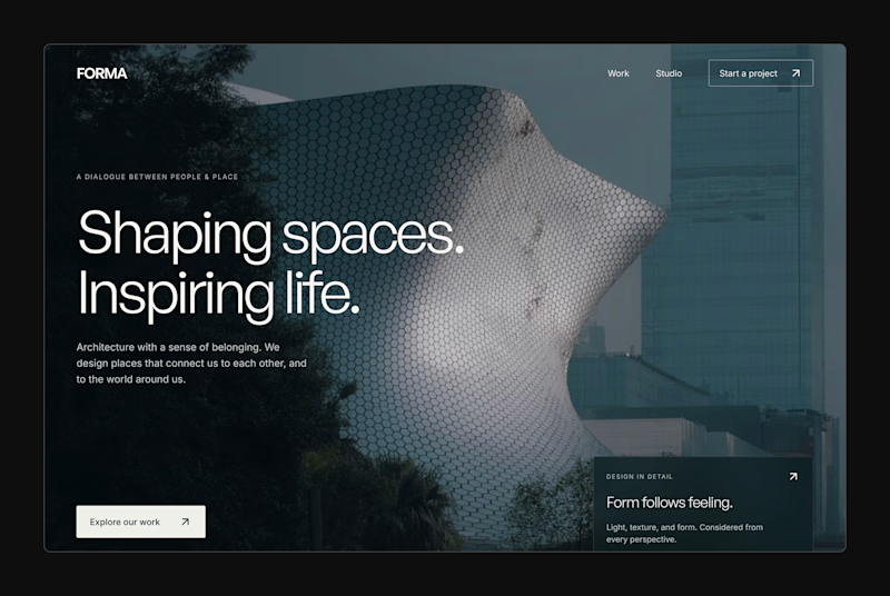
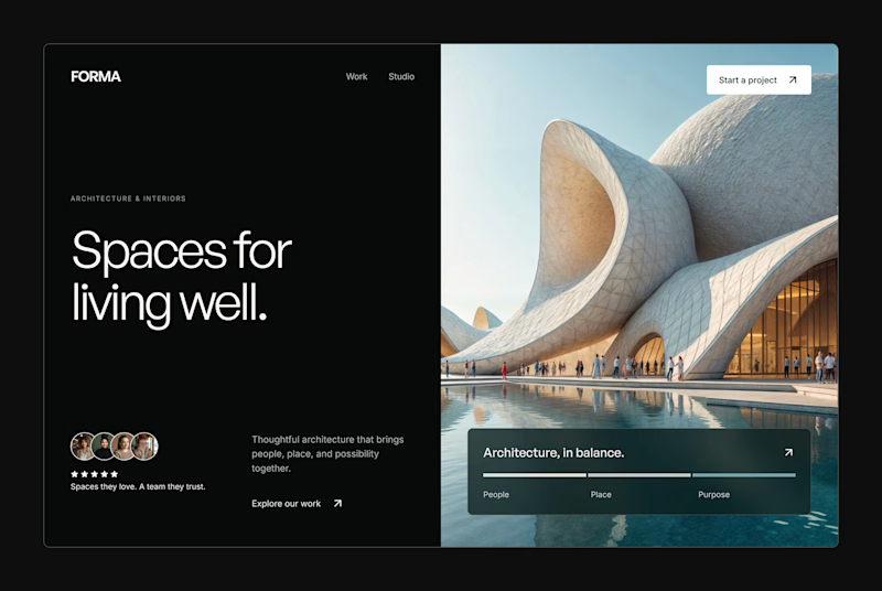
Design Exploration: Hero Section of Architecture Website. Which one do you think much better?


12 voted
43%
16 voted
57%
28 votes
Closed


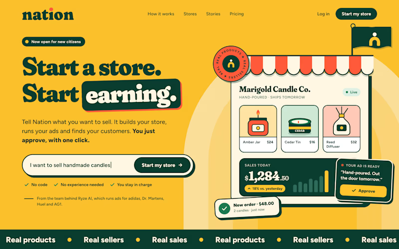
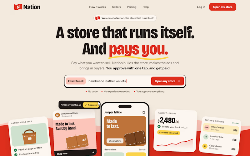
Two visual directions for the same brief. Which do you prefer?
2 voted
29%
5 voted
71%
7 votes
Closed

Direction A is more better to me it feels modern professional cartoony style that's impressive ❤️❤️
Great job Ayoub🔥🔥