The network for creativity
Join 1.25M professional creatives like you
Connect with clients, get discovered, and run your business 100% commission-free
Creatives on Contra have earned over $150M and we are just getting started
Back to feedPost

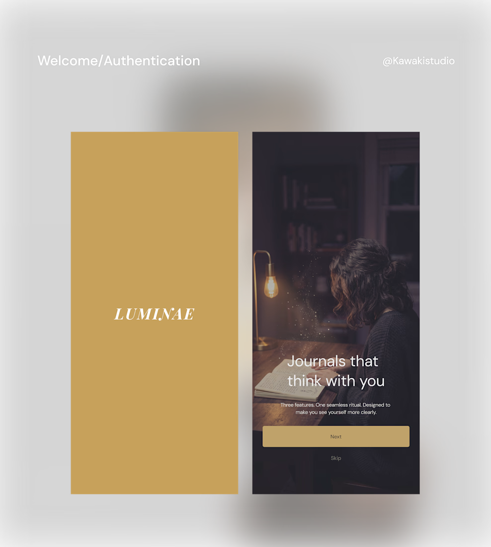
The moment a user opens your app, they make a subconscious decision: Is this worth my attention?
Every tap after that either confirms or destroys that first impression.
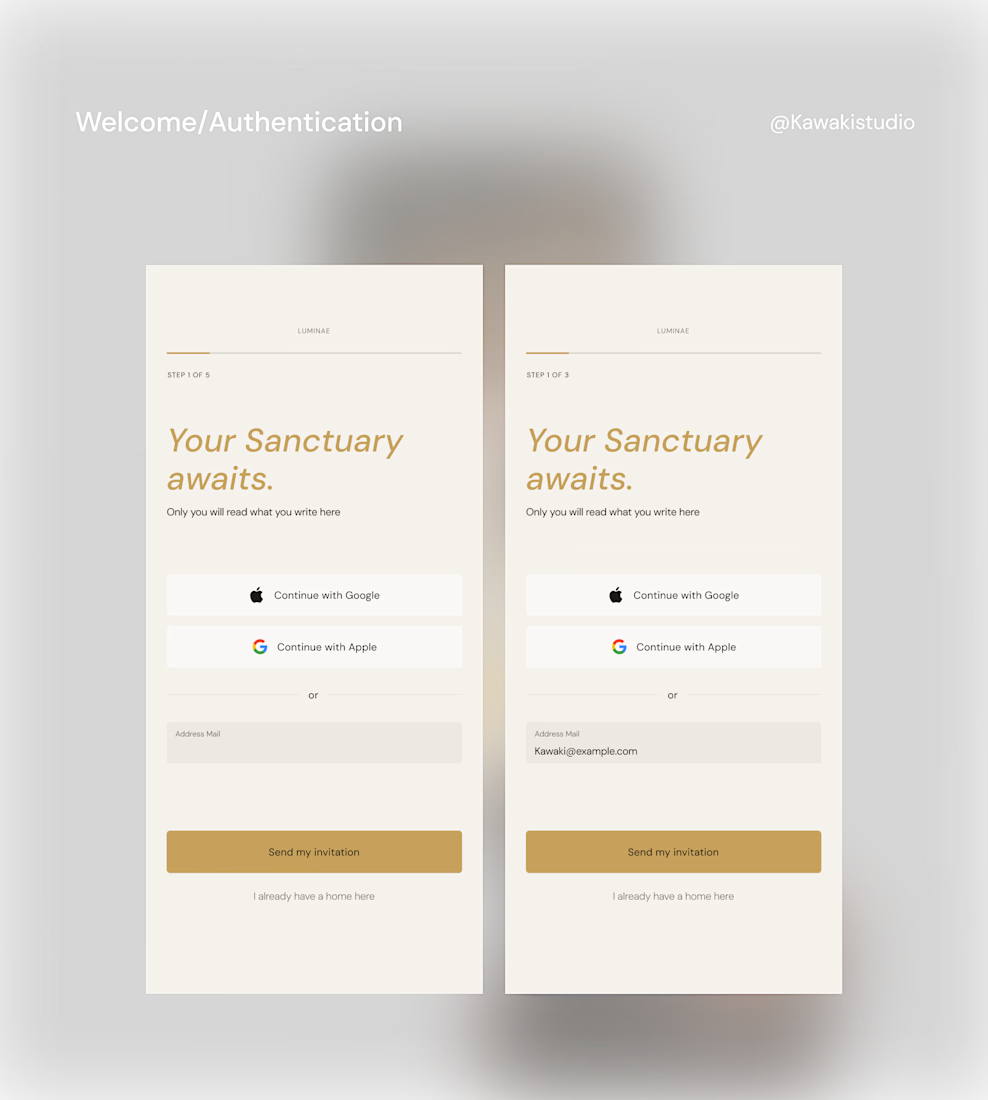
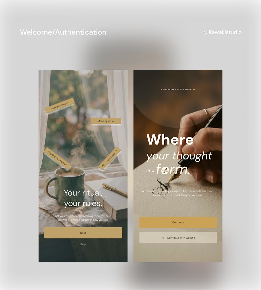
Here is how I designed the onboarding for Luminae to earn that attention.The first screen doesn't explain the product. It makes you feel something. Because the right atmosphere earns the next tap more reliably than any feature list ever will
This is where most premium apps betray themselves: Authentication.
Three beautiful welcome screens then a sterile white form, a grey placeholder, and a blue submit button. The brand disappears in a single transition.
Luminae doesn't do that.
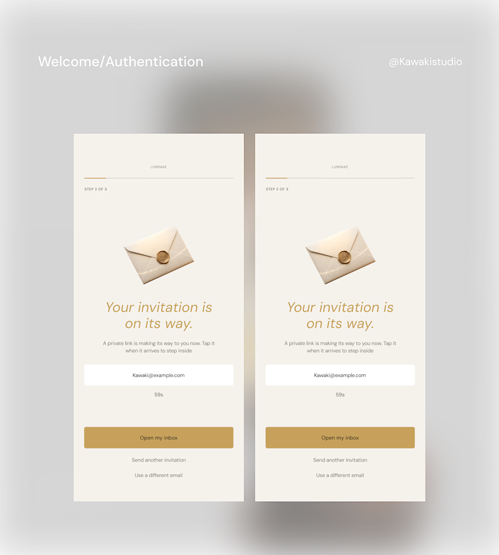
No passwords. No friction on day one. Instead a magic link. One tap.
An email that arrives feeling like a private invitation rather than a system notification.
Because in a minimalist app, the copy isn't just a detail. It’s the product.
This is what separates an app people download from an app people return to.
It's the feeling that someone actually thought about what it would be like to be you, using this, for the first time.
Building something and want this standard of care? My details are open

The network for creativity
Join 1.25M professional creatives like you
Connect with clients, get discovered, and run your business 100% commission-free
Creatives on Contra have earned over $150M and we are just getting started
Trending

Claude
Claude has entered the design space. How are you using Claude Design?

Contra University
Learn from expert creatives how to earn more using next-gen AI tools.
creativeaiflow
Creative AI workflows are evolving. What tools do you use, and what are their strengths and weaknesses?
freelancerlife
Freelancer life is wins, pivots, and everything in between. What’s yours right now?











Related posts

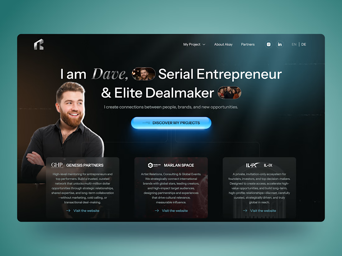
🚀 Personal Brand Website for Entrepreneur | UI/UX Case Study
Building a personal brand online is about more than just having a website — it's about creating trust from the very first interaction.
For this concept, I designed a modern personal brand website for an entrepreneur and dealmaker, combining a bold visual style with a clean user experience. The goal was to showcase credibility, highlight partnerships, and guide visitors naturally toward meaningful connections.
✨ Project highlights:
• Clean and modern UI with a premium aesthetic
• Personal branding focused homepage
• Responsive website design
• Strategic content hierarchy
• Partner & portfolio showcase
• Contact section with clear CTA
• Mobile-first experience
• Dark interface with vibrant accent colors
Always enjoy designing websites where personality and business goals come together in one cohesive experience.
💬 I'd love to hear your thoughts!



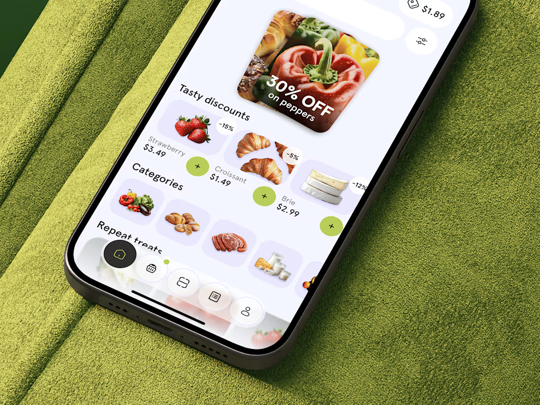
Just shared food delivery app concept 🥐 What do you think?



This looks fantastic. Which stage of the process was the most challenging?

Most websites look good.
Few make people stop, trust, and take action.
This landing page was designed with one goal: clarity over complexity.
Every section has a purpose:
- Clear visual hierarchy
- Generous whitespace
- Clean, modern UI
- Scalable components
Good design isn't about adding more,it's about removing what doesn't help users.
I'd love to hear your thoughts:
What part of a landing page has the biggest impact on conversions?
If you'd like, I can also make it more viral, designer-focused, or client-attracting.


Weldone ☀️ 💖