The network for creativity
Join 1.25M professional creatives like you
Connect with clients, get discovered, and run your business 100% commission-free
Creatives on Contra have earned over $150M and we are just getting started




The network for creativity
Join 1.25M professional creatives like you
Connect with clients, get discovered, and run your business 100% commission-free
Creatives on Contra have earned over $150M and we are just getting started





Related posts

Graphic design
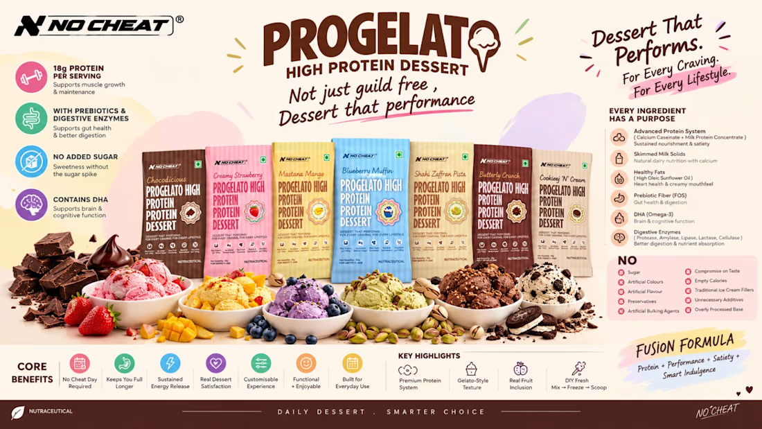

Typography on point! Really inspiring work.

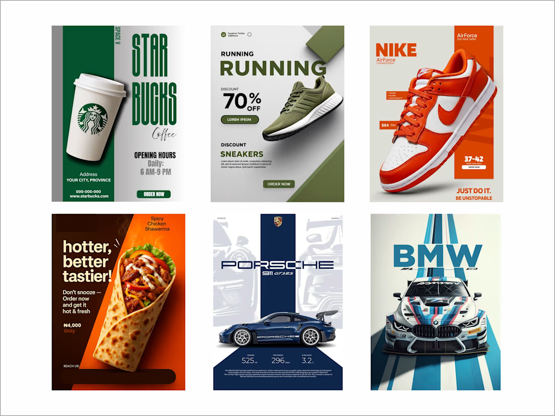
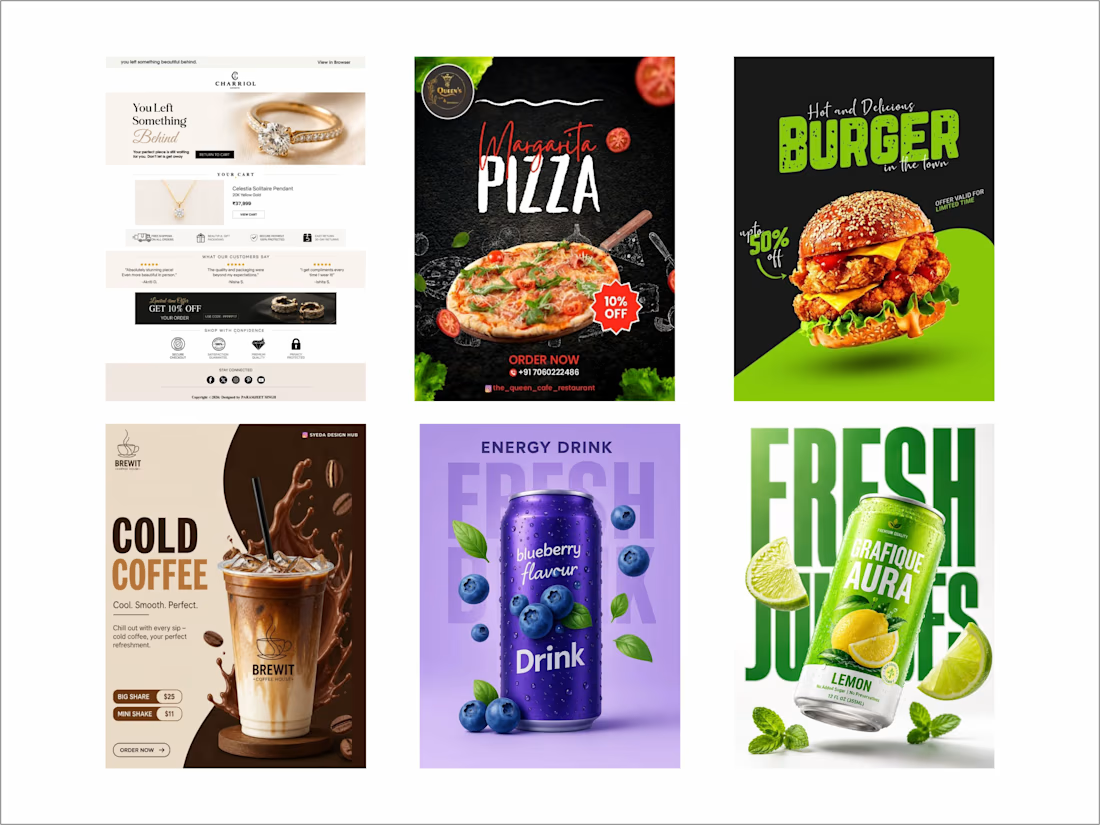
Social Media Post Design
Professional and engaging social media post designs created to strengthen brand identity and capture audience attention. I combine attractive visuals, effective typography, colors, and clear layouts to create impactful content for Instagram, Facebook, LinkedIn, and other digital platforms.



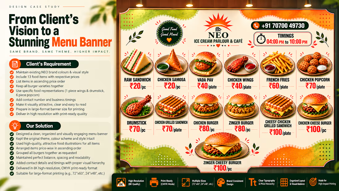
Turning a client’s requirement into something that actually works.
🎨Recently, we got the opportunity to work on a large-format menu banner for NEO Ice Cream Parlour and Café.
The brief sounded simple ,showcase the complete menu, prices and food items in an attractive way. But, the real challenge was making multiple food items, different price points, brand elements and contact information fit together without making the design feel crowded. So, we focused on keeping the existing NEO colour palette and visual identity, while improving the hierarchy, spacing, food representations and overall readability. The final design was prepared with large-format printing in mind, with high-resolution visuals, CMYK workflow and an 8K-quality output. What we enjoyed most about this project was finding the balance between visual appeal and practical communication because a menu shouldn't just look good, it should also make it easy for someone to understand what they're getting and how much it costs. A small reminder for myself from this project: Good design isn't about adding more. Its about making every element work together.
Would love to know what you think about the final execution. 👀
#GraphicDesign #MenuDesign #PrintDesign #Branding #FoodBranding #LargeFormatDesign #VisualDesign #GraphicDesigner #DesignProcess #CMYK #8KDesign #RestaurantBranding