The network for creativity
Join 1.25M professional creatives like you
Connect with clients, get discovered, and run your business 100% commission-free
Creatives on Contra have earned over $150M and we are just getting started
Back to feedPost

Final FONTI cleanup:
Cleaner edit constraints, Layout templates (wordmark → poster), Tracking and leading dials, Text history scrub, Typewriter haptics, and Home screen specimen widget.
Had loads of fun with the layout animations.


The network for creativity
Join 1.25M professional creatives like you
Connect with clients, get discovered, and run your business 100% commission-free
Creatives on Contra have earned over $150M and we are just getting started





Related posts


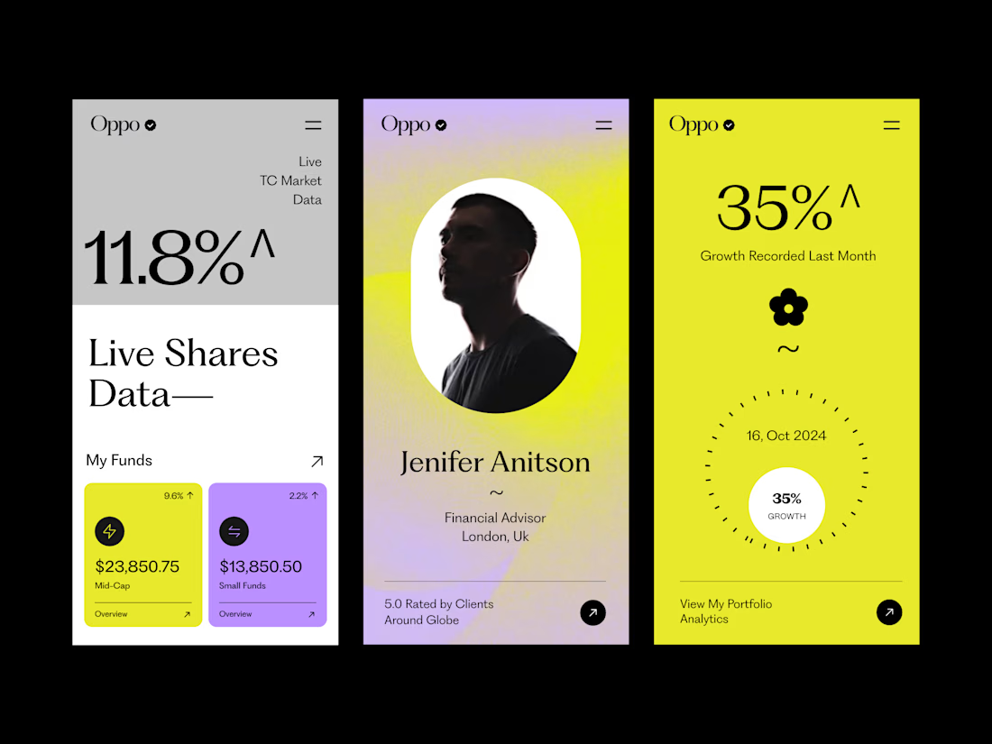
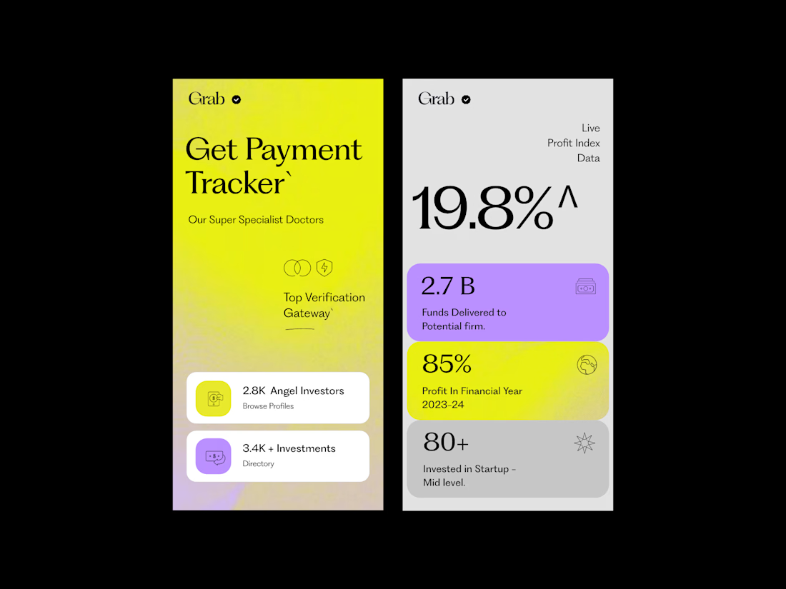
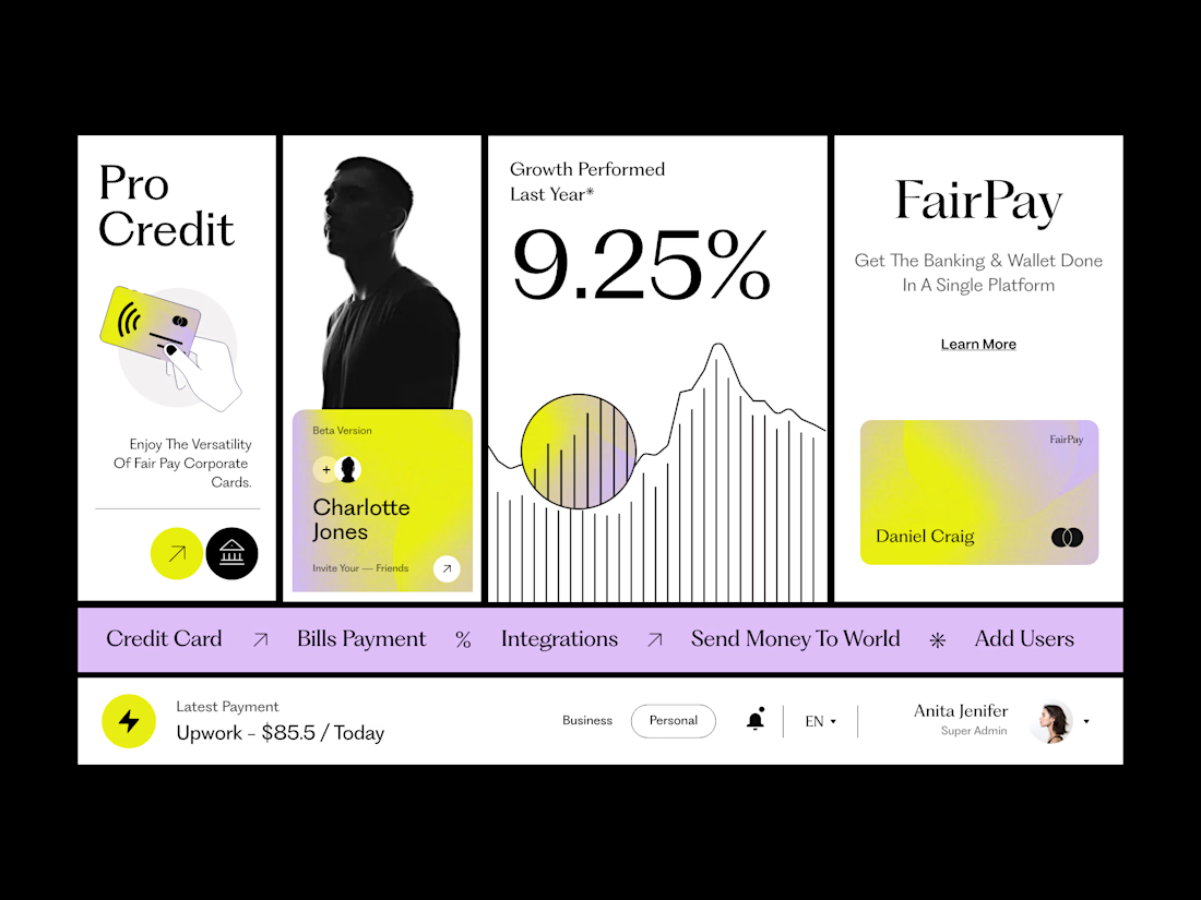
The typography is doing most of the heavy lifting here. The large type, strong contrast, and simple font choices give the screens a very confident look.
The oversized numbers and headlines create an immediate focal point, while the smaller text is kept simple so it doesn’t compete. The different type sizes create a clear hierarchy, making it easy to understand what to look at first and what to read next.
What makes it work is that the typography isn’t trying too hard. There are no unnecessary font styles or excessive weights — just the right scale, line height, and spacing between elements.
That simplicity is what makes the overall design feel premium, modern, and well considered.


Clean work !


This is amazing... I would love to see the final, please. 😍


Well done