The network for creativity
Join 1.25M professional creatives like you
Connect with clients, get discovered, and run your business 100% commission-free
Creatives on Contra have earned over $150M and we are just getting started
Back to feedPost

Fuel Delivery App
Preview description
A modern fuel delivery app designed to make ordering, tracking, and managing fuel deliveries simple, clear, and intuitive.
Project Overview
Designing a simpler way to order fuel
This project explores the design of a digital fuel delivery experience focused on making fuel ordering more convenient and easier to manage.
The goal was to create a clean, intuitive interface that guides users through the entire delivery journey—from discovering available fuel options and placing an order to tracking the delivery and managing their account.
I focused on creating a practical product experience where important information is easy to understand and key actions are easy to find.
My Role
Product Designer / UI/UX Designer
I worked across the product experience, focusing on:
User interface design
User experience design
Information architecture
User flows
Mobile app screens
Interaction patterns
Visual design
Design system and component exploration
Light and dark mode exploration
The Challenge
Ordering fuel can involve several important pieces of information at once: fuel type, quantity, pricing, delivery details, order status, and payment information.
The challenge was to organize these different parts of the experience into an interface that feels straightforward rather than overwhelming.
The design needed to make the most important actions immediately understandable while still giving users enough information to confidently complete an order.
The Approach
I approached the product by thinking through the experience as a complete user journey rather than designing individual screens in isolation.
I explored the different states and interactions needed across the experience and then translated them into a consistent interface system.
The design process focused on:
01 — Understanding the experience
Mapping out the key actions a user would need to take when ordering and receiving fuel.
02 — Structuring the interface
Organizing information and actions into clear screens and flows so users can move through the experience naturally.
03 — Designing the UI
Creating a clean visual language with strong hierarchy, clear components, and focused interactions.
04 — Exploring product states
Designing different interface states and scenarios to make the experience feel complete and functional.
05 — Refining the experience
Reviewing the screens as a complete product and improving consistency across the interface.
The Design
The final exploration brings together a broad set of screens covering the fuel delivery experience.
The interface uses clear hierarchy and structured layouts to help users quickly understand what is happening and what they can do next.
I also explored both light and dark UI themes, allowing the product to maintain its visual language across different presentation modes.
Key UX Considerations
Clear ordering flow
The ordering experience is structured around the information users need to make a decision and complete a fuel delivery request.
Delivery visibility
Delivery-related screens are designed to keep users informed about the progress and status of their order.
Consistent components
Repeated interface elements and patterns help create familiarity as users move through different parts of the product.
Practical information hierarchy
Important information is prioritized so users can scan screens quickly instead of having to interpret dense interfaces.
Responsive product thinking
The screens were designed as part of a broader digital product system rather than as isolated visual concepts.
Visual Direction
The visual direction is intentionally clean and functional.
The interface combines strong typography, structured layouts, prominent actions, and a controlled color system to create a product that feels modern without sacrificing usability.
The exploration of light and dark themes also demonstrates how the visual system can adapt while maintaining consistency.
Outcome
The result is a comprehensive UI/UX exploration for a fuel delivery product, covering the experience from ordering through delivery and account-related interactions.
Rather than focusing only on individual screens, the project demonstrates how I approach digital products as connected experiences—with attention to usability, visual consistency, interaction states, and real-world functionality.
What I Delivered
UI/UX design
User flows
Mobile app interface
High-fidelity screens
Interaction states
Light mode exploration
Dark mode exploration
Component and UI pattern exploration
End-to-end product experience
Tools
Primary tool: Figma
Other tools: Add any additional tools actually used on the project.
Skills
UI Design
UX Design
Product Design
Mobile App Design
Interaction Design
User Flows
Wireframing
Prototyping
Design Systems
Visual Design
Responsive Design
Industry
Transportation & Logistics
Potential secondary industry:
Energy.

The network for creativity
Join 1.25M professional creatives like you
Connect with clients, get discovered, and run your business 100% commission-free
Creatives on Contra have earned over $150M and we are just getting started


Trending
retrofuturism
Share your favorite designs from the past exploring the distant future. Or your own take on the aesthetic 🚀
halftone
Dots. Texture. Grain. Let's see your designs using the halftone technique.

Midjourney
Creatives are showing off what they're making with Midjourney.
colorgrade
Video editors sound off: How do you enhance the mood of your video in color grading?
Related posts


we are working on two framer templates in parallel
hero interaction magic ✨


Great work on animations

When building a fashion brand identity, most designers start with the logo.
We usually do too. It feels like the natural anchor point.
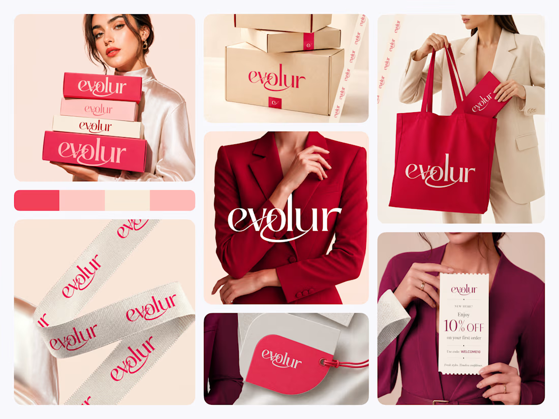
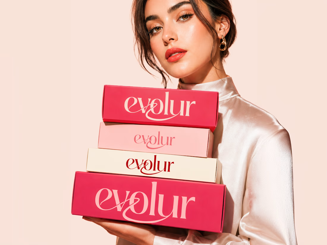
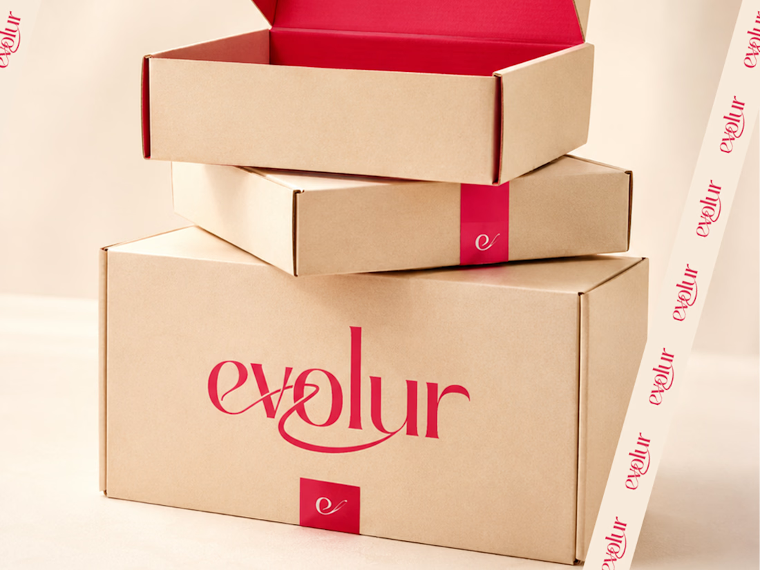
But when we worked on Evolur, we started with the touchpoint that gets touched last the packaging.
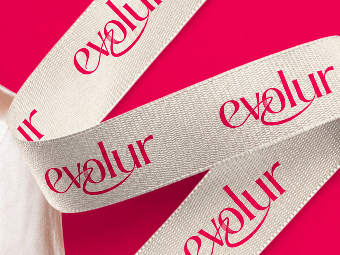
Because for a fashion label, the unboxing moment is the brand. The first impression doesn't happen on Instagram. It happens when someone pulls a ribbon-wrapped box out of a delivery bag.
So we built the identity outward from there. The wordmark came from asking what needed to look right on a swing tag at 2cm and on a tote bag at full size simultaneously. The crimson and blush palette came from asking what felt confident on kraft shipping boxes without needing a campaign photo around it.
This is what fashion branding looks like when every detail is treated like the hero shot.
What we noticed was that designing for physical touchpoints first made every digital decision easier. The hierarchy was already solved. The personality was already clear.
"Fresh styles. Timeless confidence." The brand found its own tagline by the end.
Does this feel like a brand worth wearing? 👇

Amazing branding

Designed a modern Finance Mobile App.
Soft gradient UI with balance overview, quick actions (Send, Top Up, Receive), recent transactions, and a smooth money transfer experience.


The soft gradients work really well here. Clean UI without making the finance side feel too serious.