The network for creativity
Join 1.25M professional creatives like you
Connect with clients, get discovered, and run your business 100% commission-free
Creatives on Contra have earned over $150M and we are just getting started
Back to feedPost
NOOR — Logo System Direction
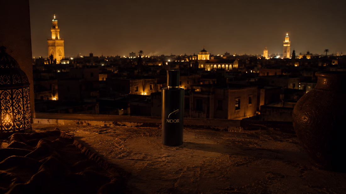
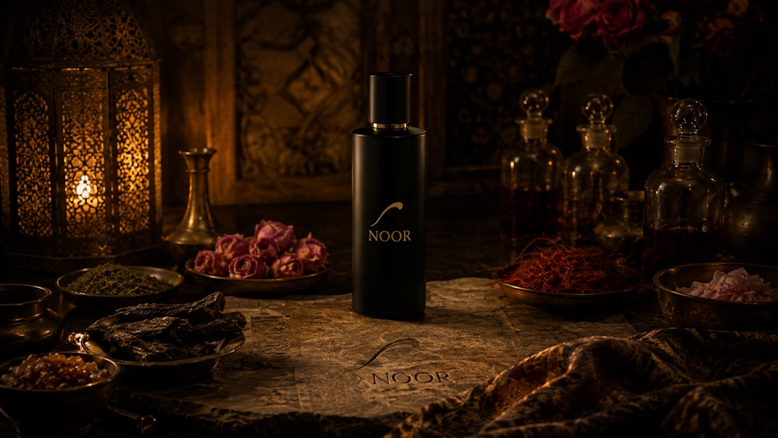
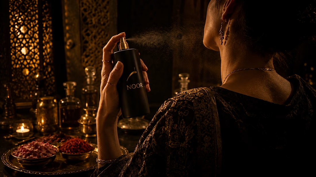
NOOR (نور) is a luxury Middle Eastern fragrance house built at the intersection of ancient trade route ingredients — Hindi oud, Kashmiri saffron, Turkish pre-dawn rose — and complete contemporary confidence. The logo system brief had one mandate: the mark must feel ancient and inevitable simultaneously. As if it was always the correct mark, and the designer merely found it.
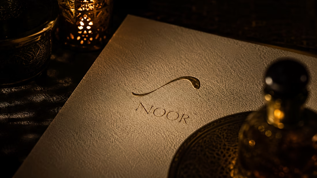
The mark originates in the Arabic letterform ن (Nun) — first letter of نور. A single horizontal stroke, a curved vessel beneath it, a singular point of light above. Line. Cup. Light. The complete philosophy of the brand in one geometry. The system covers six variants across seven specifications: primary lock-up, horizontal lock-up, symbol-only, monogram — all with a non-negotiable rule that the symbol on packaging is never printed flat. Blind-embossed, foil, debossed, etched. The mark arrives as physical sensation before visual recognition.
The brief introduces a Logo System Specification section — seven entries from mark concept to application standards — alongside a statement-rhythm identity layout, 4-column brand world grid, dramatic single-column visual bible, and a centered manifesto prompt. The document is midnight and gold, candlelit, nocturnal.
Creative Direction — M N LOKESHWAR REDDY
Link to the full project:
https://www.behance.net/gallery/250676777/NOOR-Logo-System-Direction
The network for creativity
Join 1.25M professional creatives like you
Connect with clients, get discovered, and run your business 100% commission-free
Creatives on Contra have earned over $150M and we are just getting started
Related posts
Been away for a while working on some big brand strategy projects 🥹
So excited to share a peek at one of my recent branding + packaging projects:
Maji is a specialty coffee brand dedicated to sourcing and roasting exceptional single-origin coffees from across Africa.
Let me know if you like it!!
Lovely!
Project name: KAPKAT | 1920s Soviet Era
For this CapCut Design Studio Challenge I reimagined CapCut brand in a different era.
KAPKAT It is a Creative Factory/ Agency from 1920s Soviet Russia combined with the claymation style that was also having it's first moments around those times.
With the help of Design Studio I created claymation style environment matching the aesthetic of the actual Soviet streets and buildings as well as themed posters that encourage citizens to come join the Creative Factory as well as to just be creative on their own.
This is not about gaining power- it's about bringing the best ideas out of the best creatives to deliver the best results to clients.
Enjoy!
This is Brilliant!
PIXEL PERFECT MONDAY < PIXEL PERFECT SUMMER 😂
This is Superb!
Challenges
View allTrending
Claude
Claude has entered the design space. How are you using Claude Design?
Contra University
Learn from expert creatives how to earn more using next-gen AI tools.
MagicPath
The canvas is infinite, and exploration is becoming the workflow. How are you using MagicPath?
creativeaiflow
Creative AI workflows are evolving. What tools do you use, and what are their strengths and weaknesses?
freelancerlife
Freelancer life is wins, pivots, and everything in between. What’s yours right now?