The network for creativity
Join 1.25M professional creatives like you
Connect with clients, get discovered, and run your business 100% commission-free
Creatives on Contra have earned over $150M and we are just getting started
Back to feedPost
Taste Test
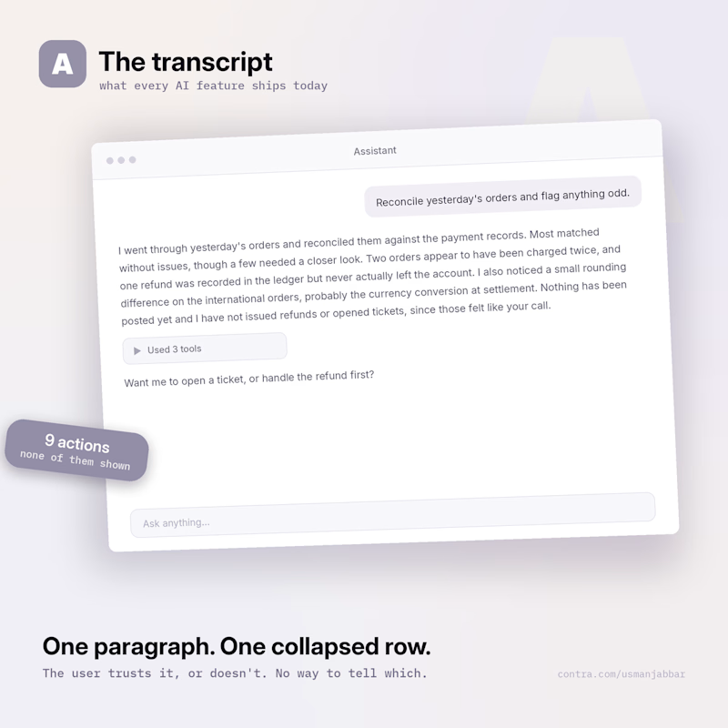
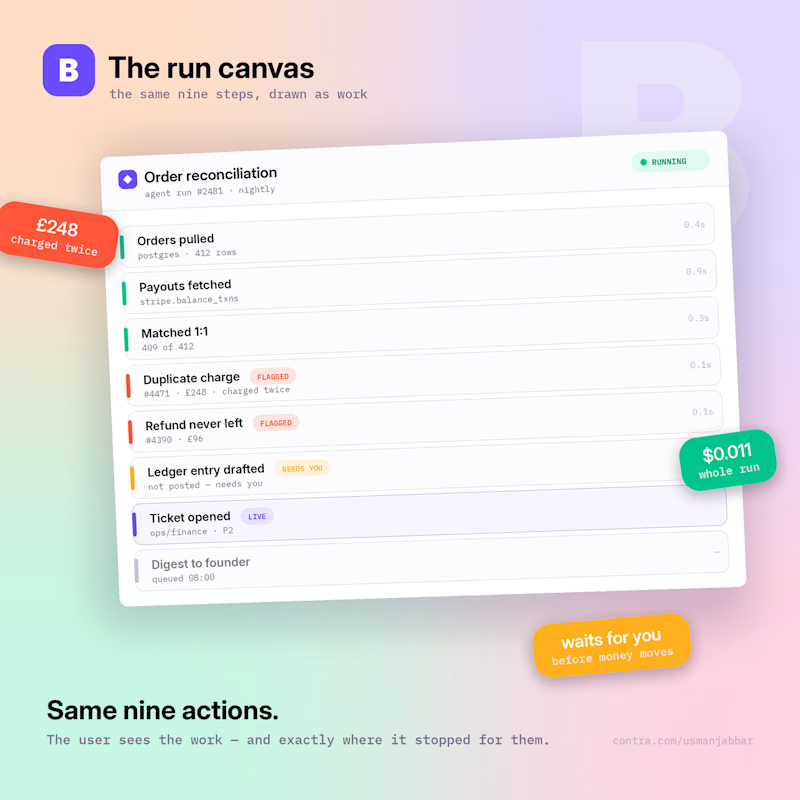
Your AI agent just did 9 things: pulled 412 orders, matched them to Stripe, caught a duplicate £248 charge, drafted a ledger entry, opened a ticket. Whole run cost $0.011.
Now the real design question — what does the user actually SEE?
A — The transcript. A paragraph of text and a collapsed "Used 3 tools".
B — The run canvas. Nine colour-coded rows: what ran, what it cost, what got flagged, and one step that stops and waits for you before money moves.
Same agent. Same run. Two completely different products.
Vote A or B — and tell me why. I build the B version for a living.
0 voted
0%
1 voted
100%
1 vote
Closed

Wow! So beautiful and professional work!👌


Thank you. Curious which way you'd actually vote though — A or B? The bit I keep going back and forth on is whether that "waits for you" row belongs inside the run at all, or should sit somewhere separate so it can't be scrolled past.

Nice framing—showing the workflow makes the handoff clearer than a generic “AI agent” pitch. I’m testing the same narrow qual + capture approach for after-hours leads; notes here if useful: https://contra.com/s/ercc3omA-ai-voice-agent-pilot-lead-qual-booking-and-capture
Run canvas wins for operations because it makes state and cost visible. I’d add one more row for human approval and a clear retry/idempotency key before any money-moving action. That keeps the speed without turning a duplicate-charge edge case into a support fire drill.
The network for creativity
Join 1.25M professional creatives like you
Connect with clients, get discovered, and run your business 100% commission-free
Creatives on Contra have earned over $150M and we are just getting started





Related posts

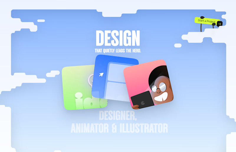
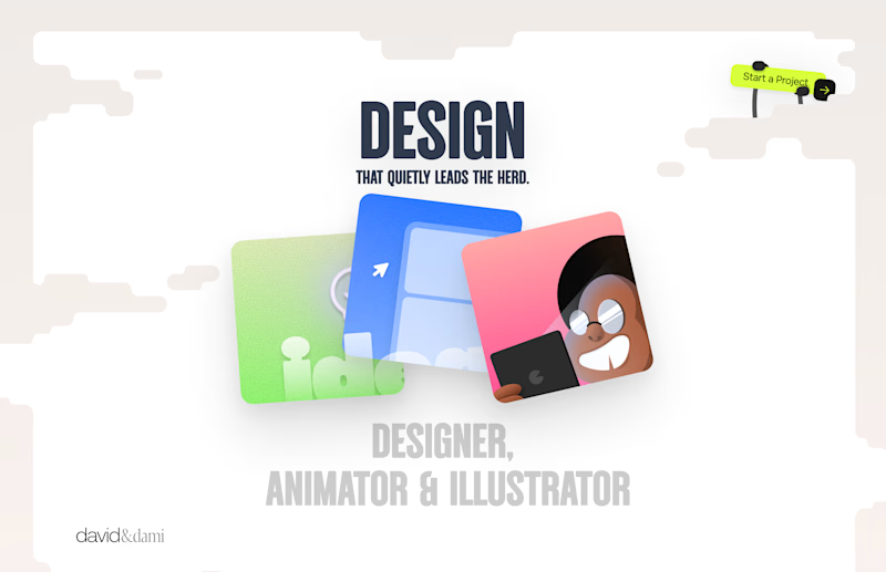
Should I go for left or right? Focusing on updating and finishing up my portfolio... and then I came across this crossroads. Another alternative is to make them switchable themes through a toggle, but I still need to decide which should be the default.

27 voted
75%
9 voted
25%
36 votes
Closed

Left is better because the text is readable, the overall blue background is not flashing to the eyes as compared to the right one.
For the top right button " Start a project ", you can add some animation so that it stands out and encourage users to click on it.


Collage

This year, I worked on a mental health app where I explored using water to represent brainwaves and quality sleep.
I think it communicates the idea much better than the typical green energy orb. 🌊
What do you think?
27 voted
43%
36 voted
57%
63 votes
Closed

Love the energy orb. which one is your pick here?