The network for creativity
Join 1.25M professional creatives like you
Connect with clients, get discovered, and run your business 100% commission-free
Creatives on Contra have earned over $150M and we are just getting started
Back to feedPost

It's live, get the FREE remix link right here :
https://framer.link/XRNDcCK

framer.link
Heal Learning: Free Blog Website Template by Milo Garcia
Showcase your programs — Heal Learning by Milo Garcia — explore this Framer Template on the Framer Marketplace and customize it in Framer’s no-code website builder.

I am currently working on getting my Framer template approved !
My idea was to create a tool that would enable small-scale coaches and trainers who have just...
The network for creativity
Join 1.25M professional creatives like you
Connect with clients, get discovered, and run your business 100% commission-free
Creatives on Contra have earned over $150M and we are just getting started




Related posts

no-code.supply is open.
I've been quietly building landing page templates. Six are out today, each with its own brand, its own type pairing and one interaction it's built around:
→ Aurel: a skincare brand with a WebGL serum drop that bulges toward your cursor
→ Ferro Type: a type foundry where the hero word bends its weight and width under the pointer
→ Meridian Expeditions: contour maps that redraw themselves as you switch routes
→ Oda: an architecture studio whose timber cabin draws itself, with a live sun study
→ Relay: a dev tool where the editor types a workflow and the run graph executes it live
→ Signal: a mission-control SaaS with a live infrastructure graph that contains threats as they flare
Built to be edited with AI. Every template ships with a README, a DESIGN.md and an AGENTS.md, so Claude, Cursor or whatever assistant you use changes it the way it was built, not the way it guesses.
Pricing, per template:
• HTML: $29
• React: $59
• Bundle (HTML + React): $79
Or get All-Access for $169: all six templates, both editions, plus every future drop. Nine more are on the way, at no extra cost.
No page builder, no lock-in, no third-party requests.
If you build sites for clients, I'd love to hear which one you'd use first.


Ferro Type is the one I would open first. Bending a variable font under the pointer re-lays out the text every frame, which is a much bigger bill than it looks, and stepping the weight in a few fixed increments is usually what keeps it smooth on a laptop that is not plugged in....

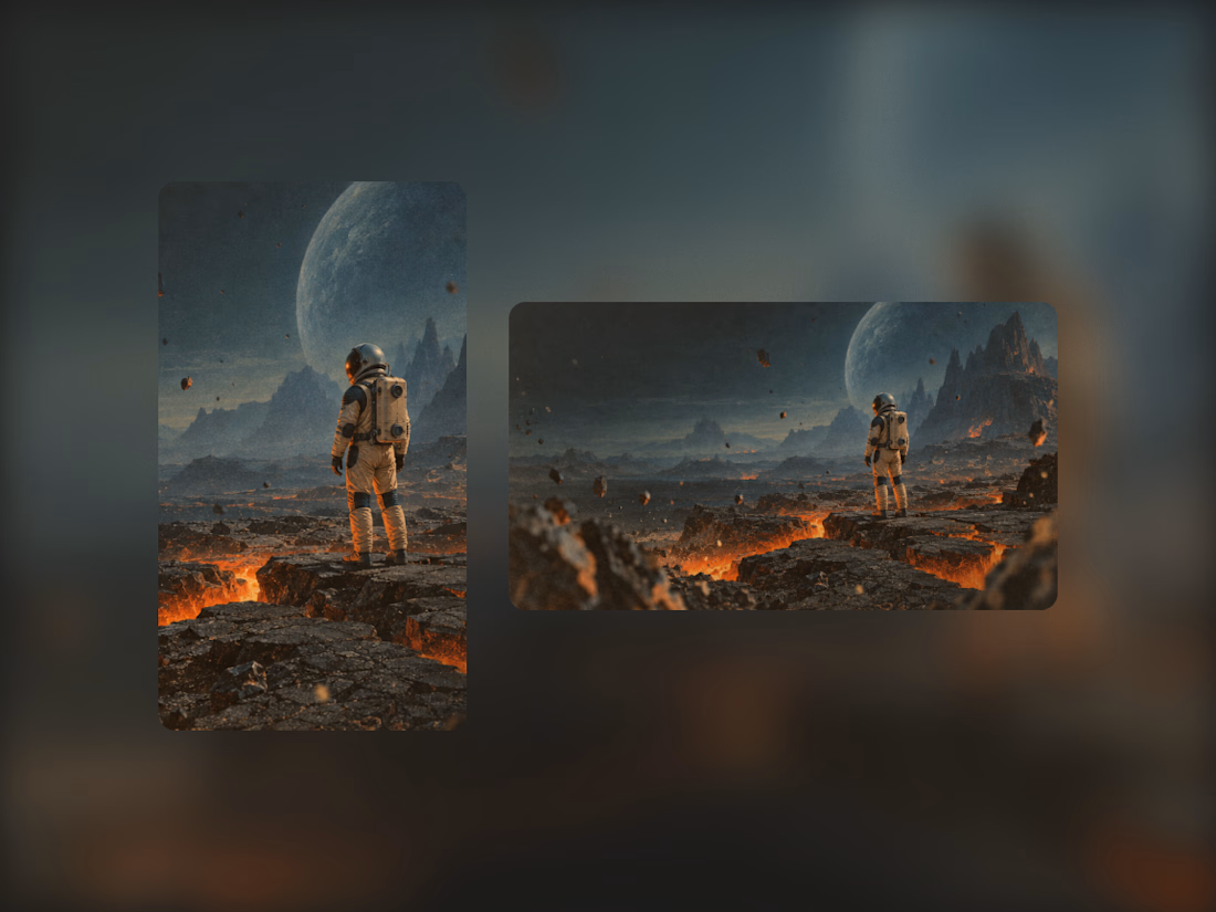
Exploring the visual identity for my first Framer template. I really like this combination of cool and warm colors, so I might follow this direction :)



Built this Framer site from scratch.
The interesting part wasn't the design.
It was building this team section with a flipping interaction and full-card expansion on hover.
Here's the final result.

Agree that the build is the fun part here. What did you end up leaning on for the expand, Framer's native variants and hover states, or did you have to drop into a code component to get it that smooth?