The network for creativity
Join 1.25M professional creatives like you
Connect with clients, get discovered, and run your business 100% commission-free
Creatives on Contra have earned over $150M and we are just getting started
Back to feedPost
✅😉
RECOMMENDED
“Have worked with Angel many times - he delivers high quality work efficiently and with excellent communication every time.”
Thomas Punch
AvalonThe network for creativity
Join 1.25M professional creatives like you
Connect with clients, get discovered, and run your business 100% commission-free
Creatives on Contra have earned over $150M and we are just getting started
Related posts
💓
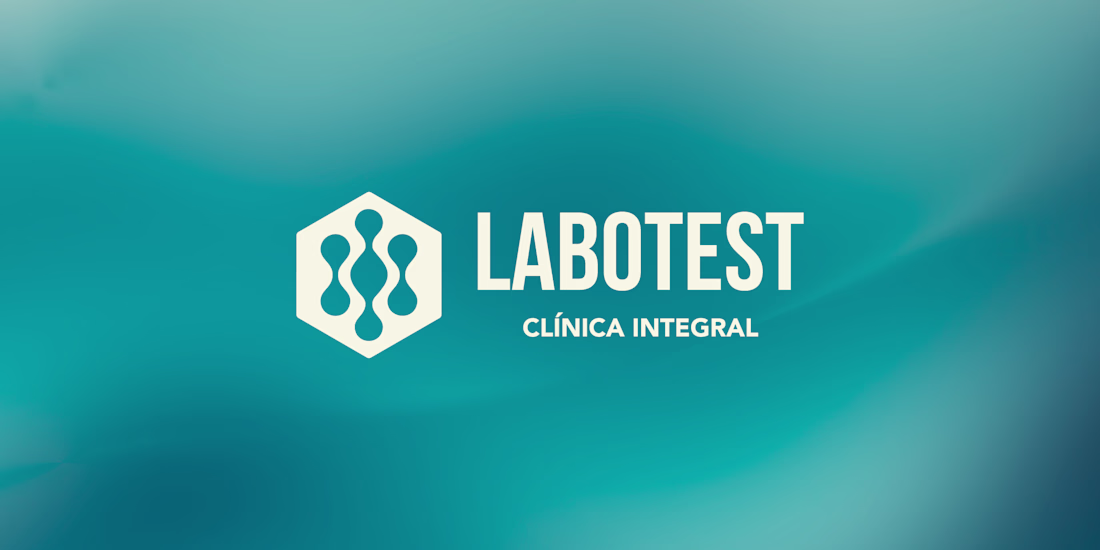
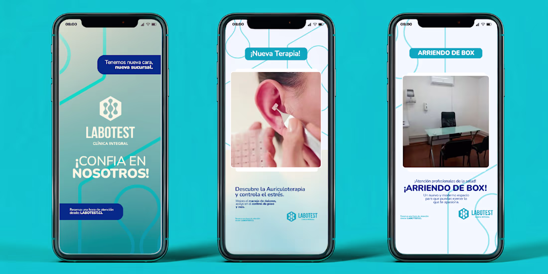
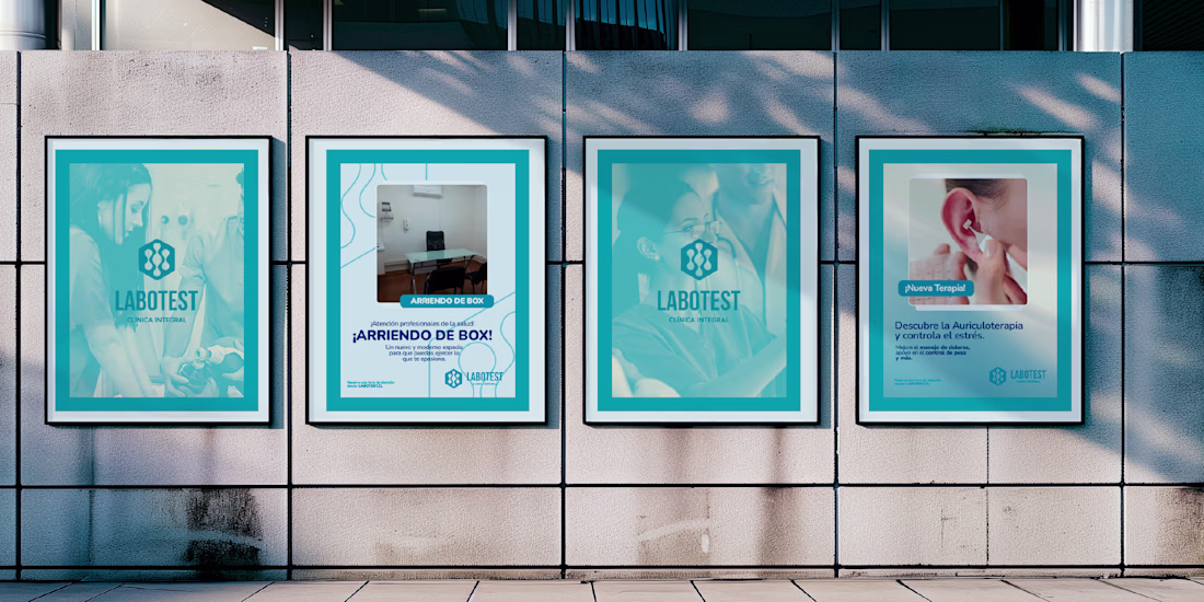
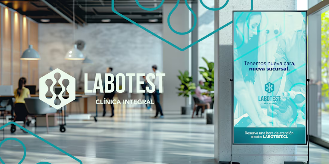
Labotest is a local Chilean healthcare company experiencing steady growth, now expanding across three regions of the country. The opening of its new branch presented the perfect opportunity to unify and modernize its visual identity.
This project is more than a rebrand — it’s a...
𝗦𝘂𝗰𝗰𝗲𝘀𝘀 𝗜𝘀 𝗕𝘂𝗶𝗹𝘁 𝗼𝗻 𝘁𝗵𝗲 𝗗𝗲𝗰𝗶𝘀𝗶𝗼𝗻𝘀 𝗬𝗼𝘂 𝗠𝗮𝗸𝗲 𝗧𝗼𝗱𝗮𝘆
Every successful business is the result of thousands of small decisions made consistently over time.
The decision to improve.
The decision to learn.
The decision to adapt.
The decision to serve customers better.
These choices may not seem significant in the moment, but they shape the future of a business.
The start of a new week is an opportunity to make decisions that move you closer to your goals.
You don't have to change everything overnight.
Just commit to making one meaningful improvement today.
Small actions, repeated consistently, create extraordinary results.
Wishing everyone a productive and successful week ahead!
𝗪𝗵𝗮𝘁'𝘀 𝗼𝗻𝗲 𝗱𝗲𝗰𝗶𝘀𝗶𝗼𝗻 𝘆𝗼𝘂'𝗿𝗲 𝗺𝗮𝗸𝗶𝗻𝗴 𝘁𝗵𝗶𝘀 𝘄𝗲𝗲𝗸 𝘁𝗵𝗮𝘁 𝘆𝗼𝘂𝗿 𝗳𝘂𝘁𝘂𝗿𝗲 𝘀𝗲𝗹𝗳 𝘄𝗶𝗹𝗹 𝘁𝗵𝗮𝗻𝗸 𝘆𝗼𝘂 𝗳𝗼𝗿?

Trending
Claude
Claude has entered the design space. How are you using Claude Design?
Contra University
Learn from expert creatives how to earn more using next-gen AI tools.
MagicPath
The canvas is infinite, and exploration is becoming the workflow. How are you using MagicPath?
creativeaiflow
Creative AI workflows are evolving. What tools do you use, and what are their strengths and weaknesses?
freelancerlife
Freelancer life is wins, pivots, and everything in between. What’s yours right now?