The network for creativity
Join 1.25M professional creatives like you
Connect with clients, get discovered, and run your business 100% commission-free
Creatives on Contra have earned over $150M and we are just getting started
Back to feedPost



The network for creativity
Join 1.25M professional creatives like you
Connect with clients, get discovered, and run your business 100% commission-free
Creatives on Contra have earned over $150M and we are just getting started



Related posts

BRF - Sadia
Designed an email marketing package to optimize engagement and conversions. Focused on clear messaging, strategic automation, and a seamless user experience.

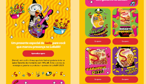

The bold yellow and pink with the illustrated character is impossible to skim past, and the product cards keep the offer clear. How do you keep such a loud style readable on mobile?

Your customers want more than just a product picture. They want information that helps them make a confident buying decision.
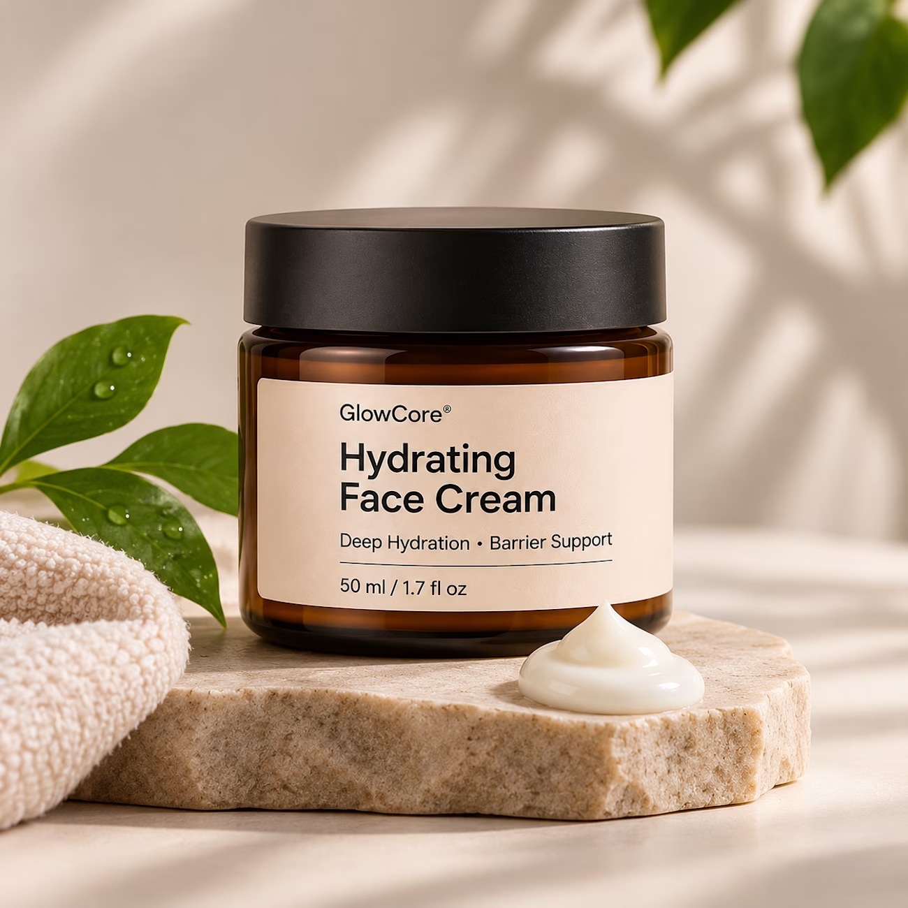
For a skincare product, they want to know:
✨ What's in it?
✨ What benefits does it offer?
✨ How should they use it?
✨ Is it right for their skin type?
Your content should answer these questions before customers even have to ask.
Because good product content doesn't just attract attention. It builds trust and helps turn interest into sales.
Does your content answer the questions customers have before buying?
#ContentStrategy #EcommerceContent #ProductMarketing #Shopify #ContentCreation


Most "where is my order?" emails can be answered by the store itself.
Shopify's new customer accounts let shoppers sign in with an emailed code, track orders, buy again, and start returns.


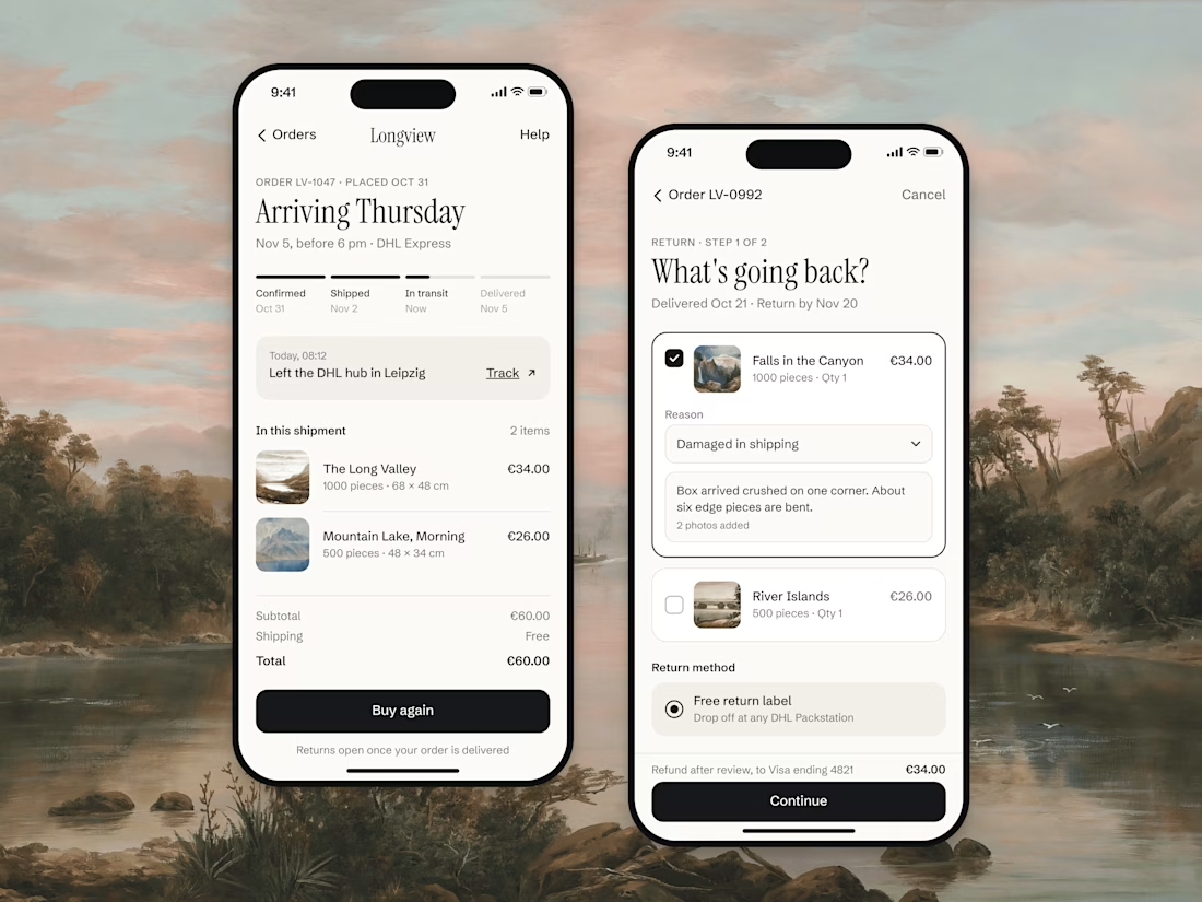
Letting shoppers track orders and start returns themselves kills a lot of support emails before they exist. Do you customize the new accounts pages per brand, or is the default good enough?