The network for creativity
Join 1.25M professional creatives like you
Connect with clients, get discovered, and run your business 100% commission-free
Creatives on Contra have earned over $150M and we are just getting started
Back to feedPost

Just shipped a new handwritten UI theme for Riven Forms.
I wanted to make forms feel less generic, so I built a sketchbook-inspired theme with hand-drawn borders, paper elements, annotations, and a more personal visual style.
The goal: make forms feel more expressive without making them harder to use.
Built with Next.js, React, TypeScript, tRPC, PostgreSQL & Drizzle.
Still experimenting with the product, but I’m really happy with how this one turned out.
Would love to hear what you think.


The network for creativity
Join 1.25M professional creatives like you
Connect with clients, get discovered, and run your business 100% commission-free
Creatives on Contra have earned over $150M and we are just getting started

Challenges
View all


Related posts

Day 10/30 of my hero section challenge.
Today: Ofelia, a spa in Bali.
→ The wordmark sits at eye level, spanning the full width, cutting across the middle of the space. Here the type claims the room, and because the interior is symmetrical and calm, it can take the weight.
→ A high-contrast serif against soft plaster. The architecture is all curves and matte texture, so the type brings the only sharp edges in the frame. Contrast without adding a single element.
10 down, 20 to go. A third of the way.
Template by Hariom, adapted and customized by me. Interior imagery generated with AI.


Contrast without adding a single element is such a clean way to put it. With 20 more of these to go, are you locking the typographic approach per venue type, or is Ofelia's centered serif going to be the constant across the whole 30?

Which of these two website designs do you prefer for Chess club "Dubica"?
I’ve finished the new website and designed two options for review:
Editorial (first image)
Futuristic (second image)
Vote in the comments below and share what you’d change.
Site: http://sahdubica.com/
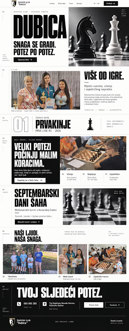
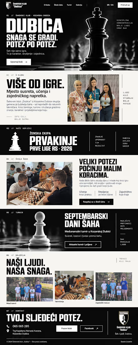

"Šahovski klub Dubica", chess club website
A bilingual static site for a chess club in Bosnia and Herzegovina. Built once, handed over, not maintained.
...

The two directions make the comparison easy to understand, and the editorial option feels especially aligned with a chess club’s sense of heritage and focus.

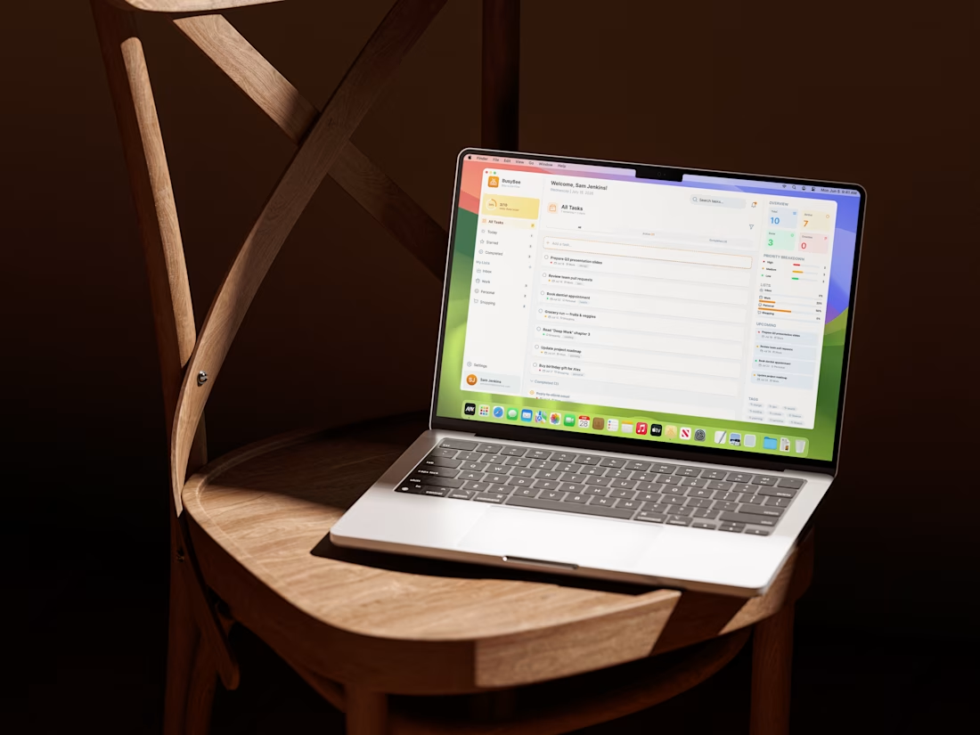
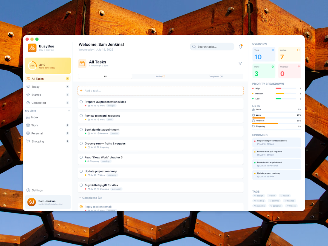
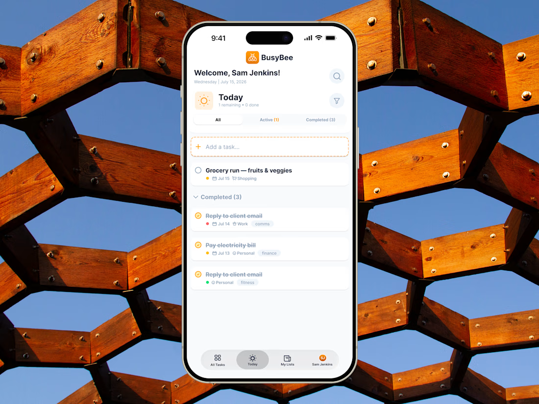
BusyBee is a product design and brand system project built around responsive UI, information hierarchy, and intuitive task management across desktop and mobile.
#shareyourwork #dashboard #uiuxdesign