The network for creativity
Join 1.25M professional creatives like you
Connect with clients, get discovered, and run your business 100% commission-free
Creatives on Contra have earned over $150M and we are just getting started
Back to feedPost

Project title
Bam Music — artist portfolio website
Project description
Bam Music is a fully custom multi-page portfolio website built for a music artist. The goal was to give the artist a professional online home — somewhere fans and industry contacts could discover their work, listen to their music, and get in touch.
I designed and built the entire site using React and JavaScript, including a homepage, an integrated audio player, a portfolio/gallery section showcasing the artist's work, and additional pages for the about and contact sections.
The focus throughout was on clean layout, smooth interactions, and a visual identity that fits the music world — bold but not cluttered, and easy to navigate on any device.
What was built
Custom homepage with hero section and artist branding
Integrated music/audio player for showcasing tracks
Portfolio/gallery section displaying the artist's work
Multi-page structure — about, contact, and more
Responsive design for mobile and desktop
Tech used
ReactJavaScriptNetlify
Live link


The network for creativity
Join 1.25M professional creatives like you
Connect with clients, get discovered, and run your business 100% commission-free
Creatives on Contra have earned over $150M and we are just getting started

Challenges
View all


Related posts

Which brand style fits Yicora?
I'm crafting a brand book for an AI platform targeting for creators.
16 voted
53%
14 voted
47%

30 votes
Closed

A feels more professional great job 🎉🎉

A website should make the product easy to understand.
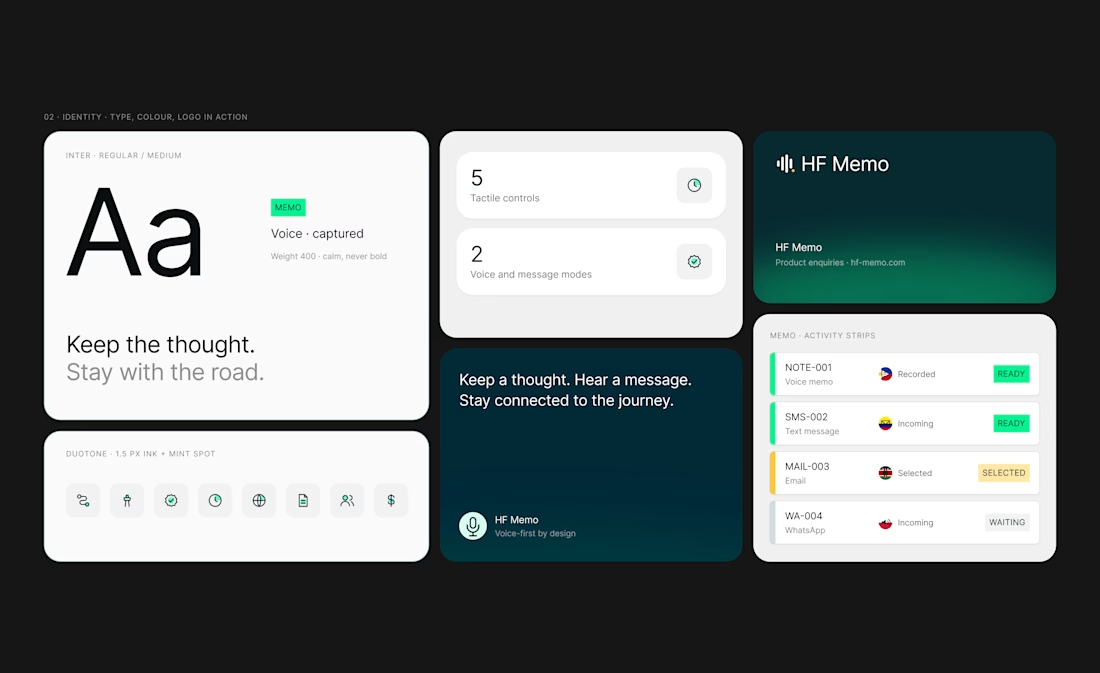
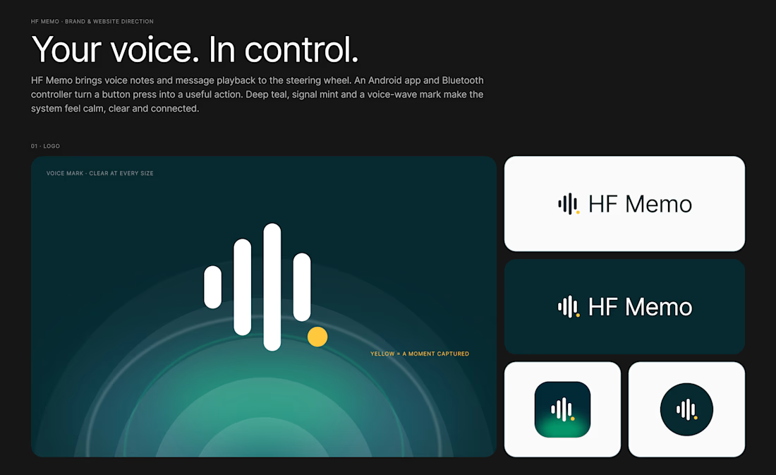
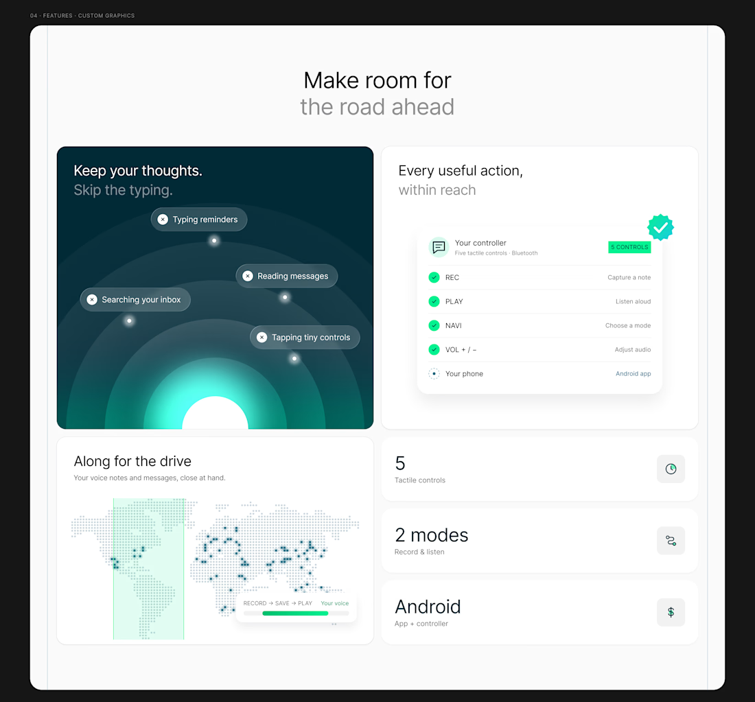
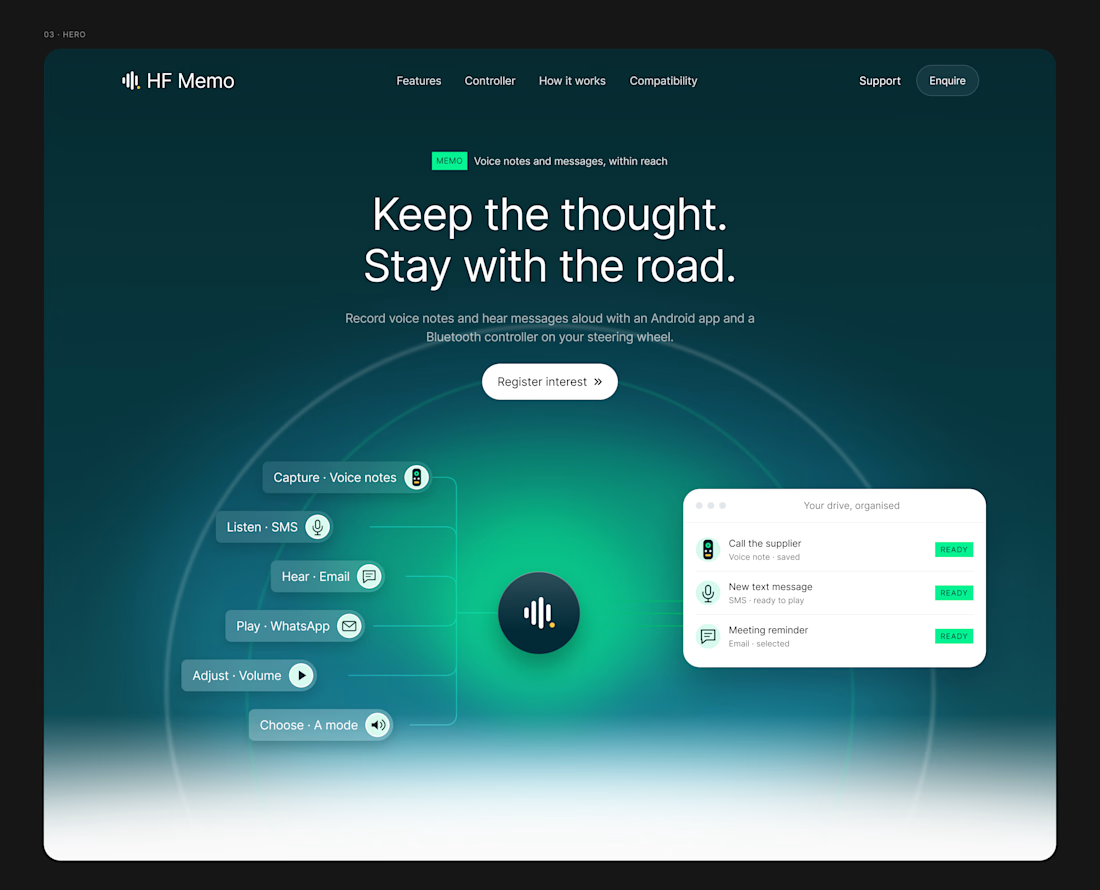
My latest redesign concept explores a new direction for HF Memo—an Android app and Bluetooth controller for recording voice notes and hearing messages aloud.
I focused on showing the experience: capture a thought, replay a recording, and understand what each controller button does.
Clean typography, light backgrounds, and lime accents give the product room to tell its story.
Designed in Figma, with editable layouts and custom graphics.
Have a product that needs a clearer website? Let’s connect.
#webdesign #uidesign #figma #productdesign



This is really amazing!!!


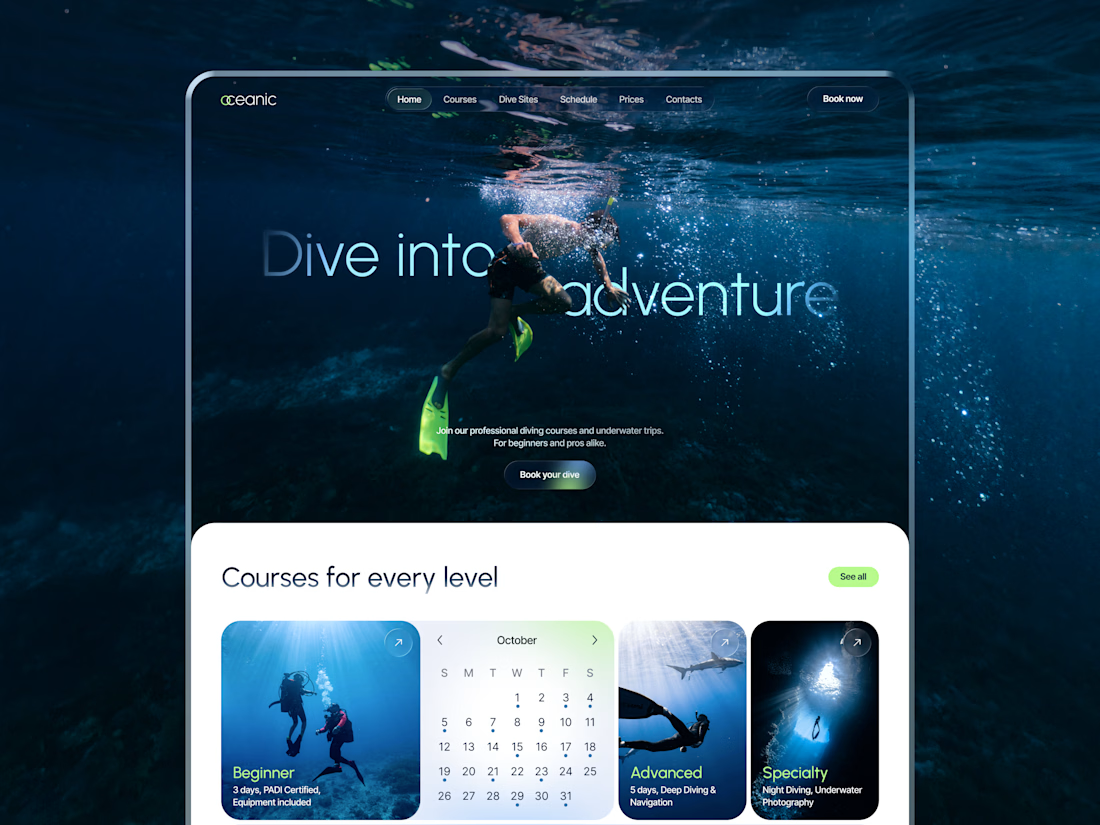
New concept for diving center 🌊
What do you think?