The network for creativity
Join 1.25M professional creatives like you
Connect with clients, get discovered, and run your business 100% commission-free
Creatives on Contra have earned over $150M and we are just getting started
Back to feedPost
How I used Claude to wireframe this Porsche financial slide 🏎️📊
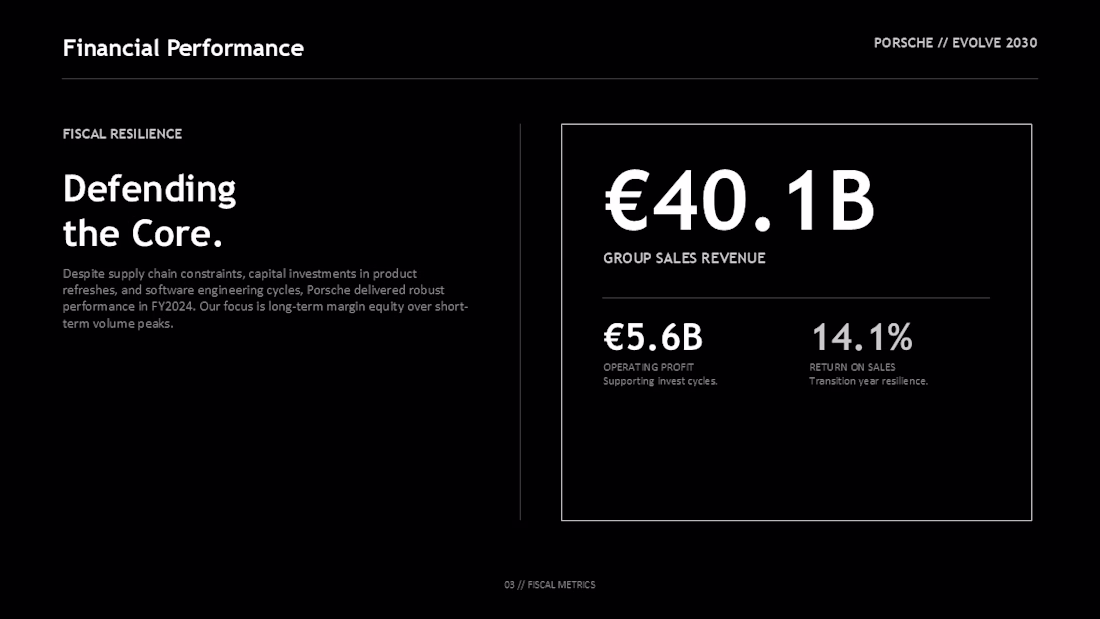
Financial slides in corporate reports are notorious for being boring—usually just cluttered tables or basic bar charts. For my Porsche Annual Innovation Report portfolio concept, I wanted to design a slide that felt like a luxury dashboard: clean, high-contrast, and editorial.
Here is how I used Claude to brainstorm the layout hierarchy and copywriting:
1. The Prompt I used:
"I am designing a financial performance slide for Porsche's annual report. The metrics I need to show are:
Group Sales Revenue: €40.1B
Operating Profit: €5.6B
Return on Sales: 14.1%
I want to avoid standard Excel charts or tables. The theme is 'fiscal resilience' and 'defending the core.' Suggest a clean, high-end editorial layout structure that establishes visual hierarchy for these numbers, and write a brief description to go with them."
2. The Blueprint Claude suggested:
Asymmetric 40/60 Split: Place the editorial context on the left (40% width) under a strong headline: "Defending the Core."
Dashboard-Style container: On the right (60% width), draw a thin, clean bordered box to frame the stats, mimicking a premium car dashboard panel.
Statistical Hierarchy: Make the hero metric (€40.1B) massive at the top of the box. Place the supporting metrics (€5.6B and 14.1%) side-by-side underneath.
3. The Execution:
I took this blueprint directly into PowerPoint. I set a deep dark background (#000000), established clean grid lines, and styled the typography using bold headers to match Porsche's luxury aesthetic.
This is my favorite #creativeaiflow—I don't use AI to write code or do the design for me. I use it as a layout partner to wireframe and establish text hierarchy before I start pushing pixels.
💬 #portfolioreview: What do you think of this dashboard-style layout for financial slides? Would you have styled the container box differently?
Drop your thoughts below, or share a link to your latest portfolio project so I can check out your work! 👇
#creativeaiflow #claude #portfolioreview #presentationdesign #powerpoint
The network for creativity
Join 1.25M professional creatives like you
Connect with clients, get discovered, and run your business 100% commission-free
Creatives on Contra have earned over $150M and we are just getting started
Related posts
Which thumbnail do you think is better for a portfolio?
4 voted
50%
4 voted
50%
8 votes
Closed
First one looks more impressive.
Trying two directions for the same biological age dashboard concept.
One leans slightly more vibrant and energetic, the other feels softer and more premium.
Which one would you choose: Purple or Blue?
5 voted
50%

5 voted
50%

10 votes
Closed
Would choose the blue
🚀 Which mockup grabs your attention the most?
We've transformed our latest website design into two creative presentation styles:
💻 Website Mockup – A premium laptop showcase highlighting the full desktop experience.
📱 Mobile Mockup – A sleek smartphone presentation showcasing the responsive mobile design.
Now it's your turn to decide! 👇
9 voted
64%

5 voted
36%

14 votes
Closed
Love this!
They are so amazing!
Challenges
View allTrending
Claude
Claude has entered the design space. How are you using Claude Design?
Contra University
Learn from expert creatives how to earn more using next-gen AI tools.
MagicPath
The canvas is infinite, and exploration is becoming the workflow. How are you using MagicPath?
creativeaiflow
Creative AI workflows are evolving. What tools do you use, and what are their strengths and weaknesses?
freelancerlife
Freelancer life is wins, pivots, and everything in between. What’s yours right now?