The network for creativity
Join 1.25M professional creatives like you
Connect with clients, get discovered, and run your business 100% commission-free
Creatives on Contra have earned over $150M and we are just getting started
Back to feedPost

Exploring a modern dashboard design focused on clarity, structure, and smooth user flow. The layout is built to make complex data feel simple, with clear hierarchy and easy navigation.
Designed with consistency in spacing, components, and visual balance to improve usability and overall experience. The goal is to help users understand information faster and take action with less friction.
Feedback is welcome.


The network for creativity
Join 1.25M professional creatives like you
Connect with clients, get discovered, and run your business 100% commission-free
Creatives on Contra have earned over $150M and we are just getting started
Related posts

How to get instant feedback on your Figma designs 🙌
1. Run the Visual Usability Checker plugin
2. Choose from 3 methods to answer key questions.
3. Will users notice the right elements? Visual hierarchy gives instant heatmaps of attention.
4. Is my design too complex? Use cognitive load analysis to understand mental effort.
5. When choosing between variants, use iterative testing to validate UI elements like CTA buttons.
6. All backed by actionable AI recommendations.
👉 Use the promo code ATHEROS for the 20% discount for PRO during the first 6 months.

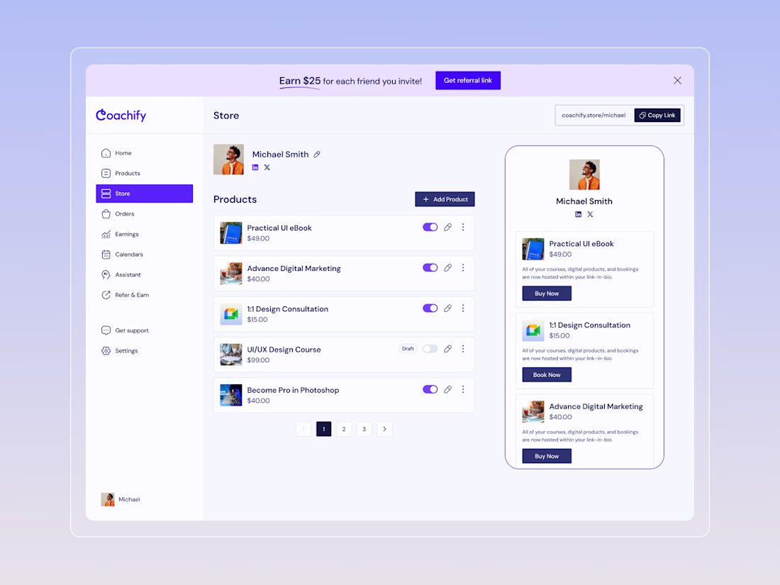
Coachify - UI/UX Design for a Creator Commerce Platform
Recently had the opportunity to design the full UI/UX for Coachify - a platform that lets coaches and digital creators sell courses, products, and bookings through a single link-in-bio.
The challenge was to take a feature-rich product and make it feel effortless. Creators shouldn't need to think about setup, navigation, or tech — they should just list, share, and earn.
We focused on building a dashboard that feels lightweight but powerful: a storefront view with toggle controls for product visibility, a public-facing bio page that updates in real time, pagination for scaling product libraries, and a referral system woven naturally into the experience.
Every screen was designed to reduce friction and keep the creator's attention on what matters - their content and their customers.
Looking to design your next SaaS or creator tool? Let's connect and build something great together.

Nice work

Check this out!

Applied :)


Trending


FLORA
Reusable workflows are replacing one-off prompts in creative AI. Share what you're building in FLORA.
portfolioreview
The best portfolios tell a story, not just show a grid. Share yours for feedback.
brandguidelines
Brand guidelines are becoming living systems. What are you building for your clients?
freelancerlife
Freelancer life is wins, pivots, and everything in between. What’s yours right now?
aivideo
AI video tools are moving at warp speed. Which ones are you experimenting with?