The network for creativity
Join 1.25M professional creatives like you
Connect with clients, get discovered, and run your business 100% commission-free
Creatives on Contra have earned over $150M and we are just getting started
Back to feedPost

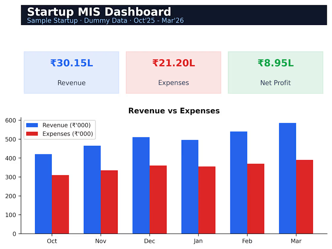
A 6-month MIS dashboard tracking revenue, expenses, net profit and margin trends with an auto-updating bar chart, giving founders a one-page view of business health.

The network for creativity
Join 1.25M professional creatives like you
Connect with clients, get discovered, and run your business 100% commission-free
Creatives on Contra have earned over $150M and we are just getting started





Related posts

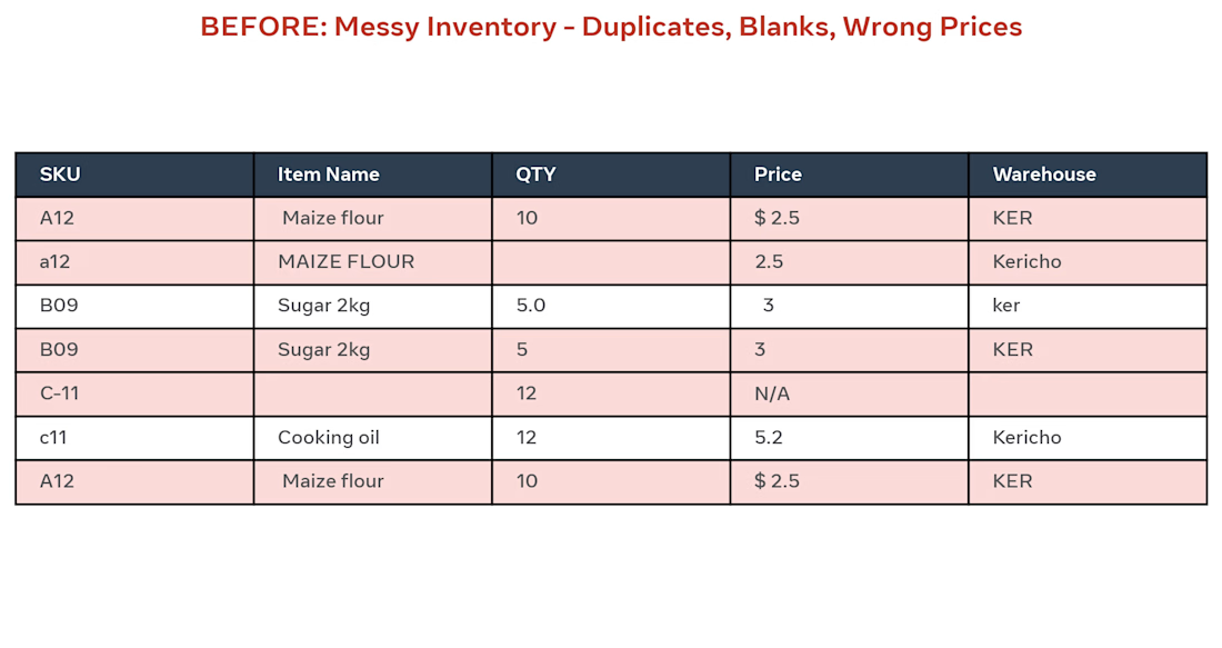
BEFORE: Client had messy Excel inventory with 500 rows, duplicates (A12 / a12), blanks, wrong prices like "$ 2.5" and "N/A", and different warehouse names (KER / ker / Kericho).
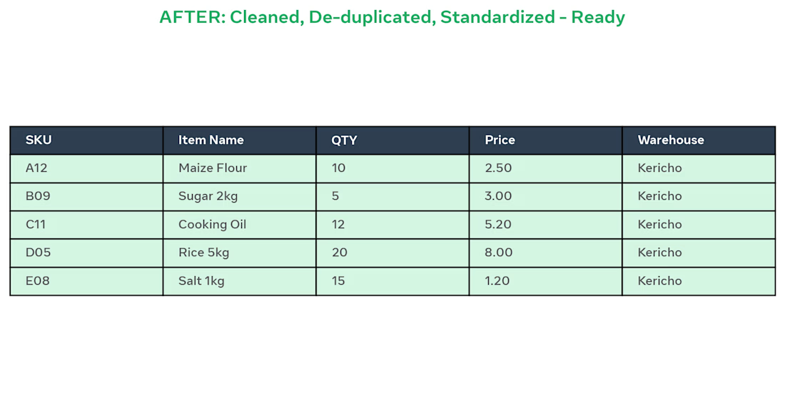
AFTER: I did:
Removed 12 duplicate SKUs
Standardized item names to Title Case
Fixed QTY and Prices to 2 decimals
Unified Warehouse to Kericho
Made sheet ready for pivot dashboard
Result: Clean, ready-to-use inventory in 2 days using Excel.
Tools: Excel, Remove Duplicates, Text to Columns, TRIM, PROPER


👟 24+ Years Footwear Expert → Now Helping USA Shoe Brands 3X ROAS with Facebook & Instagram Ads
I just launched my new project: Facebook & Instagram Ads for Shoe Brands Only!
🚫 Why ONLY Shoe Brands?
I was Ex-Head Commercial of Top 3 Footwear Factory in Bangladesh. I know shoe buyer psychology, not just ads.
🎯 Recent Result: USA Hemp Sneaker Brand
ROAS 1.2x → 3.2x in 30 Days
CPC $0.80 → $0.35
Revenue $15k → $38k/mo
Most agencies run generic ads. I build:
✅ Shoe-buyer only audiences (Sneakerheads, not random interests)
✅ UGC Try-on + Factory Story Creatives
✅ Shopify + Subscription Funnel for Repeat Buyers
If you own a Shoe Brand (Sneakers, Boots, Sustainable Shoes like 8000Kicks), drop your store URL - I'll send you FREE 5-min audit with 3 mistakes losing you money.
Let's make your shoe brand the next 8000Kicks 🚀
#footwear #shoebrand #facebookads
footwearfootweardesignShopifyGoogle SheetsMicrosoft ExcelLead GenerationMarket ResearchProduct Research




Good Luck!


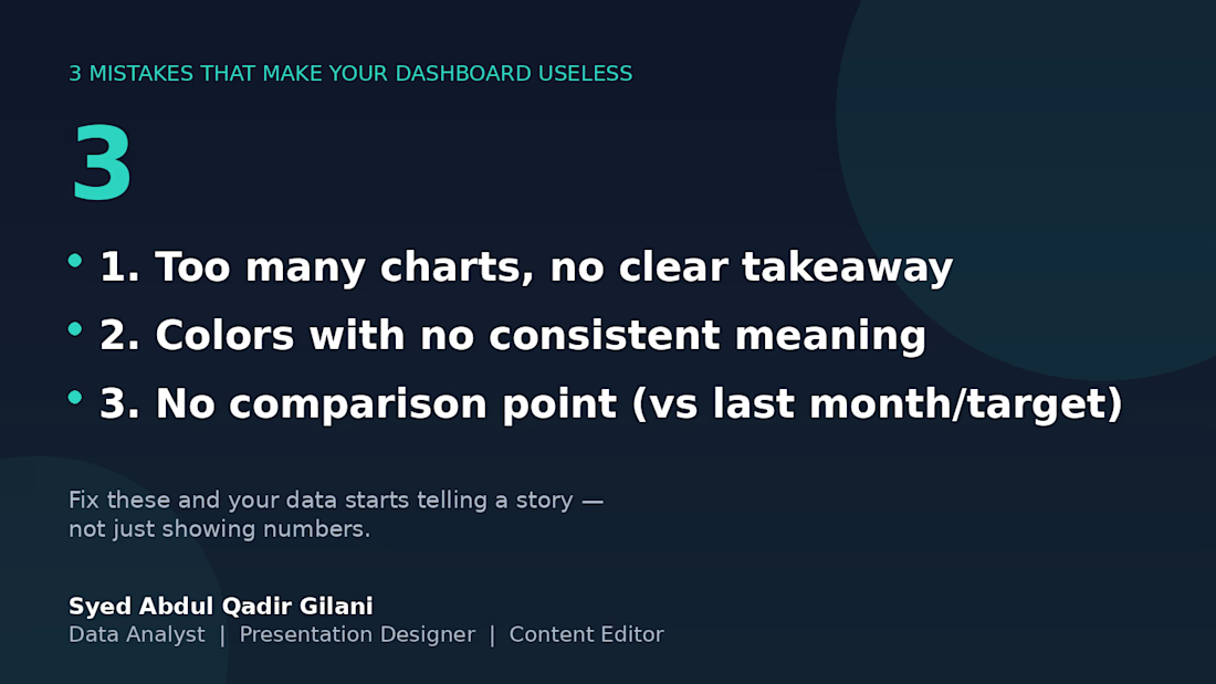
3 mistakes that will eventually make this board useless. 📉
I've reviewed several client dashboards over the years, and the same 3 problems show up over and over:
1️⃣ Too many charts, no clear takeaway — if I can't tell what to do after looking at it, it's decoration, not a dashboard.
2️⃣ Colors with no consistent meaning — red means "unacceptable" on one chart and "category 3" on the next. Pick a system and stick with it.
3️⃣ No comparison point — a number alone means nothing. "Revenue: $12,480" tells you nothing. "Revenue: $12,480 (+18% vs last month)" tells you everything.
Fix these three, and your data stops being numbers on a page — it starts being something people actually use to decide.
What's the most common dashboard mistake you've seen? 👇