The network for creativity
Join 1.25M professional creatives like you
Connect with clients, get discovered, and run your business 100% commission-free
Creatives on Contra have earned over $150M and we are just getting started
Back to feedPost
CREARA is a Spain-based architectural firm with a unique selling point: creating spaces that align with the lifestyles desired by young families.
With a premium, minimalist aesthetic, the firm stands out by avoiding cookie-cutter designs, instead creating bespoke solutions tailored to each client's specific needs.
Focusing primarily on young families, the visual identity is soft, modern, and sustainable.


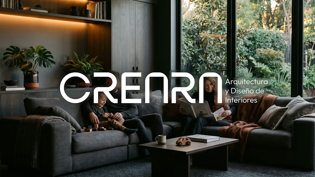
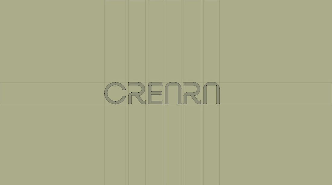
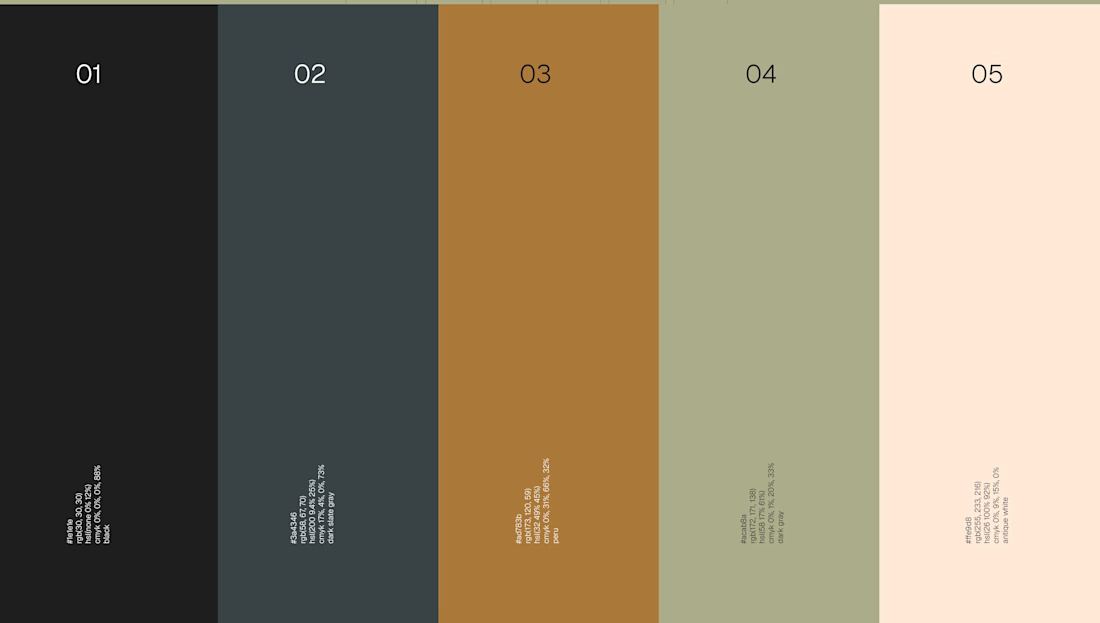
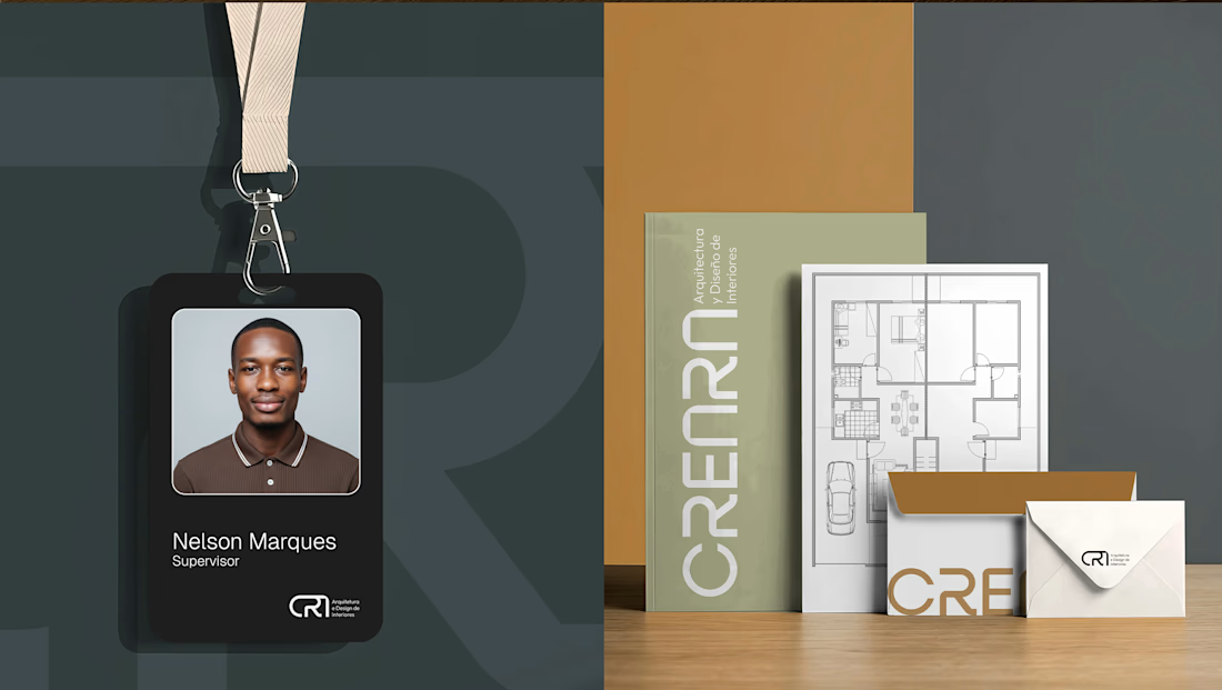

Love the clean branding and earthy color palette.

Thank🙌 😍


Looks great! 👌
Thanks🙌 😍


the soft green palette and restrained type feel really considered
It really did; the project took about a full month to complete, and selecting the colors was one of the biggest challenges.

This is a great work, Nelson
Thanks 😍

Logo is amazing!
Thanks 😍

The young-families angle is the tricky constraint here, since premium minimal usually gets read as slightly untouchable and families are the audience least inclined to want that. The softened wordmark and the warmer half of the palette look like where that gets absorbed. Was the...
The color details weren't defined in the brief...
The brief simply specified a desire for a design that felt premium, yet also—in a way—cozy and gentle for families.
So, I created a more "premium" logo using fine lines and soft curves, and complemented the rest with supporting...

The network for creativity
Join 1.25M professional creatives like you
Connect with clients, get discovered, and run your business 100% commission-free
Creatives on Contra have earned over $150M and we are just getting started











Related posts


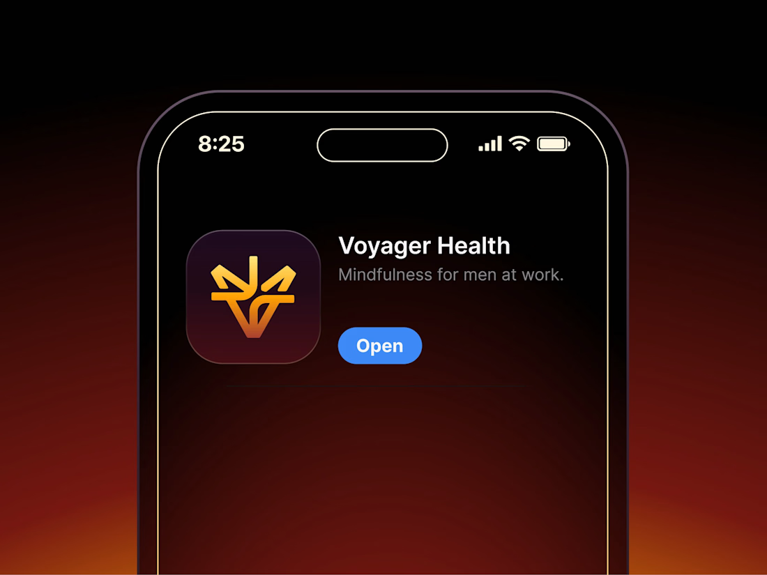

Aryna, that golden symbol pops so nicely against the plum background ✨

Behind the scenes of the Treal Studio brand film.
Built in one week, from creative direction to sound design.


Love the overall feel, looks amazing 👌🏼

It’s been a minute since my last post here on Contra.
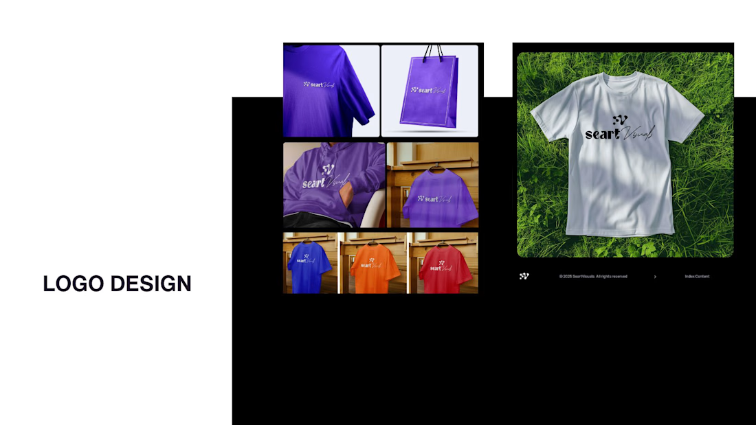
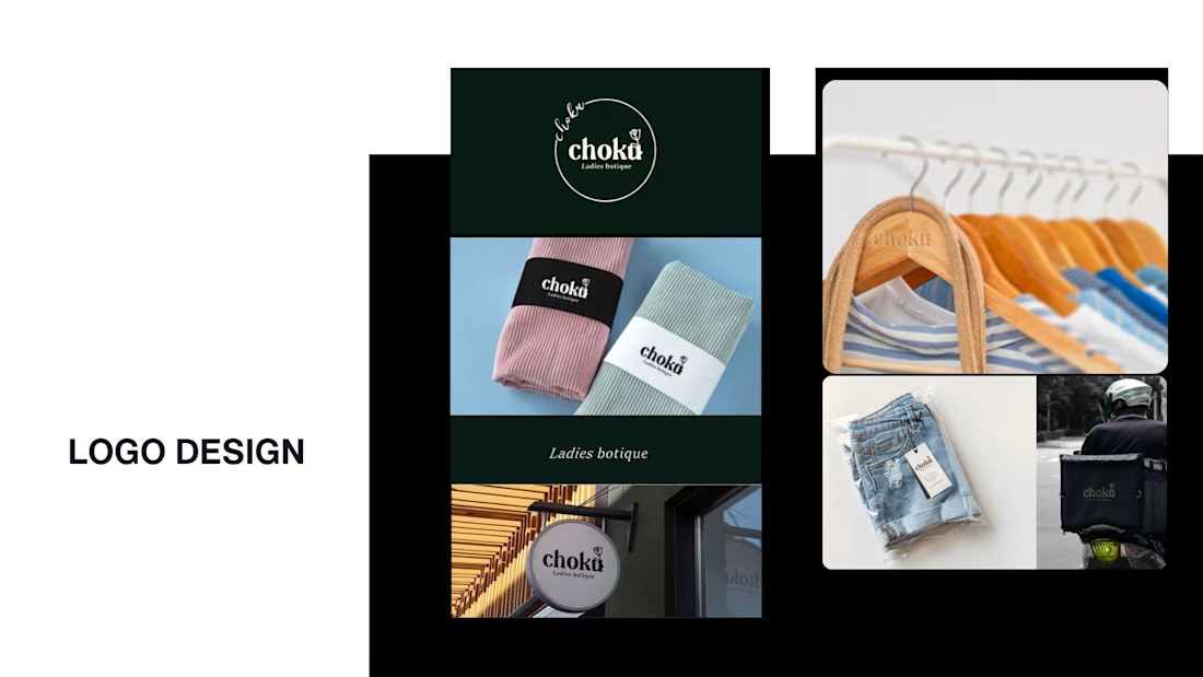
While my main focus usually lives in photo editing and digital design, I was digging through the archive recently and thought it’d be fun to share a couple of branding projects from the past:
Slide 1: Seart Visuals apparel & merchandise branding (1 year ago)
Slide 2: Choku Ladies Boutique identity and mockups (2 years ago)
Brand identity isn't my everyday lane, but tackling projects like these taught me a lot about visual consistency across different mediums. I’d love to hear your thoughts or see any feedback from fellow designers. Great to connect with the community again.


That's really great typography logo design❤️❤️